Yashram Brands Unlimits Brand Identity
CASE STUDY
Brand: Yashram Brands Unlimits
Industry: A house of brands (umbrella-brand) for a range of brands
Project Scope:
Rebranding and refreshed identity system
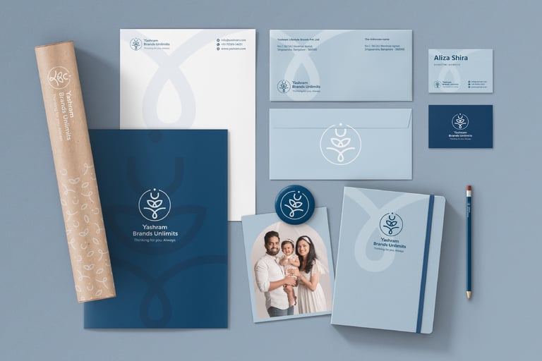
Complete identity suite: logo variations, color palette, typography, illustration style, brand patterns
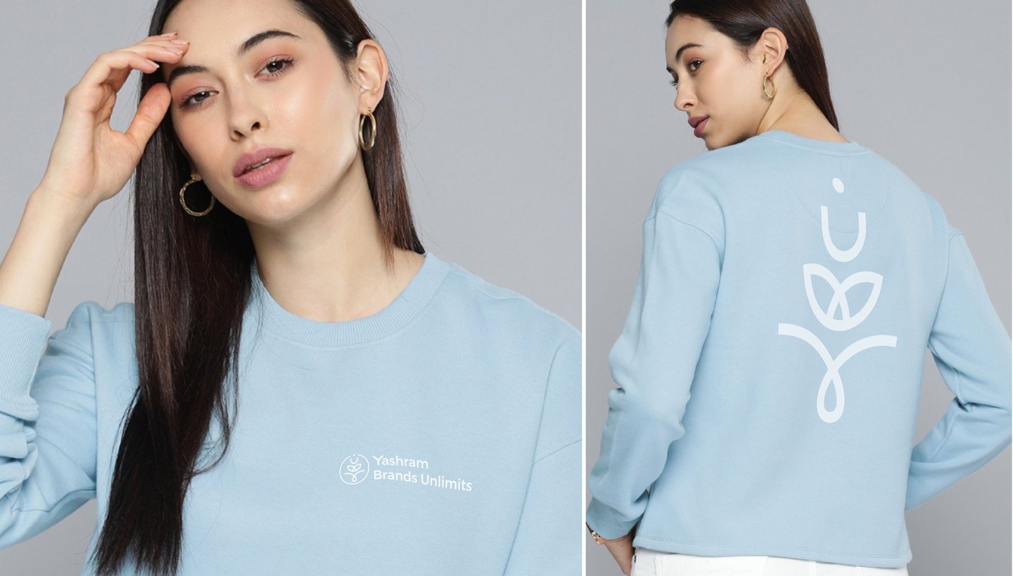
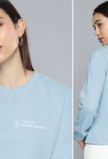
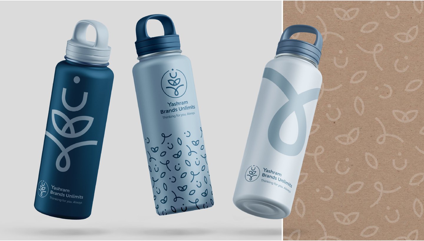
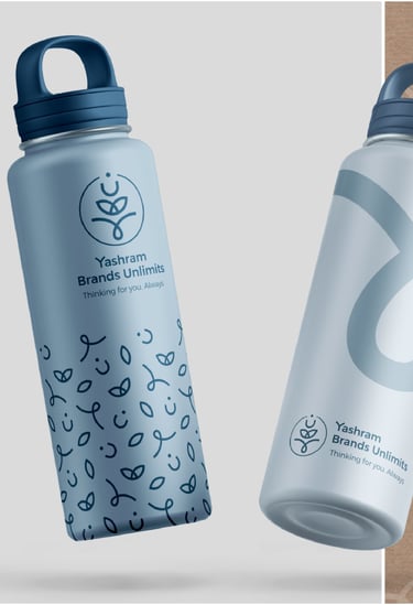
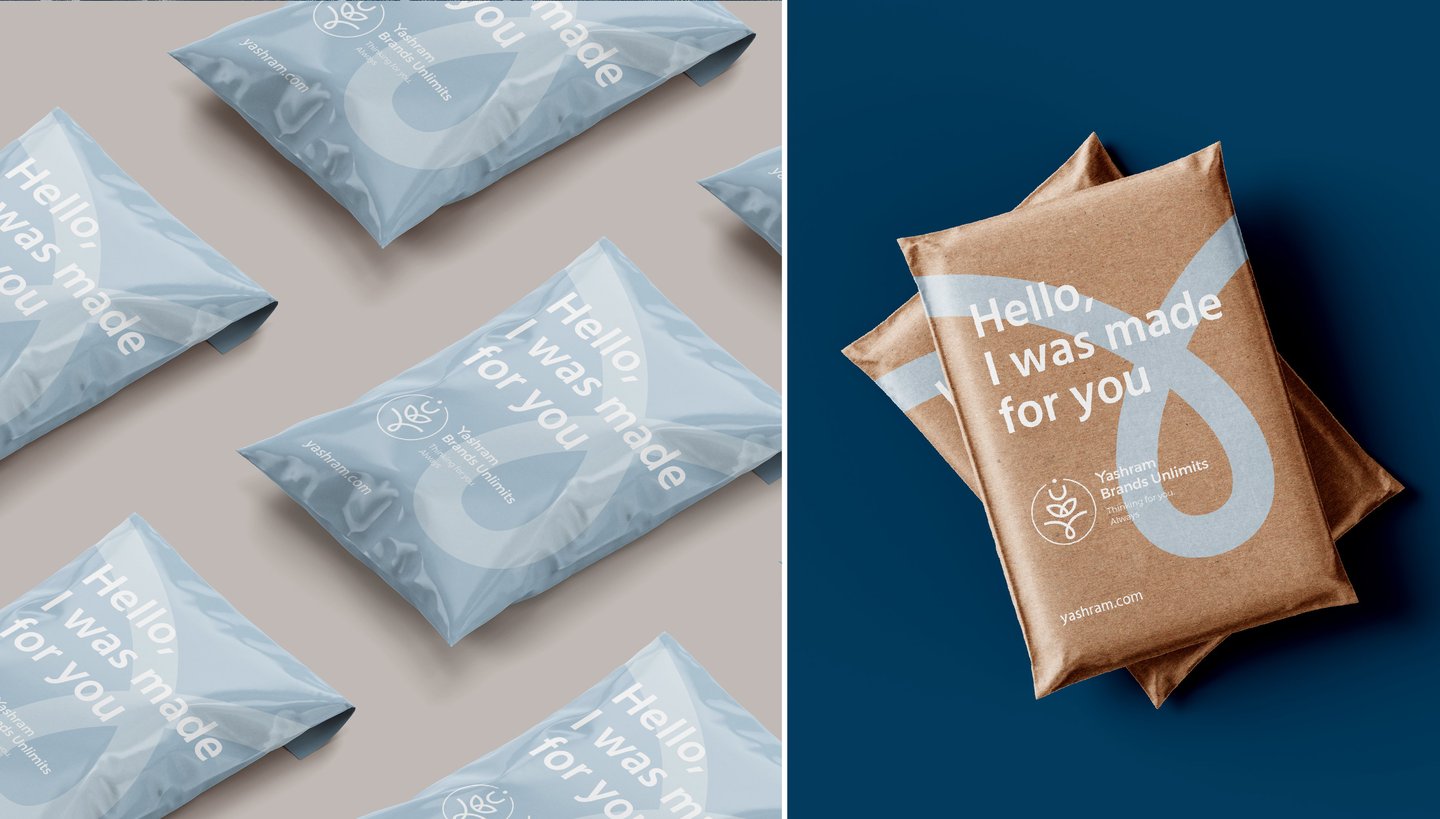
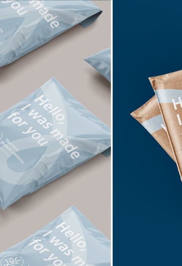
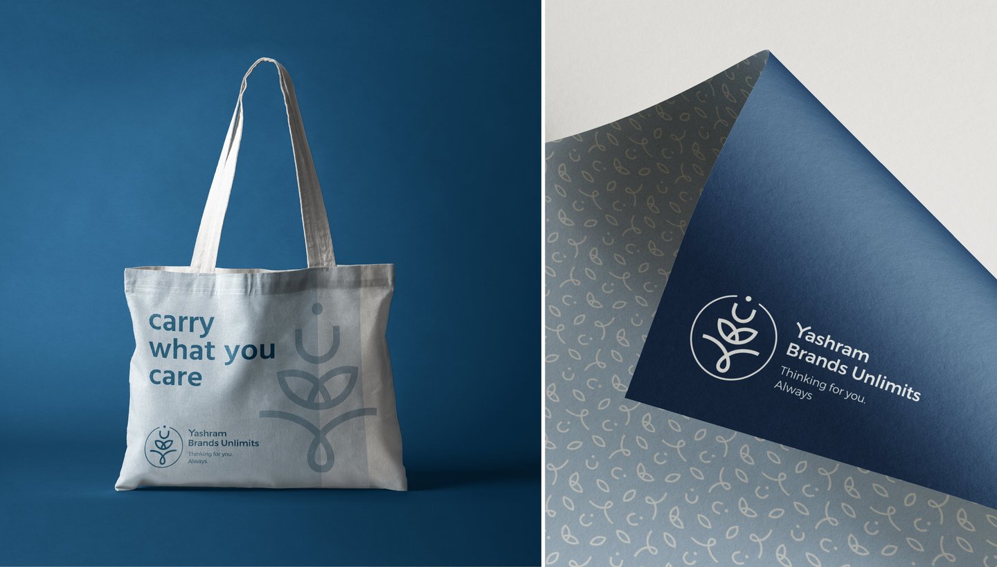
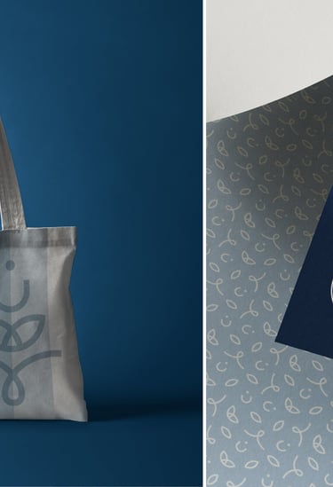
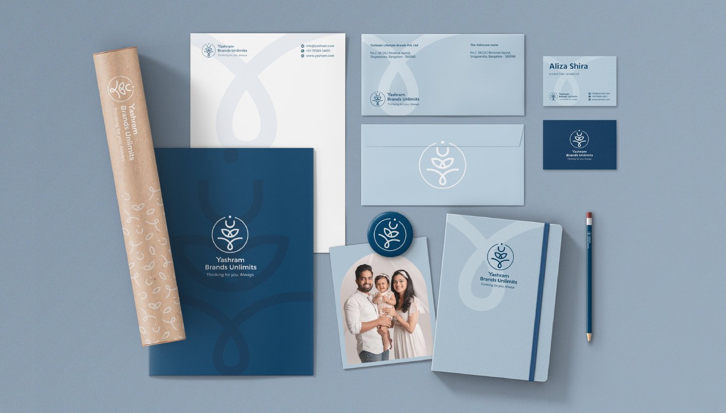
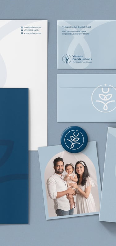
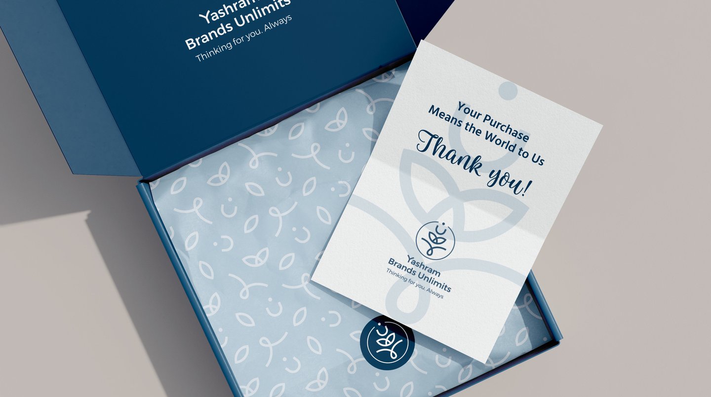
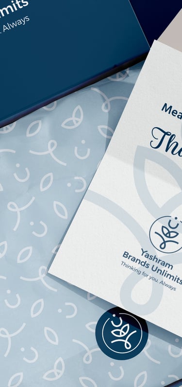
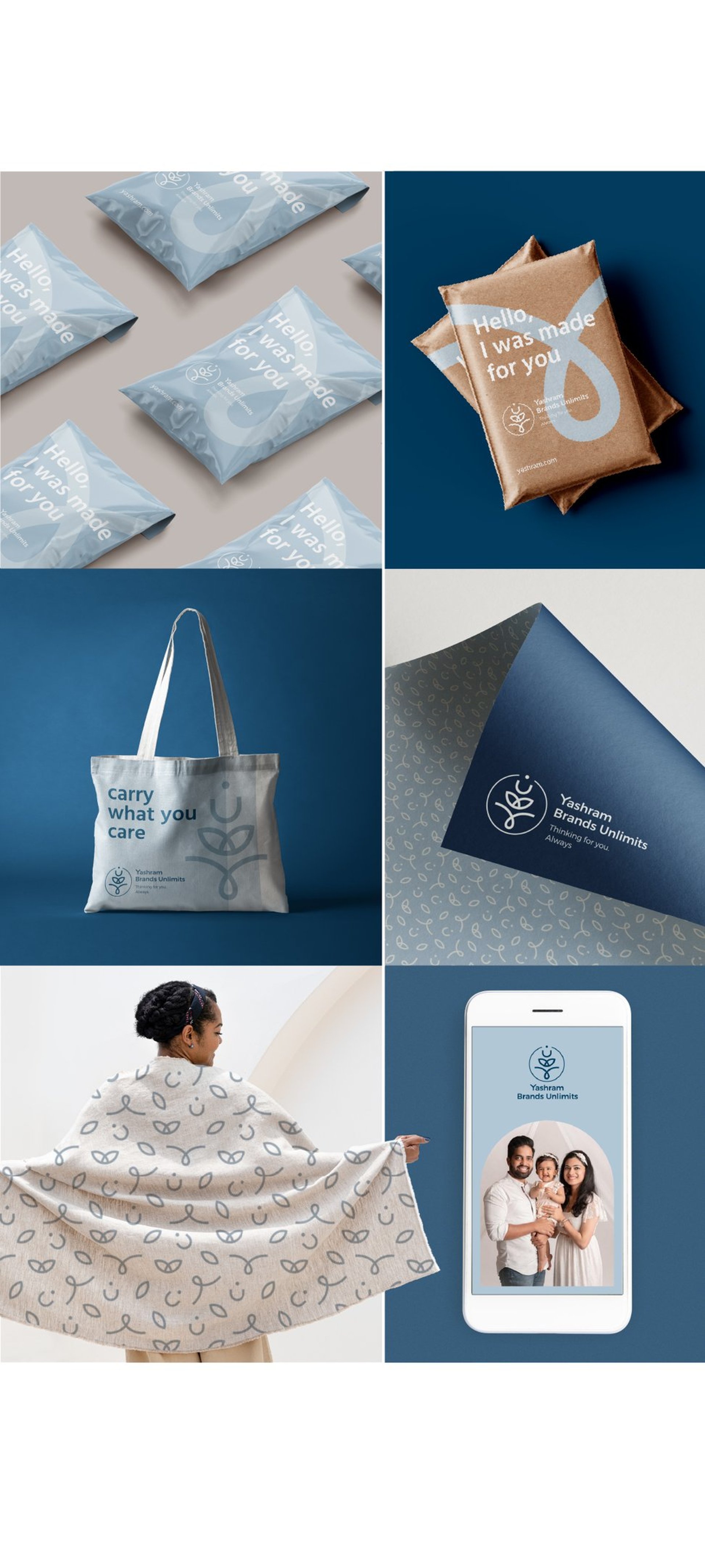
Brand collateral: packaging, stationery set, digital templates, different corporate merchandise
ABOUT THE BRAND:
Yashram Brands Unlimits - is and Indian house of brands (umbrella-brand) for a range of brands that makes meaningful products helping people when they are vulnerable (functional underwear, products for pregnant women and mothers, sustainable baby diapers etc.).
DESIGN CHALLENGE:
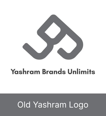
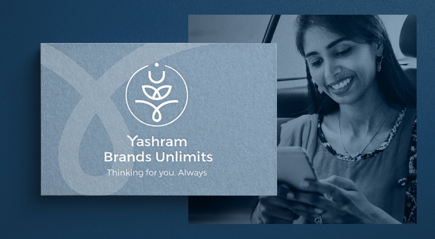
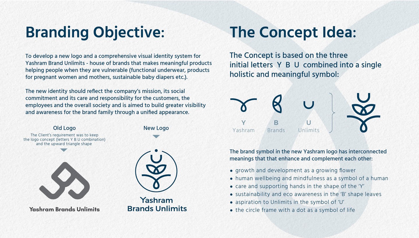
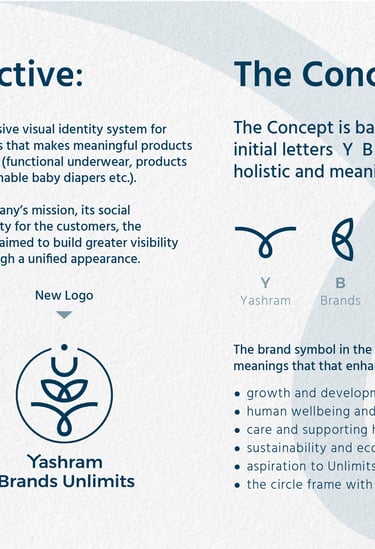
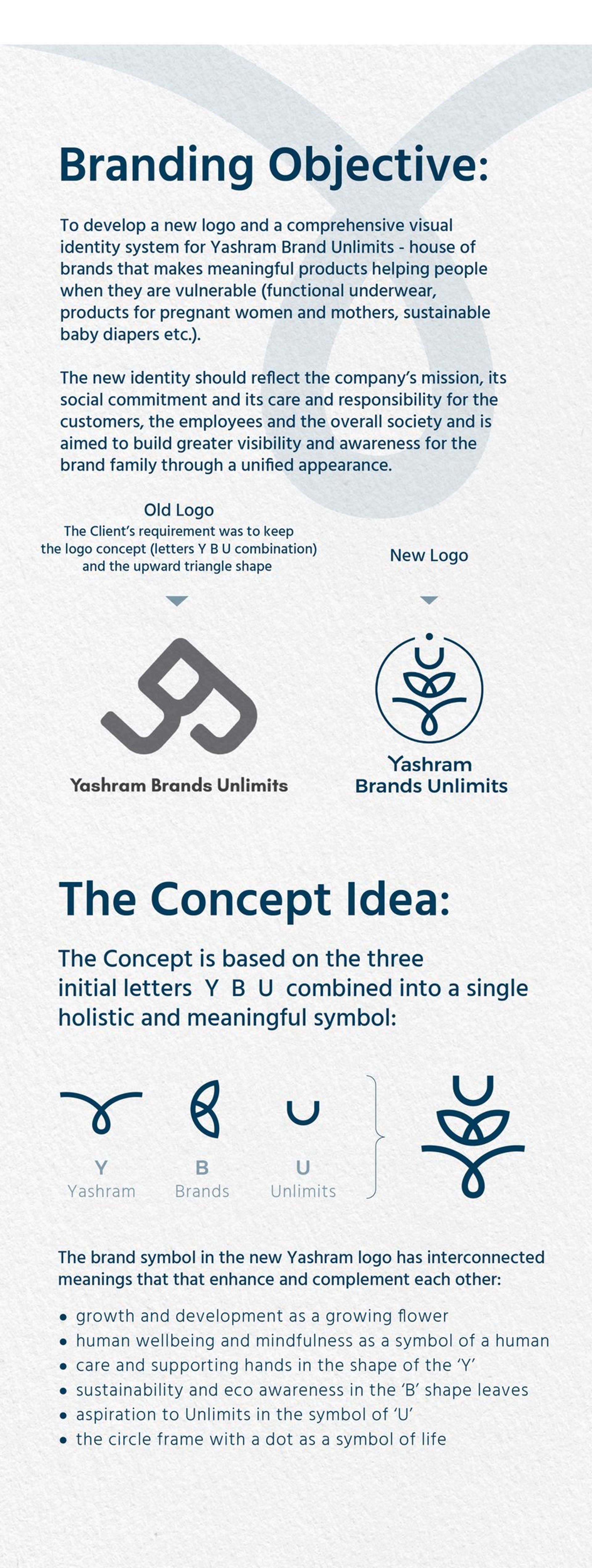
I had to develop a new (renovated) identity for Yashram company as an umbrella company connecting different brands (Baby Munkin, Adira, Morph Maternity) with the same social mission and philosophy. And further to build more visibility and awareness for the brand family through their common appearance at touch-points.
Renovation (restyling) of existing brand identity elements to encompass the house of brands and the brand`s philosophy.
Within developing it is expected:
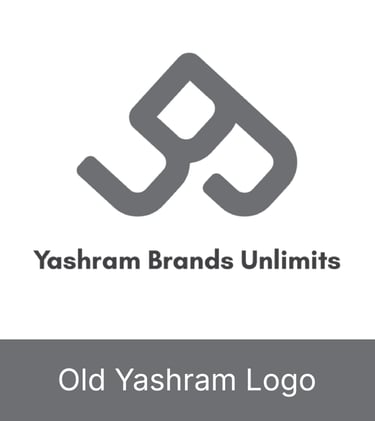
to keep the logo concept (letters combination Y B U) with and without the tagline,
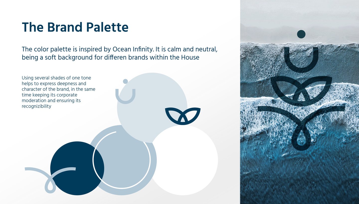
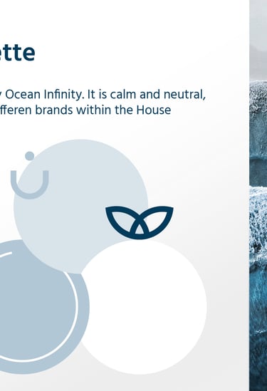
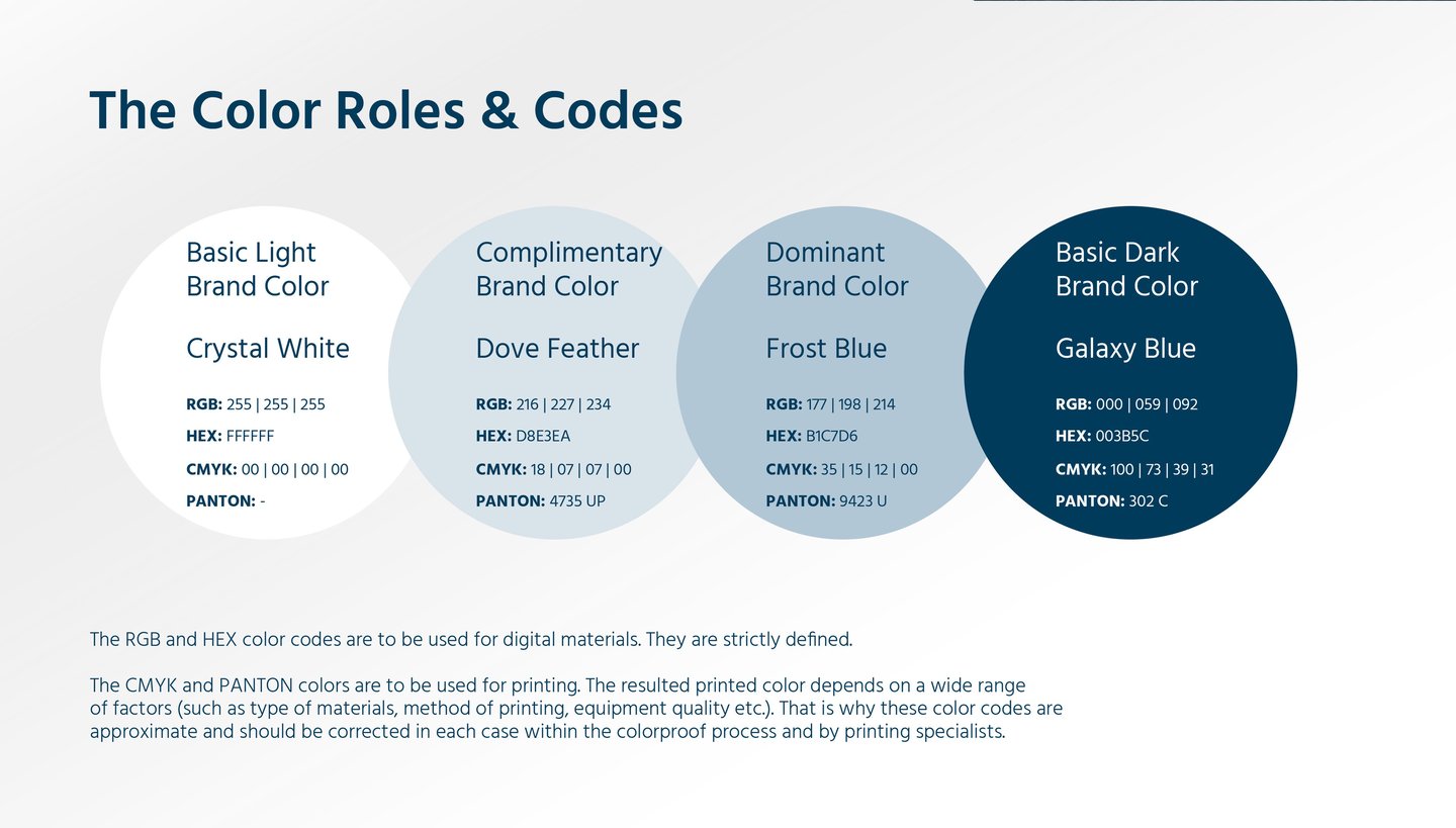
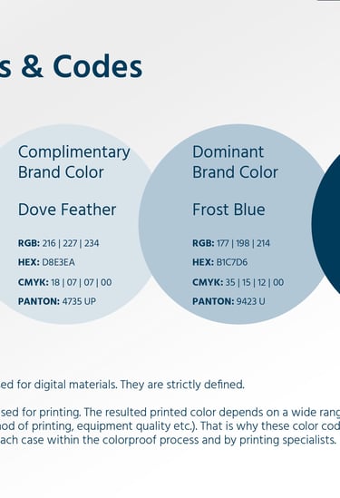
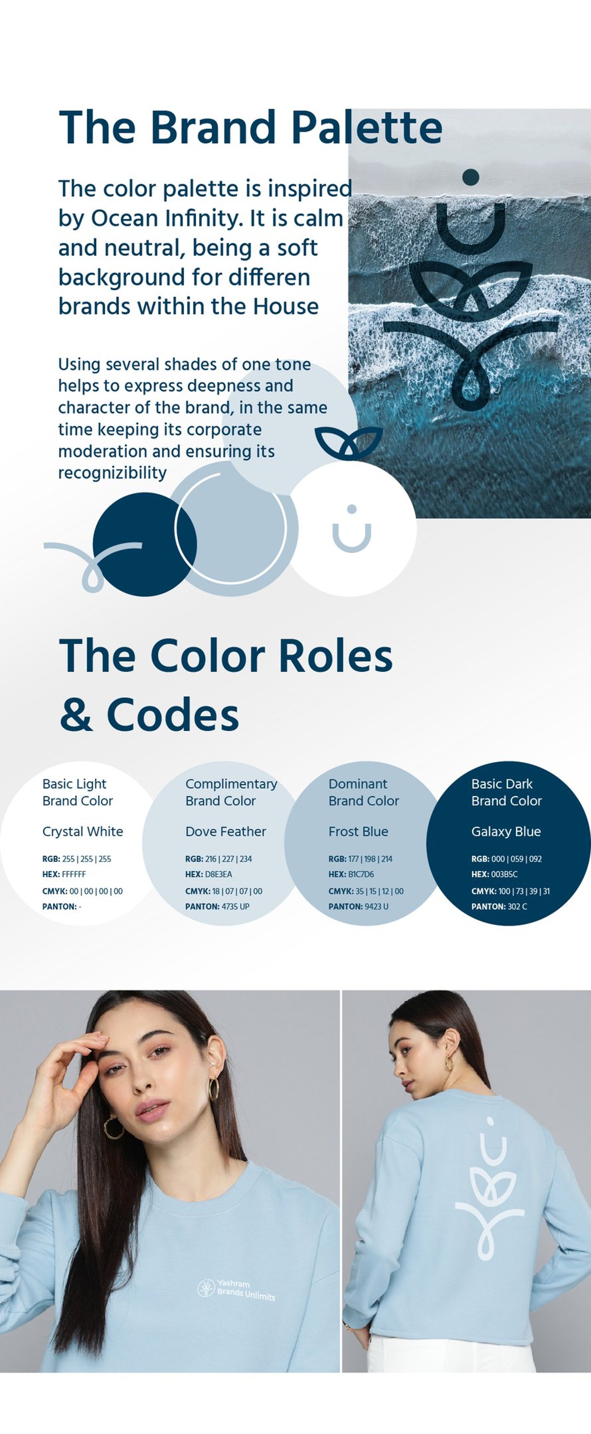
pick colour palette (neutral) and typography system,
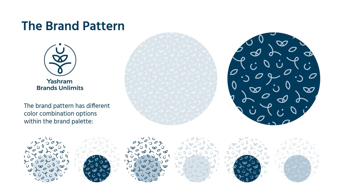
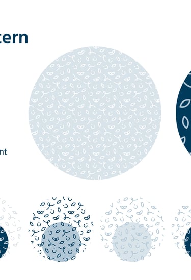
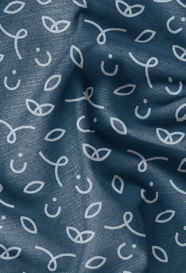
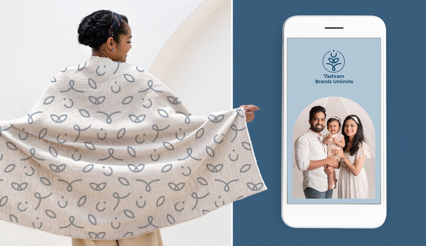
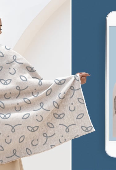
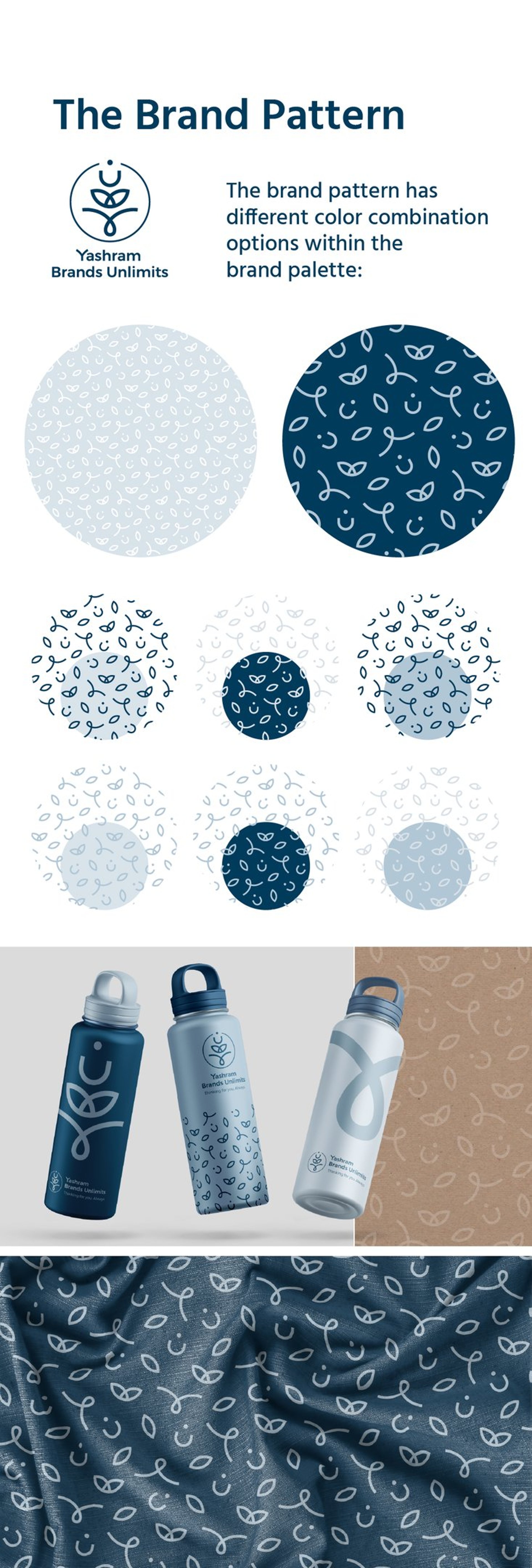
and develop pattern (neat and neutral based on logo, to use it as a background for packaging materials).
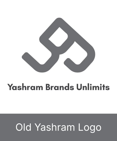
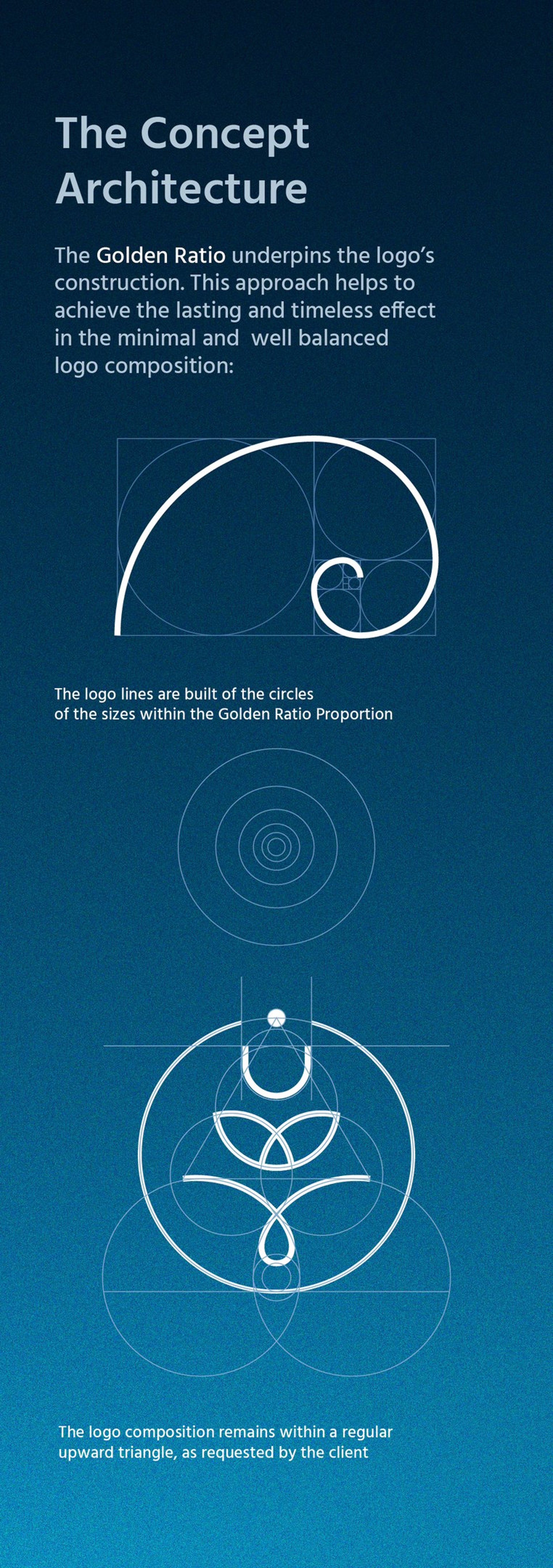
The Client’s requirement was also to keep the logo upward triangle shape.
CONCLUSION
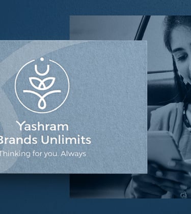
With the rebrand, Yashram Brands Unlimits has emerged with a cohesive, versatile identity that aligns with its vision of supporting brands with clarity, creativity, and confidence. At its core is a distinctive visual motif that reflects transformation and growth, combined with a refined typographic system and a color palette designed for both digital vibrancy and print flexibility.
Across all assets - logo systems, packaging, digital templates, social media designs - the new identity strengthens the company’s coherence and presence. Clear guidelines ensure consistency in usage and application. The result is a brand experience that feels emotionally resonant, professionally polished, and ready to scale further with Yashram Brands Unlimits’ growing ambitions.
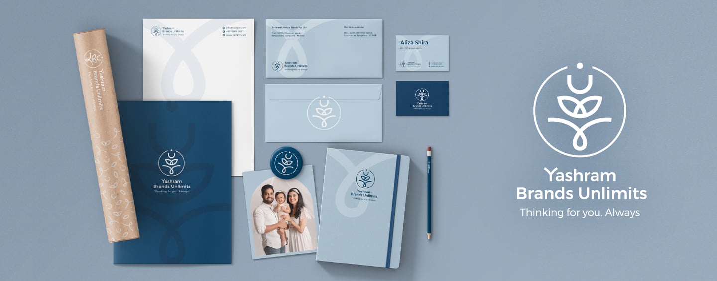
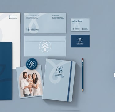
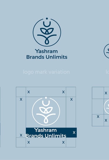
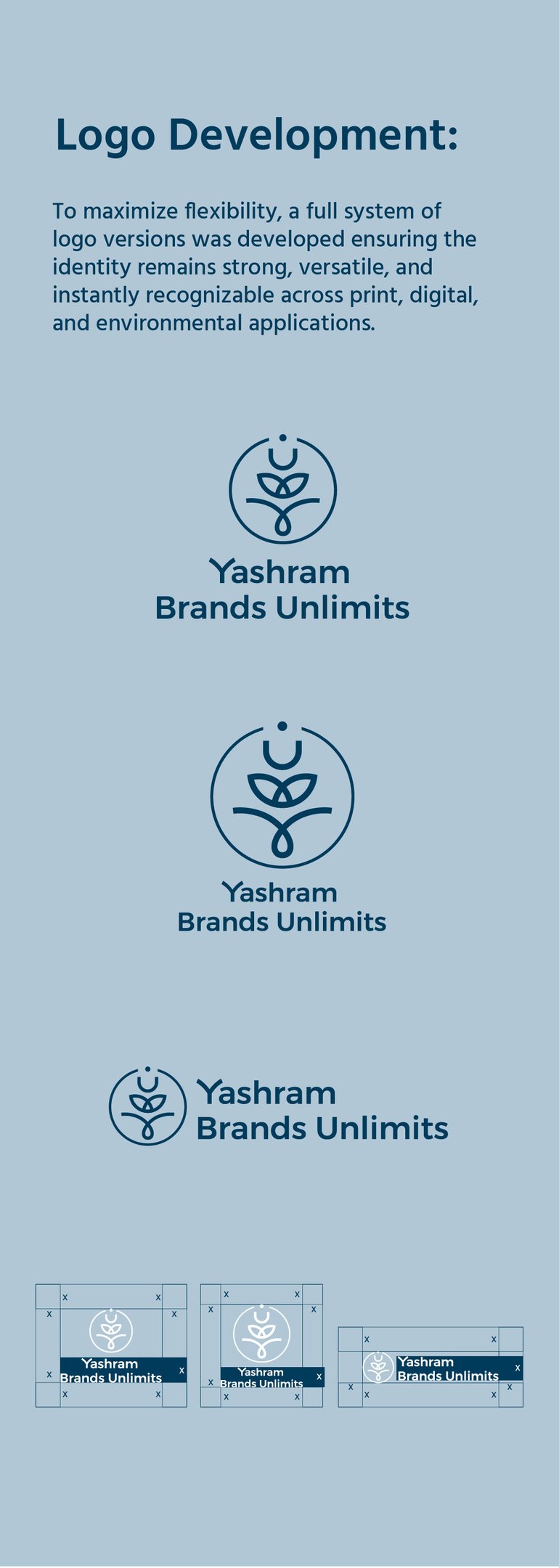
Logo Development:
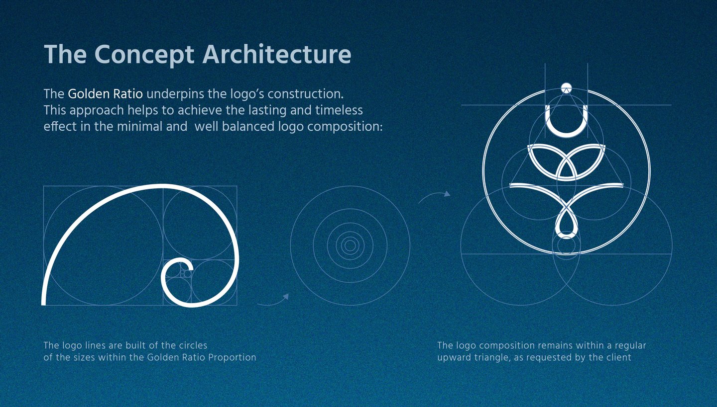
The Yashram Brands Unlimits logo was designed on the foundation of the Golden Ratio, creating perfect harmony, proportion, and visual balance. This mathematical structure ensures the mark feels both timeless and adaptable, working seamlessly across scales and mediums. Every curve and angle was carefully refined to embody growth, clarity, and limitless potential, reflecting the brand’s vision.
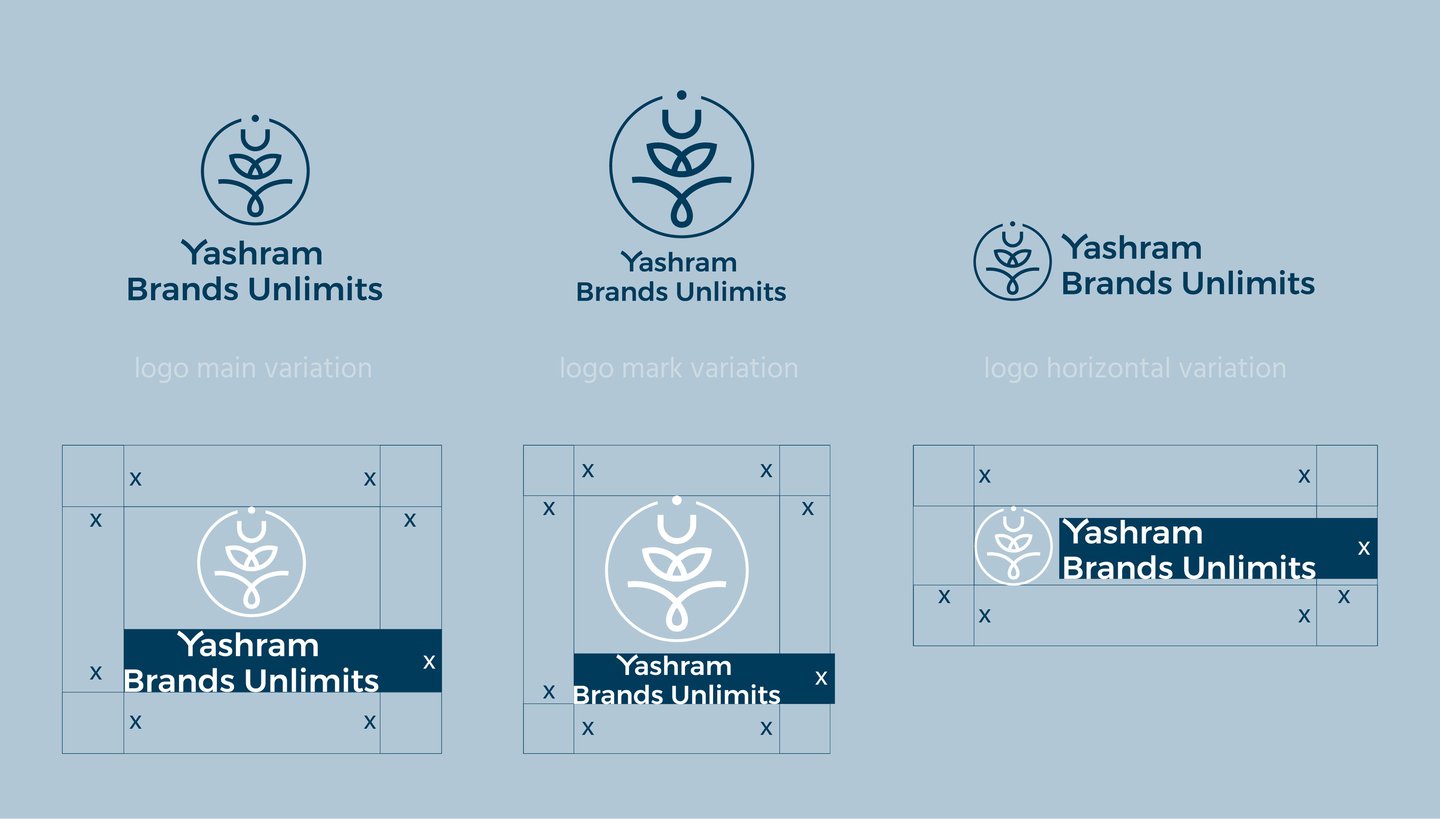
To maximize flexibility, a full system of logo versions was developed ensuring the identity remains strong, versatile, and instantly recognizable across print, digital, and environmental applications.
WEB SITE LAYOUTS & DIGITAL MATERIALS

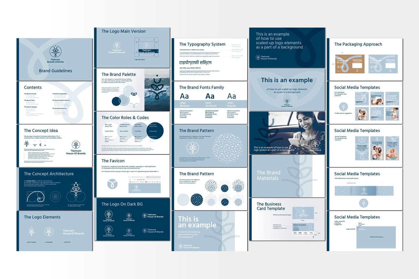
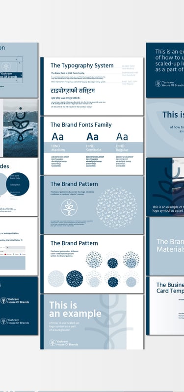
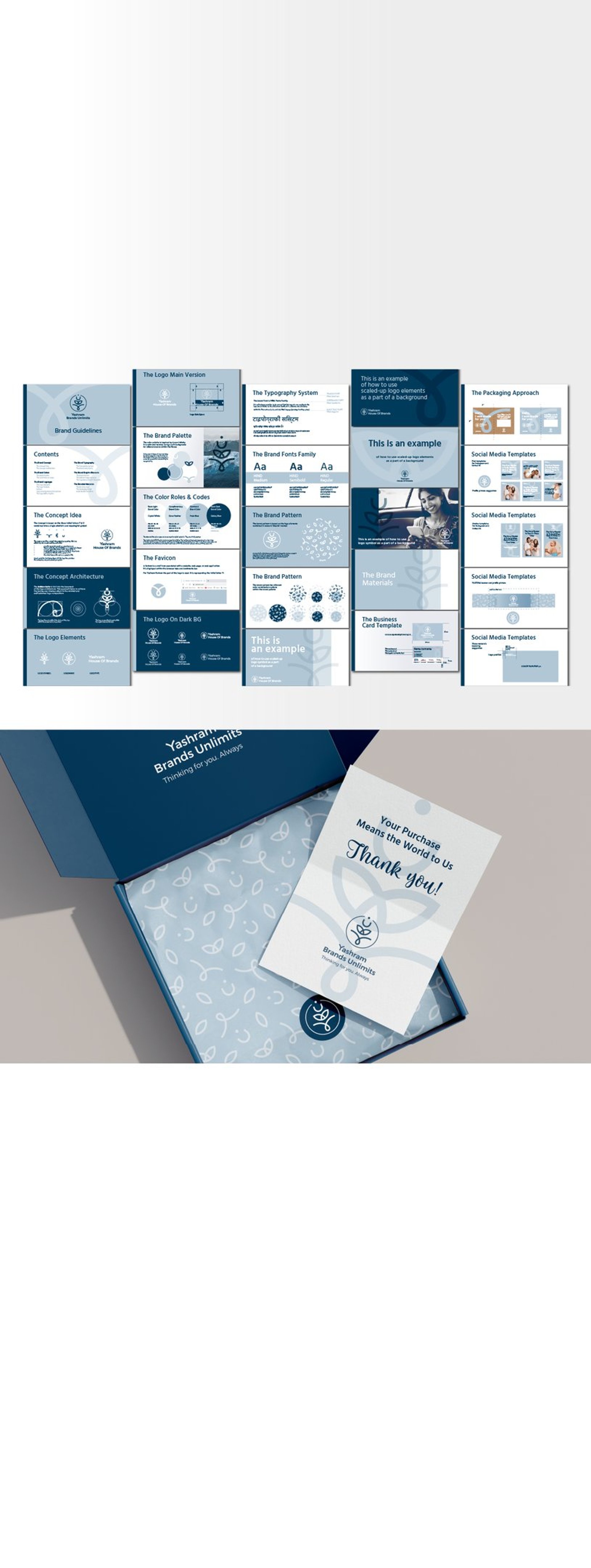
Brand Guidelines
To ensure clarity, consistency, and ease of application across every touchpoint, a comprehensive brand guideline was developed for Yashram Brands Unlimits. It brings together all essential brand assets, including the logo system, color palette, typography, patterns, packaging elements, and digital templates.
The guidelines provide clear instructions on correct usage, proportions, spacing, and application, offering practical examples that support both internal teams and external partners. This structured resource safeguards the integrity of the brand, ensuring that Yashram’s refreshed identity is applied cohesively across packaging, digital platforms, marketing materials, and social media — preserving its recognition, personality, and promise of limitless growth.
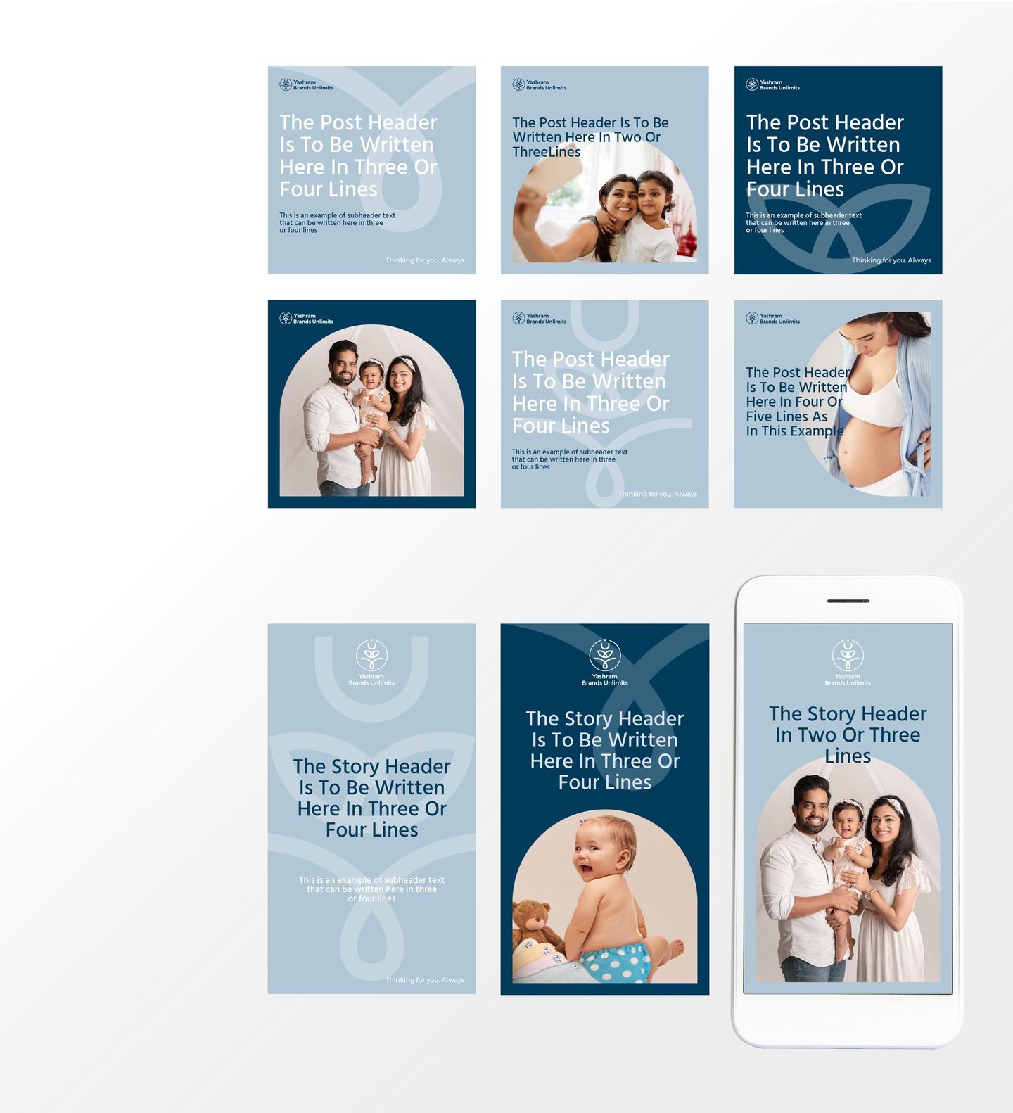
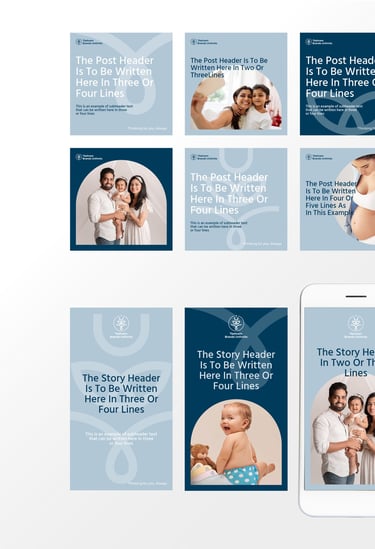
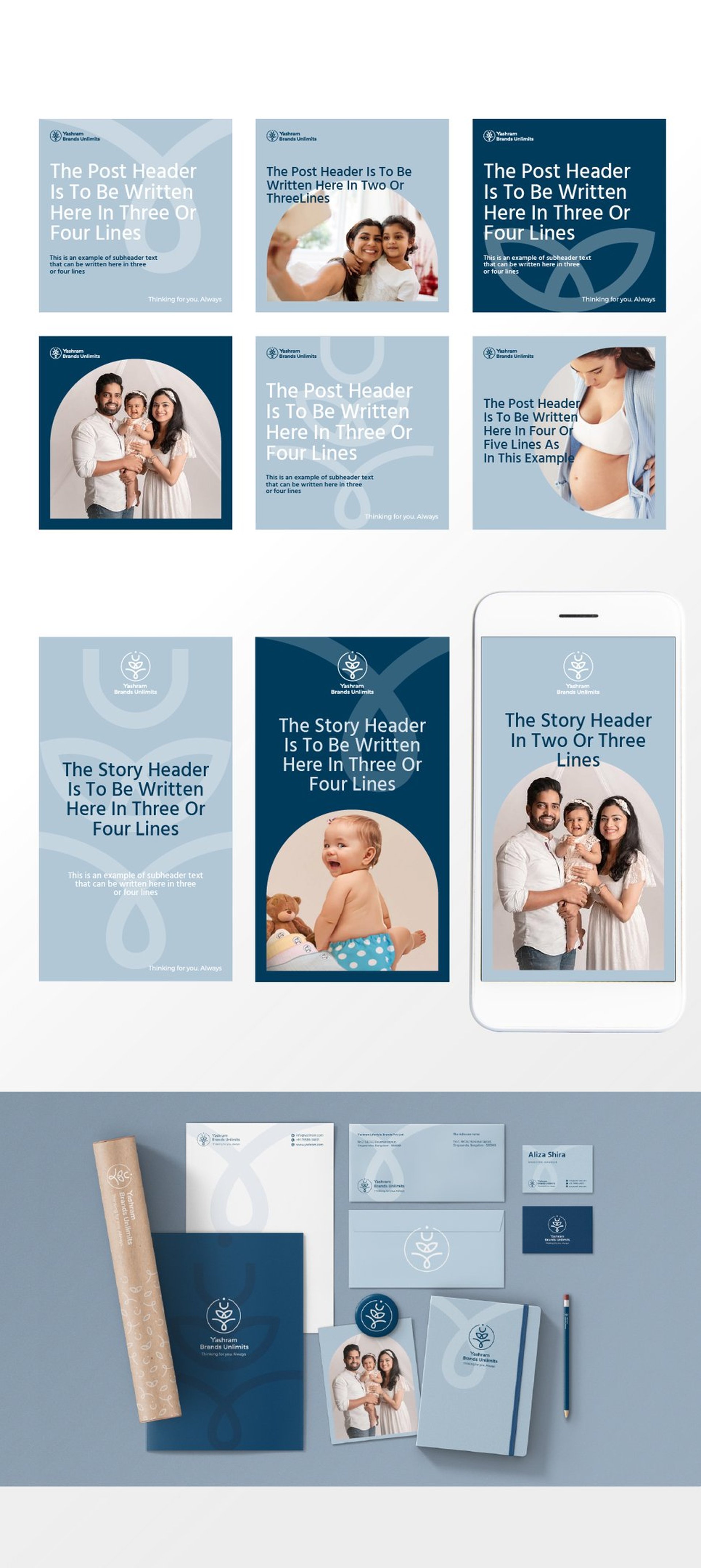
Instagram Templates
For Yashram Brands Unlimits, custom Instagram templates were designed to carry the brand’s identity seamlessly into the digital space. Drawing from the logo system, color palette, typography, and graphic elements, the templates create a cohesive visual voice that is instantly recognizable.
Each design was crafted to support a range of content types, from campaign launches and product showcases to collaborations and brand storytelling, while maintaining a polished and professional look.
These templates ensure that every post reinforces Yashram’s identity, strengthens audience engagement, and reflects the brand’s bold, contemporary personality.
Yashram Brand identity
CASE STUDY

Brand: Yashram Brands Unlimits
Industry: A house of brands (umbrella-brand) for a range of brands
Project Scope:
Rebranding and refreshed identity system
Complete identity suite: logo variations, color palette, typography, illustration style, brand patterns
Brand collateral: packaging, stationery set, digital templates, different corporate merchandise
ABOUT THE BRAND:
Yashram Brands Unlimits - is and Indian house of brands (umbrella-brand) for a range of brands that makes meaningful products helping people when they are vulnerable (functional underwear, products for pregnant women and mothers, sustainable baby diapers etc.).
DESIGN CHALLENGE:
I had to develop a new (renovated) identity for Yashram company as an umbrella company connecting different brands (Baby Munkin, Adira, Morph Maternity) with the same social mission and philosophy.
And further to build more visibility and awareness for the brand family through their common appearance at touch-points.
Renovation (restyling) of existing brand identity elements to encompass the house of brands and the brand`s philosophy.
Within developing it is expected:
to keep the logo concept (letters combination Y B U) with and without the tagline,
pick colour palette (neutral) and typography system,
and develop pattern (neat and neutral based on logo, to use it as a background for packaging materials).

CONCLUSION
The rebrand gives Yashram Brands Unlimits a cohesive identity that reflects transformation, growth, and clarity. With a unified visual system across all assets, the brand feels consistent, polished, and ready to scale with the company’s ambitions.
Brand Guidelines
The guidelines unify all brand assets—logo, colors, typography, packaging, and templates—into a clear, practical system. They ensure consistent application across platforms, preserving Yashram Brands Unlimits’ integrity and recognition as it grows.
Get News & Inspiration
© 2024-2025 tanyabe.com.
All rights reserved
Useful Links