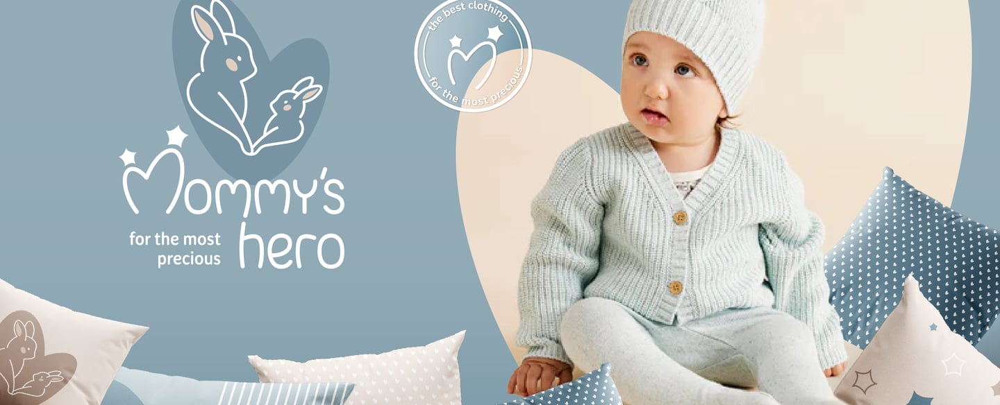
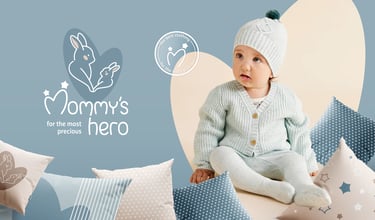
Mommy's Hero Brand Identity
CASE STUDY
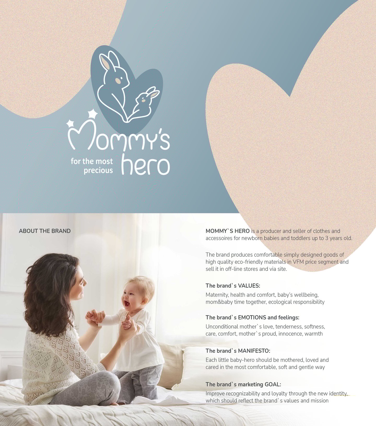


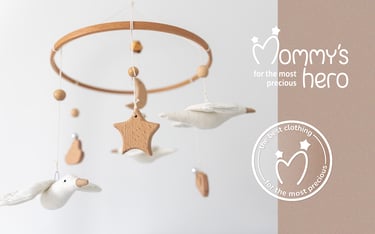
Brand: Mommy's Hero
Industry: Clothes and accessories for babies
Project Scope:
Brand naming, Brand positioning
Full Brand Identity System development: logo variations, functional color palette, typography system, set of illustrations, signature patterns, illustrations, set of functional icons
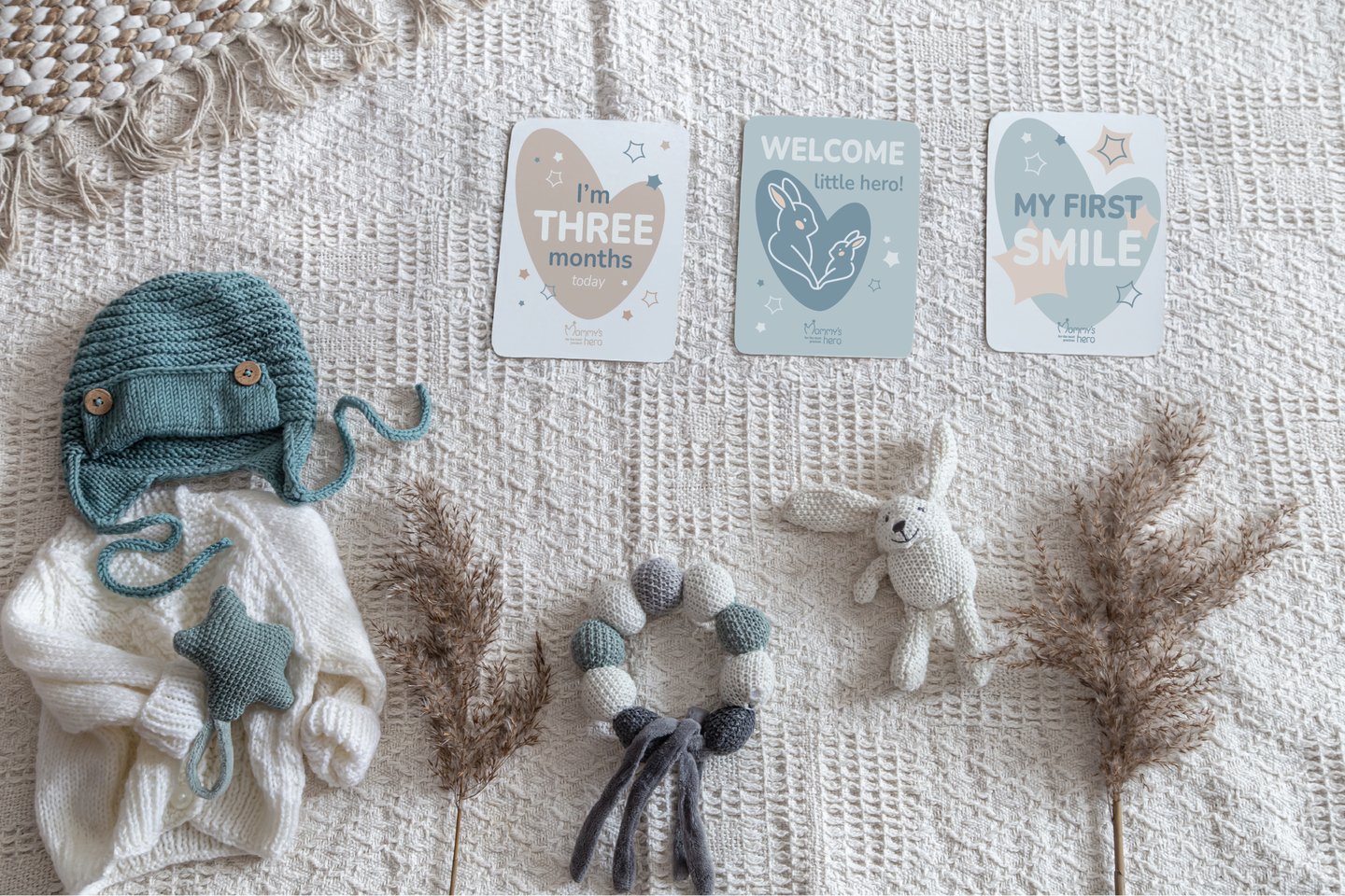
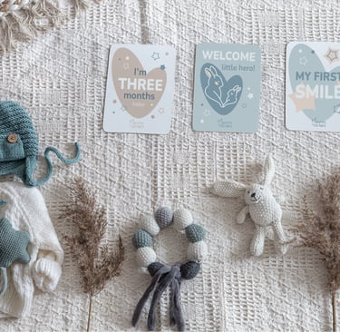
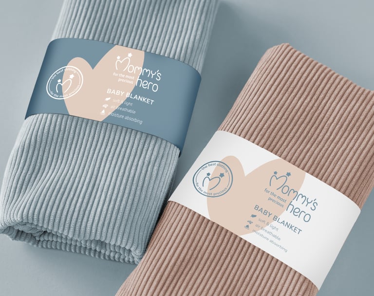
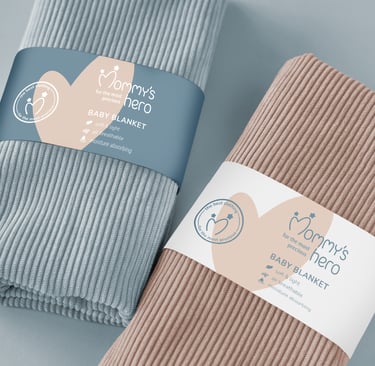
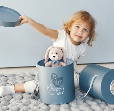
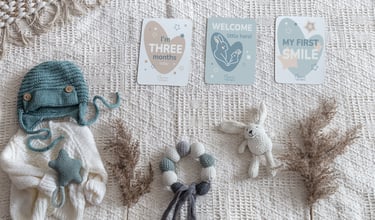
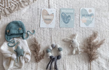
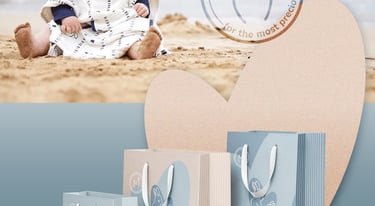
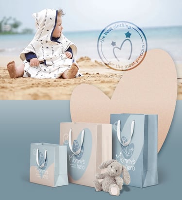
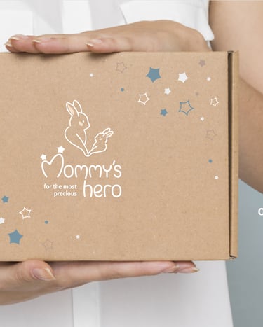
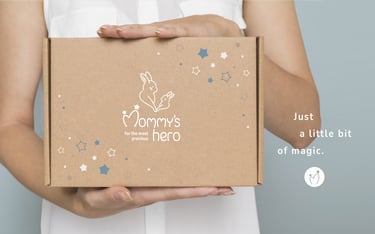
Branded Materials: Baby greeting cards, packaging materials, stickers
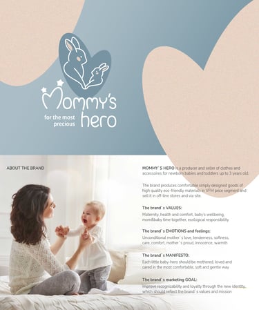
ABOUT THE BRAND:
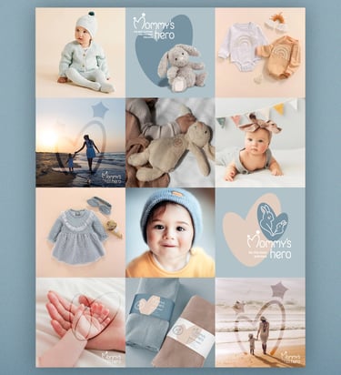
Mommy’s Hero is a baby store devoted to celebrating the magical connection between mothers and their little ones. With a carefully curated selection of products, the brand offers quality, comfort, and emotional resonance - creating a joyful and trustworthy experience for parents.
The project began with naming: Mommy’s Hero. The name encapsulates the heart of the brand: every baby is their mother’s little champion, a source of love, laughter, and meaning. This emotional story guided the visual identity, which combines tenderness with playfulness, warmth with trust.
CONCLUSION
The Mommy’s Hero identity captures the joy and magic of parenthood through a system that is both emotional and practical. From naming to logo, colors, illustrations, and digital guidelines, every detail works together to celebrate the bond between mother and child. The result is a brand world that feels warm, trustworthy, and endlessly versatile -a true reflection of every baby as their mommy’s little hero.
DESIGN CHALLENGE:
The creative challenge was to design an identity that conveys softness and care without slipping into clichés, while ensuring versatility across packaging, apparel, and digital platforms.
The identity had to express:
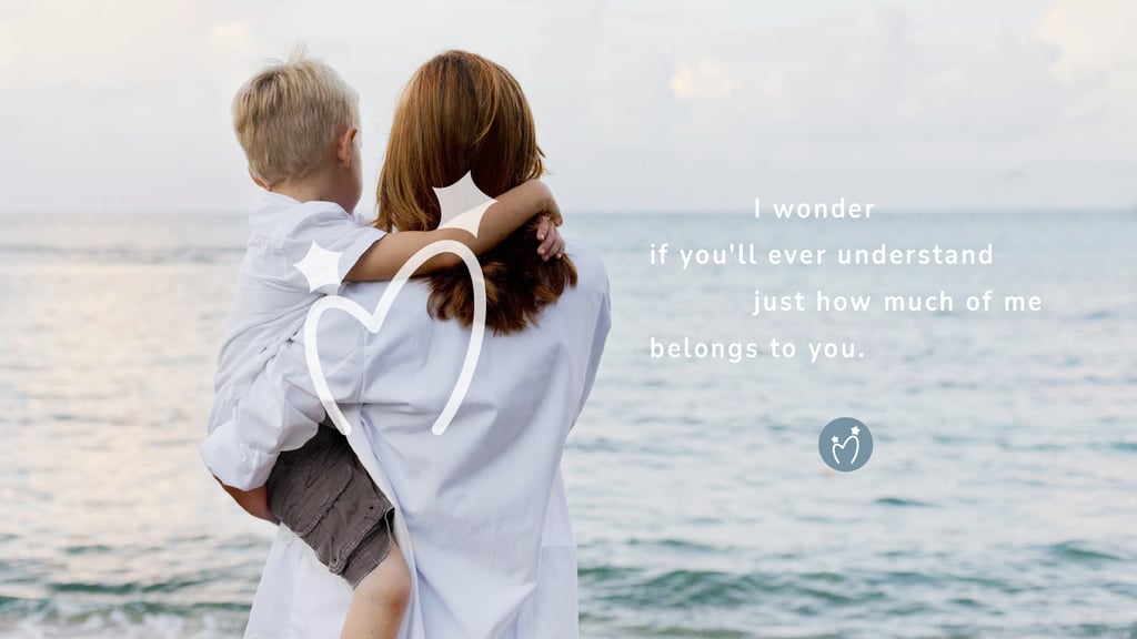
Tenderness and warmth — reflecting the intimate bond between parent and child
Playfulness and imagination — capturing the joy of early childhood
Trust and reliability — reassuring parents through quality and consistency
Gift-like charm — making every product feel special and memorable
The color palette was developed around soft pastels and balanced neutrals to evoke calm and safety, while custom illustrations (bunnies, stars, hearts, and gentle patterns) brought a playful, emotional dimension. The logo system was designed to feel iconic yet friendly, adaptable across touchpoints from packaging to digital.
The resulting identity is soft, kind, and versatile - a gentle brand world that grows with families and honors the everyday magic of raising little heroes.
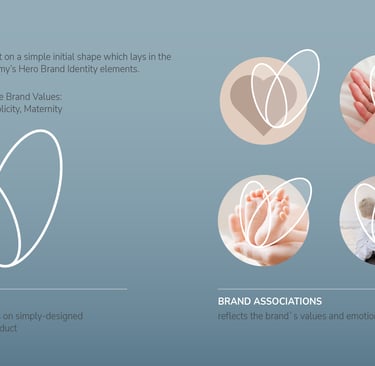
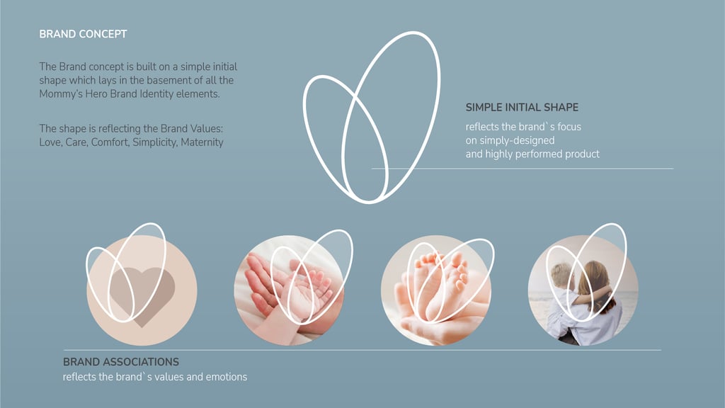
Brand Concept and Associations:
The brand identity is rooted in the emotional bond between mother and child. Tenderness, love, warmth, and playfulness are the guiding associations, expressed through gentle shapes, soft colors, and a joyful visual tone.
Mommy’s Hero positions every baby as their mother’s little champion - the heart and hero of the story.
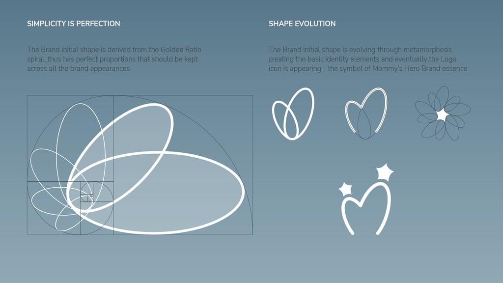
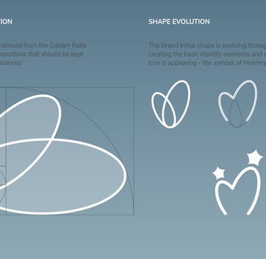
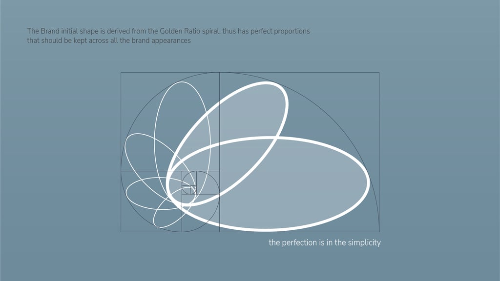
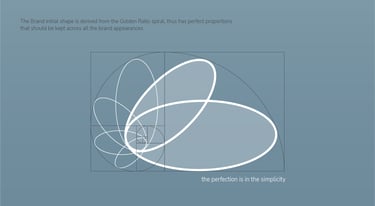
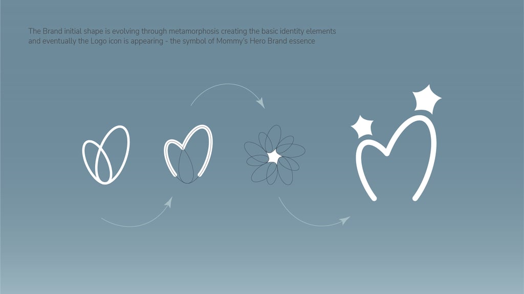
From Harmony to Identity: Evolving the Golden Ratio into Brand Symbols
The brand’s signature shape was thoughtfully developed using the Golden Ratio - a foundation of natural harmony and balance.
From this timeless proportion, the form was carefully evolved into the logo elements, ensuring every curve and line felt purposeful, intuitive, and emotionally resonant.
This process turned a universal principle of beauty into a unique, meaningful expression of Mommy’s Hero.
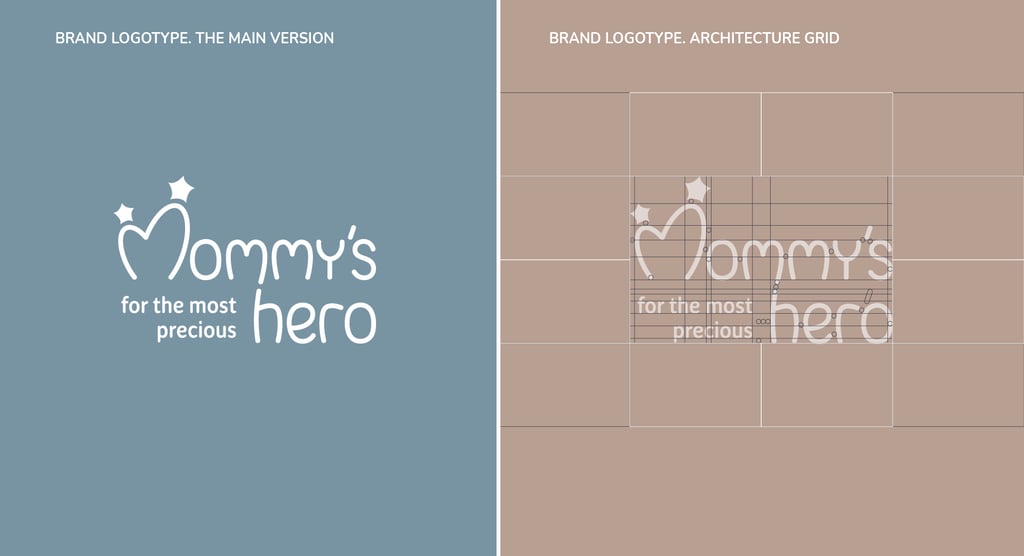
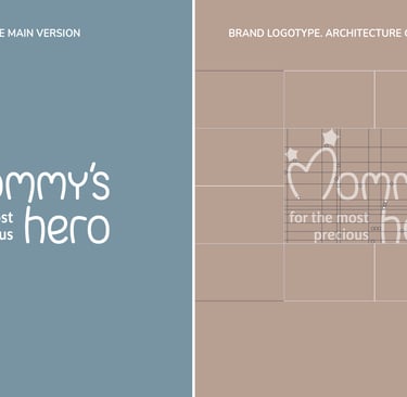
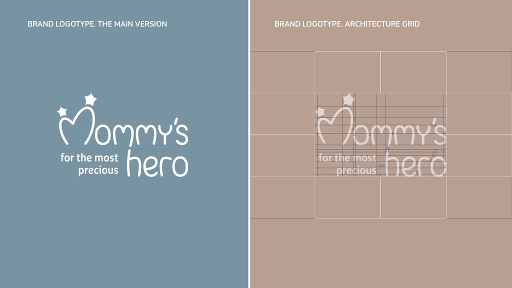
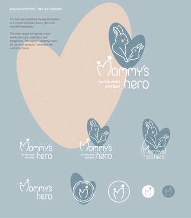
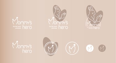
Logotype and its Architectural Grid:
The logotype is carefully built on a clear architectural grid. Its balanced proportions reflect stability and reliability, while rounded details communicate softness and care.
This structured approach allows the logo to remain legible and iconic across scales and mediums.
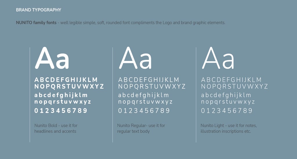
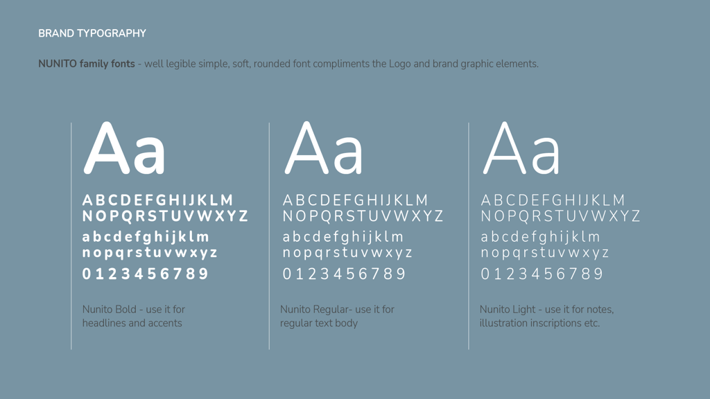
Typography:
The typography system combines modern sans-serif typeface family Nunito for clarity and friendliness with subtle rounded details for warmth.
It provides a functional yet approachable tone, suitable for both product packaging and digital communication.
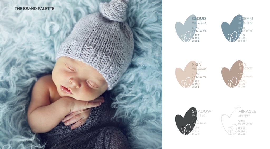
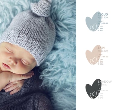
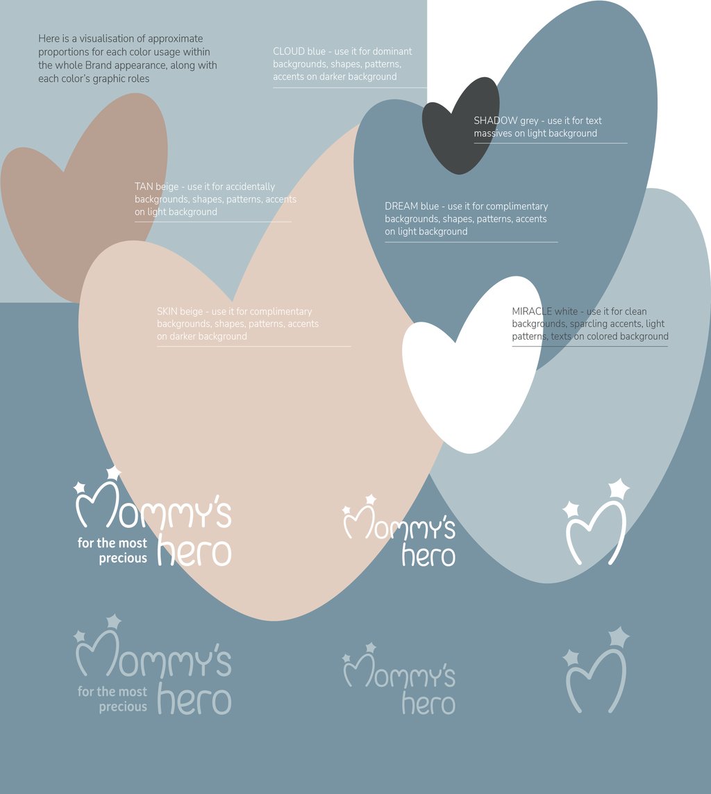
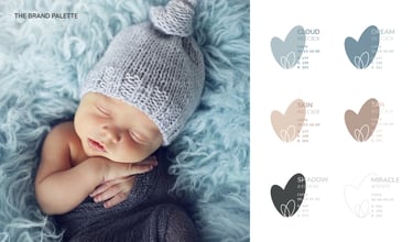
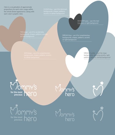
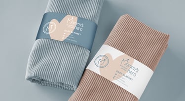
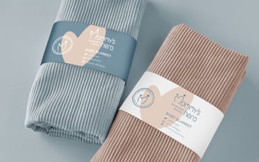
Color Palette and Color Usage:
The palette blends soft pastels - powder pinks, sky blues, warm beige, gentle mint - with grounding neutrals. These shades reflect safety, comfort, and childhood innocence.
The flexible system supports both playful and calm moods, adapting easily to various touchpoints.
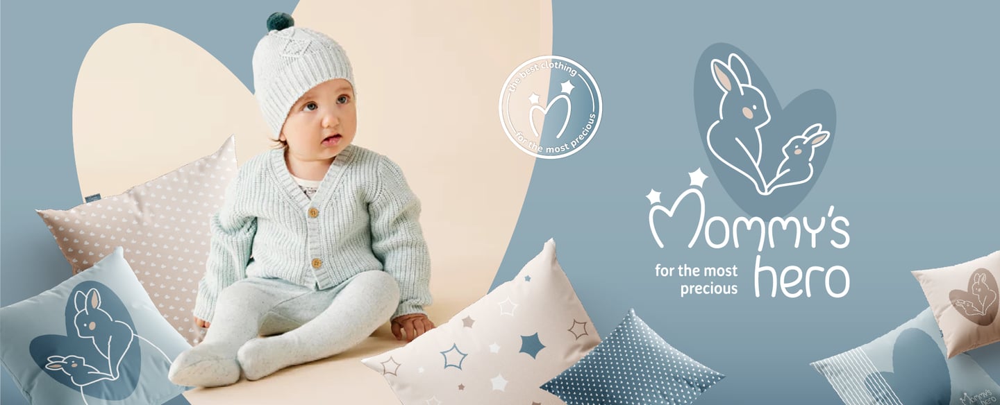
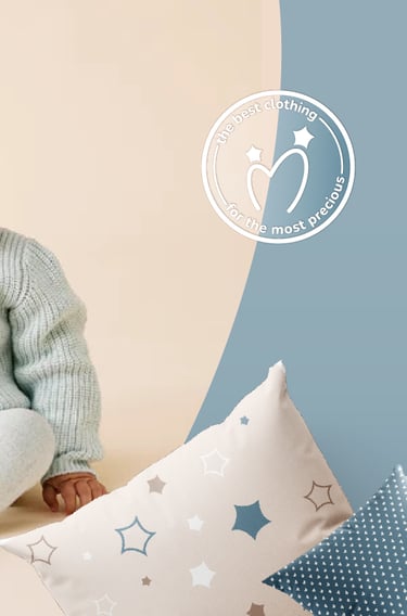
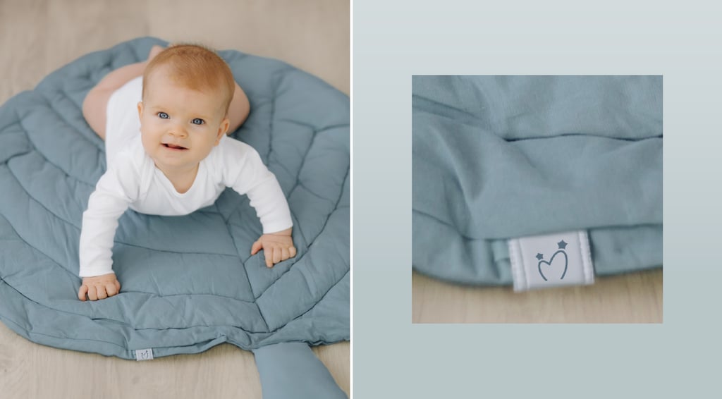
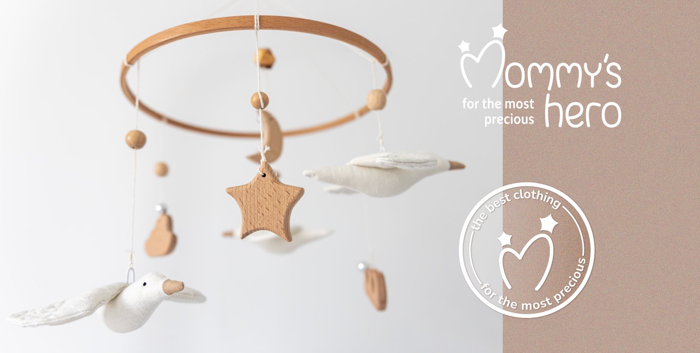
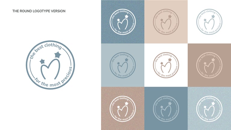
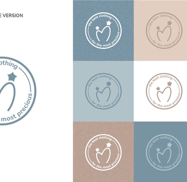
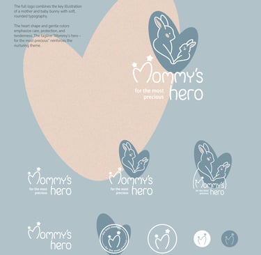
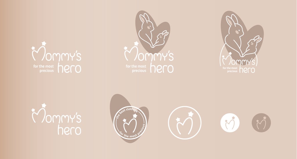
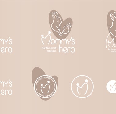
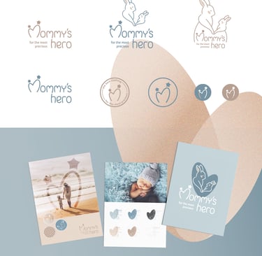
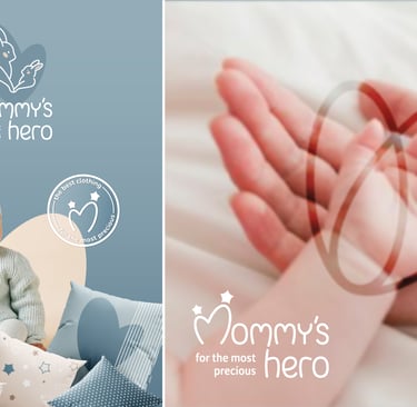
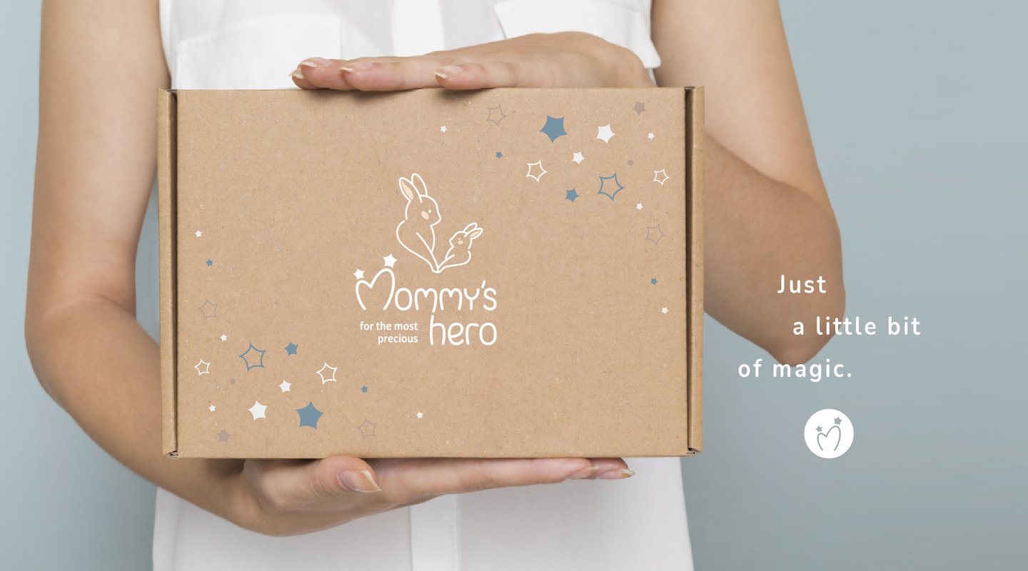
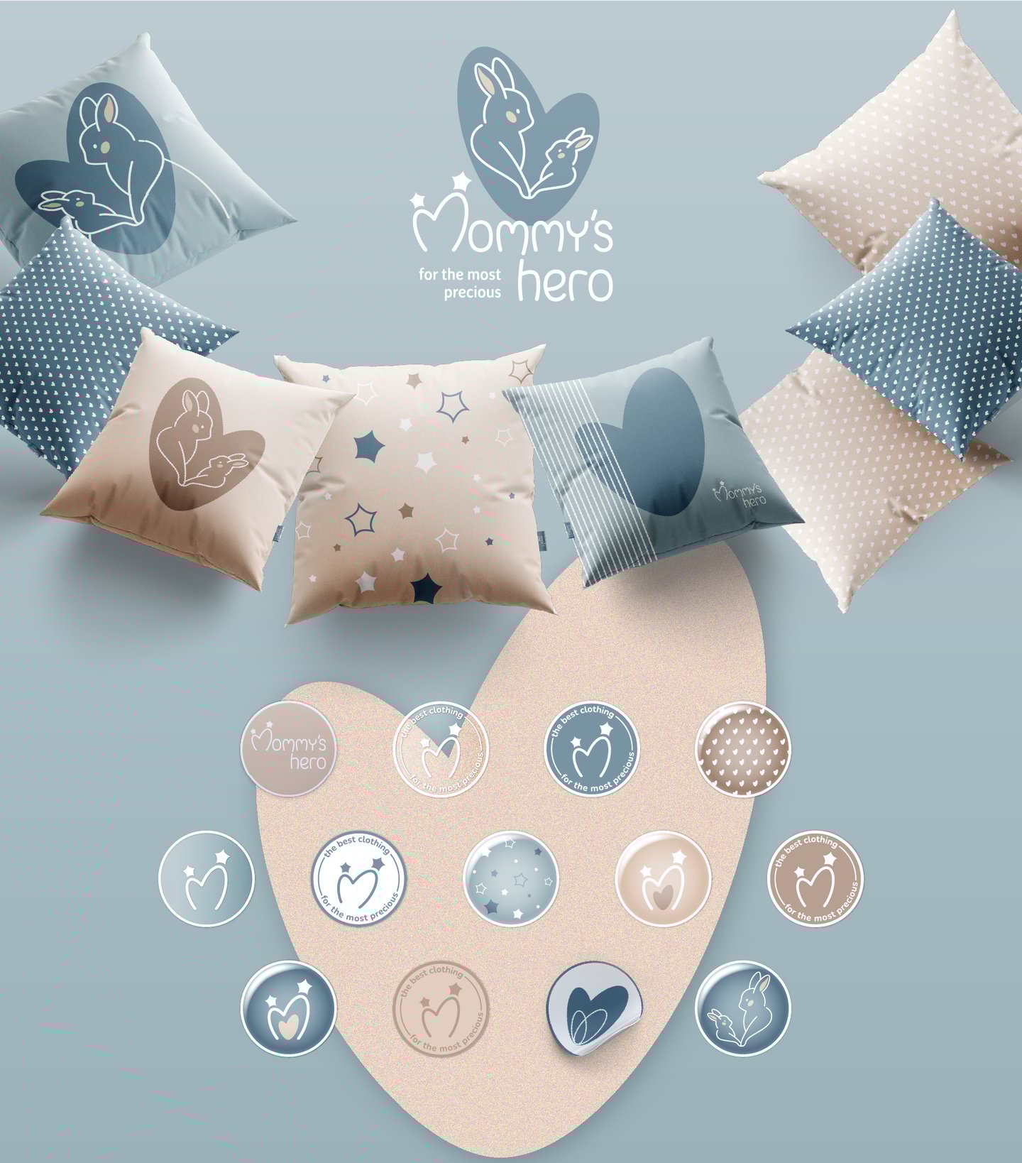
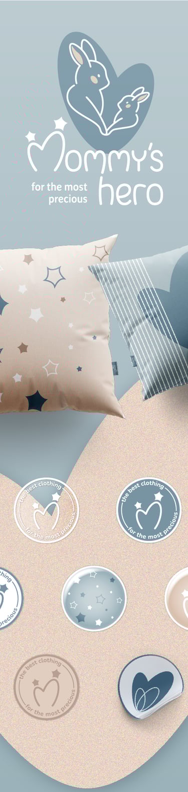
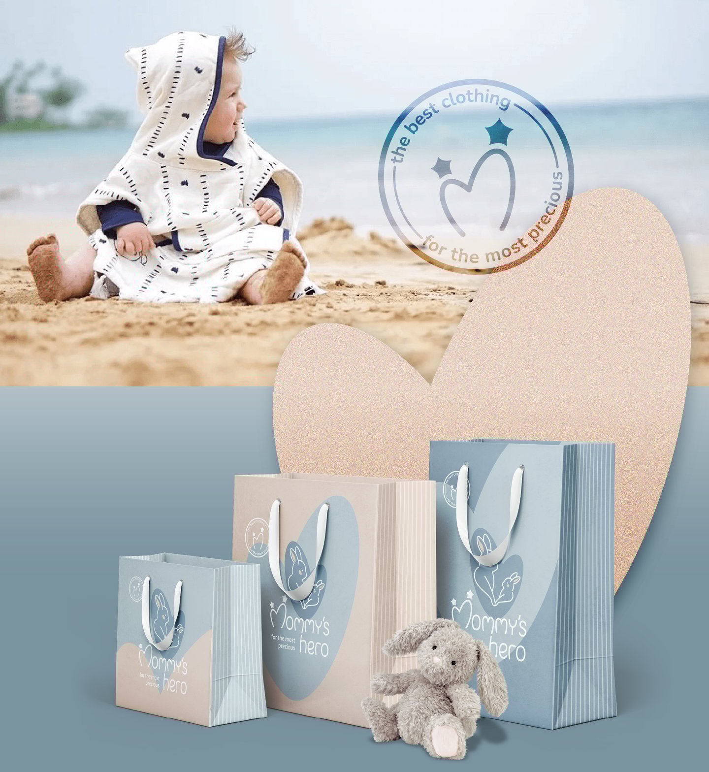
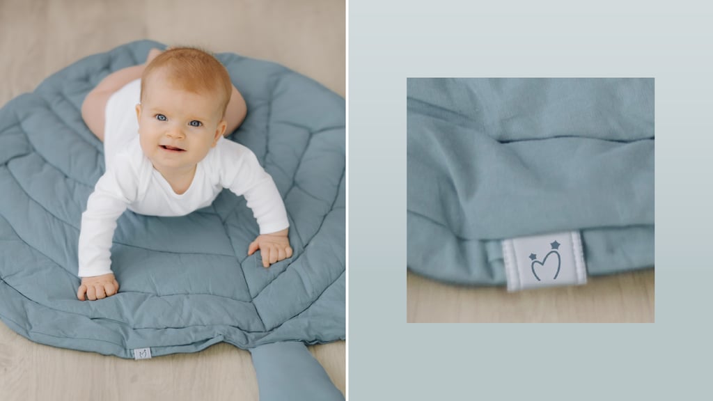
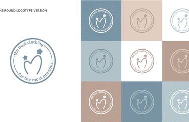
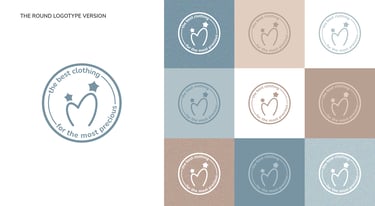
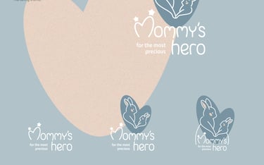
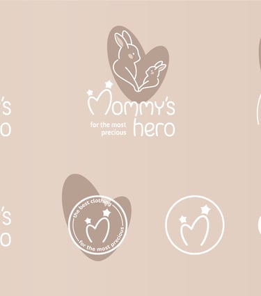
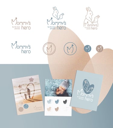
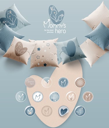
Round Logo (Logo Seal):
The circular seal version of the logo works as a versatile brand stamp, perfect for packaging, social media, and merchandise. It reinforces the identity while adding a handcrafted, personal touch - as if every item comes with a seal of love and care.
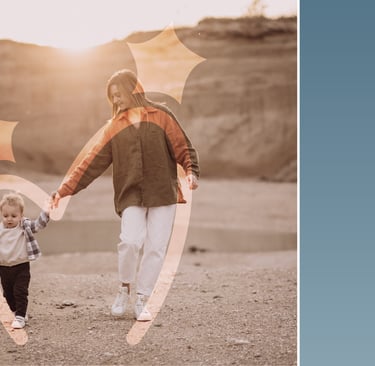
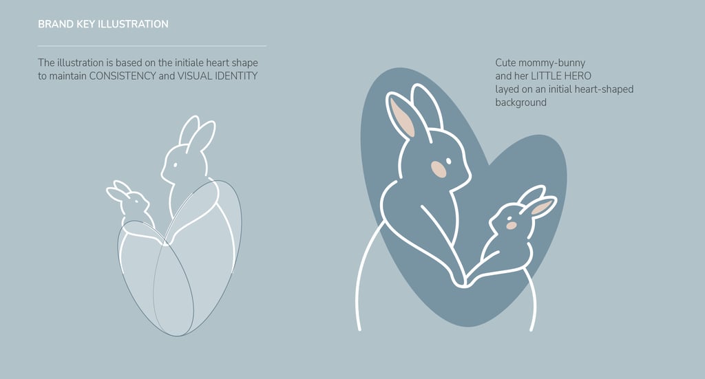
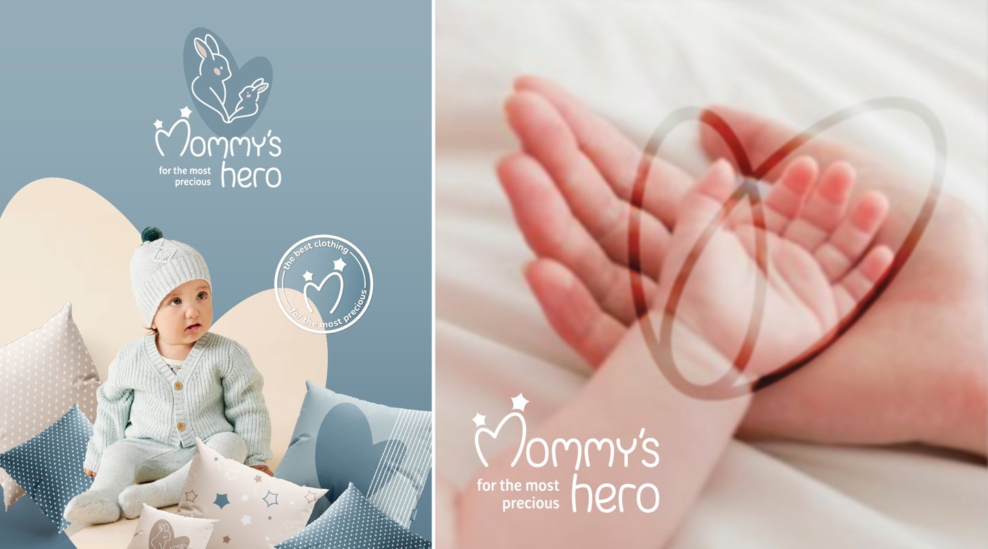
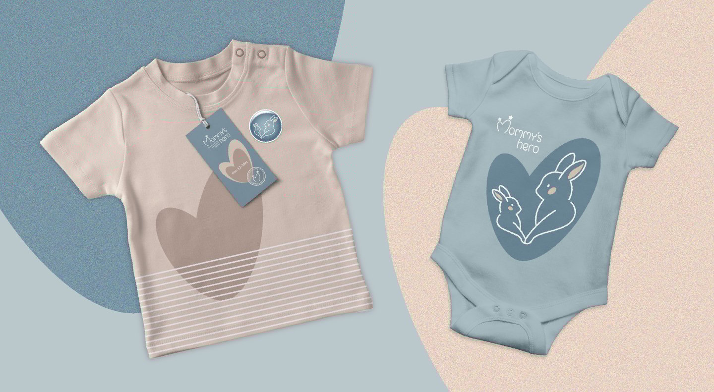
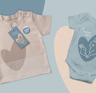
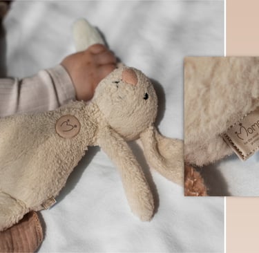
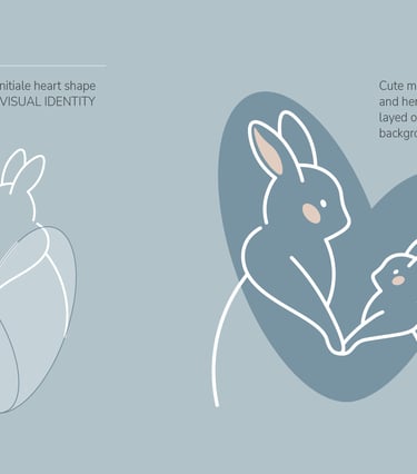
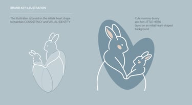
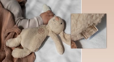
Mother & Baby Bunnies Illustration:
The brand's illustration features two bunnies -a mother and her baby -symbolizing tenderness, care, and the deep bond at the heart of the brand.
This pair creates instant emotional connection, making the identity warm and relatable for parents while magical and endearing for children.
Beyond their charm, the bunnies are rooted in the brand’s visual foundation: their curves evolve from the initial heart shape and are refined through the Golden Ratio.
Together, they embody both love and harmony, perfectly aligned with the brand’s design system.
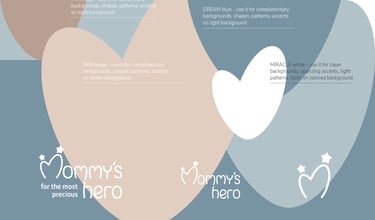
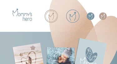
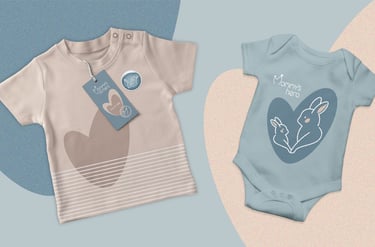
Playful Color Mixes:
The logo, illustrations, and backgrounds use a flexible color system that combines soft pastels with grounding neutrals.
This allows the brand to maintain visual consistency while introducing variety across different touchpoints.
By applying different combinations and contrasts, the palette supports hierarchy, highlights key elements, and adapts to both digital and physical formats.
From subtle, calming tones for product packaging to vibrant, cheerful compositions for social media and promotional materials, the color system ensures that Mommy’s Hero feels lively, approachable, and always recognizable.
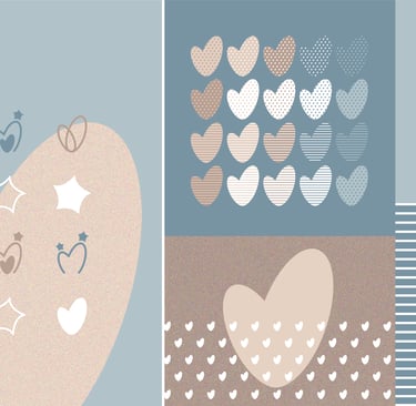
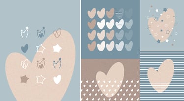
Patterns that Play and Adapt:
Stars, hearts, and soft geometric shapes form a flexible pattern system that can be layered, repeated, or combined in different ways across layouts, packaging, and digital assets.
Modular by design, these patterns maintain brand cohesion while offering endless creative possibilities. They guide hierarchy, emphasize key messages, and create visual interest without overwhelming the content.
By varying scale, color, and density, the patterns can adapt to different contexts - from subtle backgrounds on product packaging to bold, eye-catching motifs for social media posts -ensuring a consistent yet dynamic brand presence.
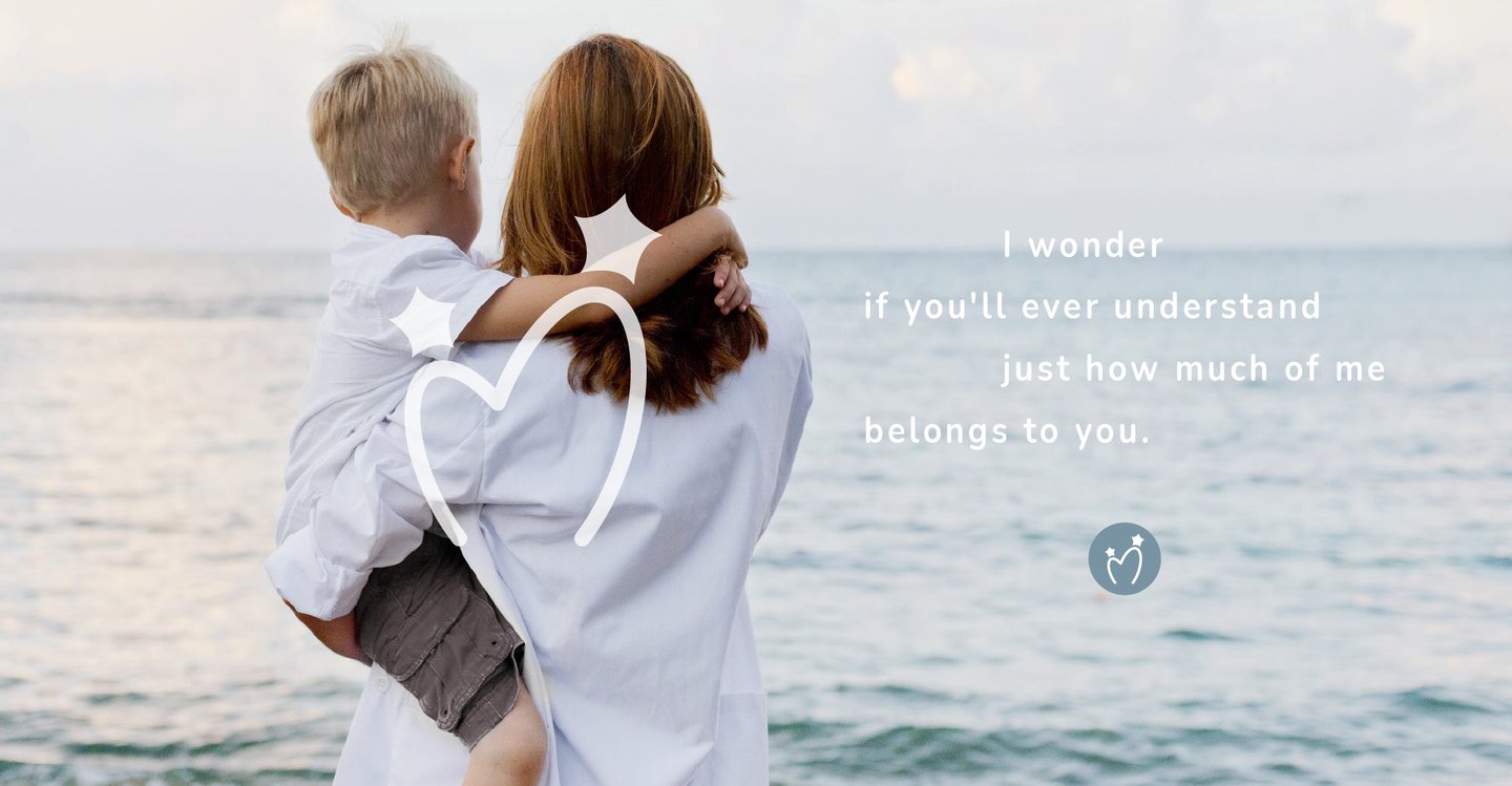
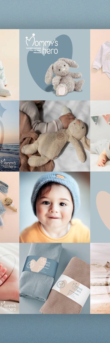
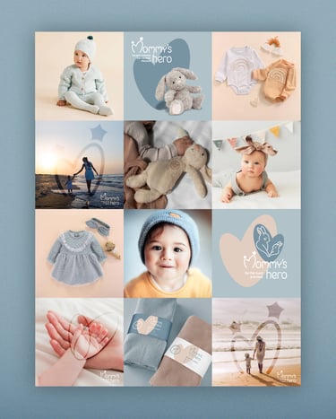
Image Guideline for Instagram:
The image style for Instagram follows a clean, bright, and soft-toned aesthetic.
Pastel backdrops, minimal compositions, and playful illustrations create a cohesive, warm digital presence.
The guidelines ensure that every post reflects tenderness, positivity, and the brand’s caring essence.

Mommy's Hero Brand Identity
CASE STUDY
Brand: Mommy's Hero
Industry: Clothes and accessories for babies
Project Scope:
Brand naming, Brand positioning
Full Brand Identity System development: logo variations, functional color palette, typography system, set of illustrations, signature patterns, illustrations, set of functional icons
Branded Materials: Baby greeting cards, packaging materials, stickers
ABOUT THE BRAND:
Mommy’s Hero is a baby store devoted to celebrating the magical connection between mothers and their little ones. With a carefully curated selection of products, the brand offers quality, comfort, and emotional resonance - creating a joyful and trustworthy experience for parents.
The project began with naming: Mommy’s Hero. The name encapsulates the heart of the brand: every baby is their mother’s little champion, a source of love, laughter, and meaning. This emotional story guided the visual identity, which combines tenderness with playfulness, warmth with trust.
DESIGN CHALLENGE:
The creative challenge was to design an identity that conveys softness and care without slipping into clichés, while ensuring versatility across packaging, apparel, and digital platforms.
The identity had to express:
Tenderness and warmth — reflecting the intimate bond between parent and child
Playfulness and imagination — capturing the joy of early childhood
Trust and reliability — reassuring parents through quality and consistency
Gift-like charm — making every product feel special and memorable
The resulting identity is soft, kind, and versatile - a gentle brand world that grows with families and honors the everyday magic of raising little heroes.
Brand Concept and Associations:
The identity celebrates the deep bond between mother and child, blending warmth and playfulness to create a relatable and joyful brand experience.
Mommy’s Hero positions every baby as their mother’s little champion - the heart and hero of the story.
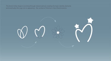
Golden Ratio in Logo Design
The brand’s signature shape was thoughtfully developed using the Golden Ratio - a foundation of natural harmony and balance.
From this timeless proportion, the form was carefully evolved into the logo elements, ensuring every curve and line felt purposeful, intuitive, and emotionally resonant.


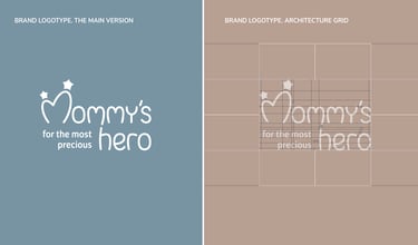
Logotype and its Architectural Grid:
A balanced logotype built on a precise grid ensures clarity and adaptability across various applications.
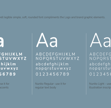
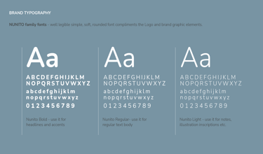
Typography:
The typography system combines modern sans-serif typeface family Nunito for clarity and friendliness with subtle rounded details for warmth.
Color Palette and Color Usage:
The palette blends soft pastels - powder pinks, sky blues, warm beige, gentle mint - with grounding neutrals. These shades reflect safety, comfort, and childhood innocence.
The flexible system supports both playful and calm moods, adapting easily to various touchpoints.
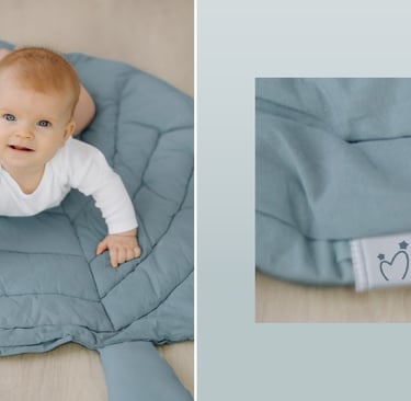
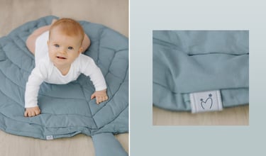
Round Logo Seal
The circular logo seal offers a compact, versatile mark, ideal for stamps, stickers, and merchandise.
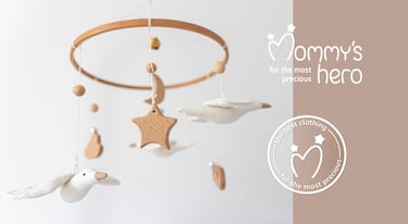
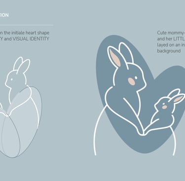
Bunny Illustrations
Mother and baby bunnies, derived from the heart shape and Golden Ratio, symbolize tenderness and the brand's nurturing essence.
Flexible combinations of logo, illustration, and backgrounds maintain brand consistency while allowing creative expression.

Graphic Elements & Patterns
Modular patterns of stars, hearts, and shapes enrich layouts and packaging, ensuring visual cohesion and adaptability.


Instagram Image Guidelines
A clean, bright aesthetic with pastel tones and playful elements creates a cohesive and engaging digital presence.
CONCLUSION
The Mommy’s Hero identity captures the joy and magic of parenthood through a system that is both emotional and practical.
From naming to logo, colors, illustrations, and digital guidelines, every detail works together to celebrate the bond between mother and child.
The result is a brand world that feels warm, trustworthy, and endlessly versatile - a true reflection of every baby as their mommy’s little hero.
Get News & Inspiration
© 2024-2025 tanyabe.com.
All rights reserved
Useful Links