Adira Brand Identity
CASE STUDY


Client: ADIRA
Industry: Underwear Fashion
Project Scope:
Rebranding, Full Brand Identity System development: logo variations, functional color palette, typography system, set of illustrations, signature patterns, set of functional icons, sub-brand extension assets.
Branded materials: Web-site layouts, set of digital banners, packaging materials, social media templates, postcards, branded merchandise, stickers collection for a special Adira's initiative for girls.
ABOUT THE BRAND:
Adira is an Indian brand redefining comfort and confidence for women through thoughtfully designed, high-quality functional underwear. From puberty to maternity, periods to menopause, and through often-overlooked health challenges, Adira supports women at every stage of life with care and empathy.
The name Adira, meaning “strong, powerful, and noble” in Hebrew, perfectly captures the brand’s essence and mission: to enhance the lives of women at every age through innovation, comfort, and care. Adira is a celebration of strength, beauty, diversity, and self-love.
With a strong mission and loyal customer base already in place, Adira needed a visual identity that could express its depth and ambition — one that could connect emotionally while standing out strategically.
DESIGN CHALLENGE:
From our first conversation, Adira’s founder and I kept returning to one powerful and deeply human insight: the evolving journey of a woman’s body. A story shaped by transformation, strength, and quiet resilience — from girlhood through every chapter of life. Our goal was to design an identity that could hold all of this with honesty, empathy, and beauty.
The identity needed to express:
Empowerment and comfort
Strength and support
Confidence, trust, and self-love
A sense of home — returning to one’s body with pride
Equally important was reflecting Indian cultural context and aesthetic preferences:
Embracing color and brightness as emotional expressions
Balancing symbolism with accessibility
Communicating femininity with nuance — bold, but never brash; expressive, but never excessive
Prioritizing warmth and visual richness over cold minimalism
But above all, the project hinged on a non-negotiable principle:
TO CELEBRATE THE FEMALE BODY WITHOUT ANY TRACE OF OBJECTIFICATION OR SEXUALIZATION.
In an industry that often reduces women to idealized forms, Adira demanded something radically different. The brand’s visual voice needed to be respectful, real, and emotionally intelligent. That wasn’t just a design choice — it was the core of the CREATIVE CHALLENGE and the heartbeat of this identity.
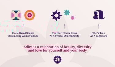
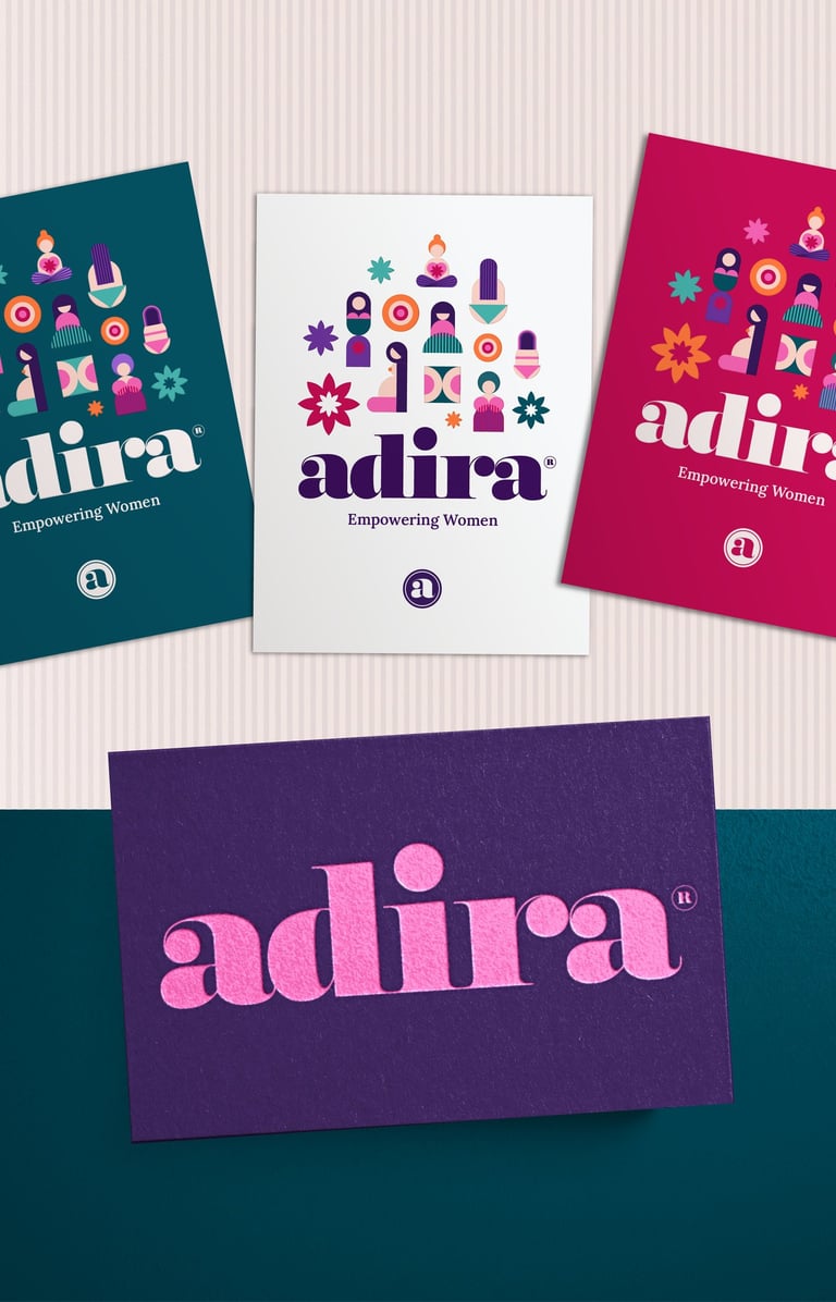
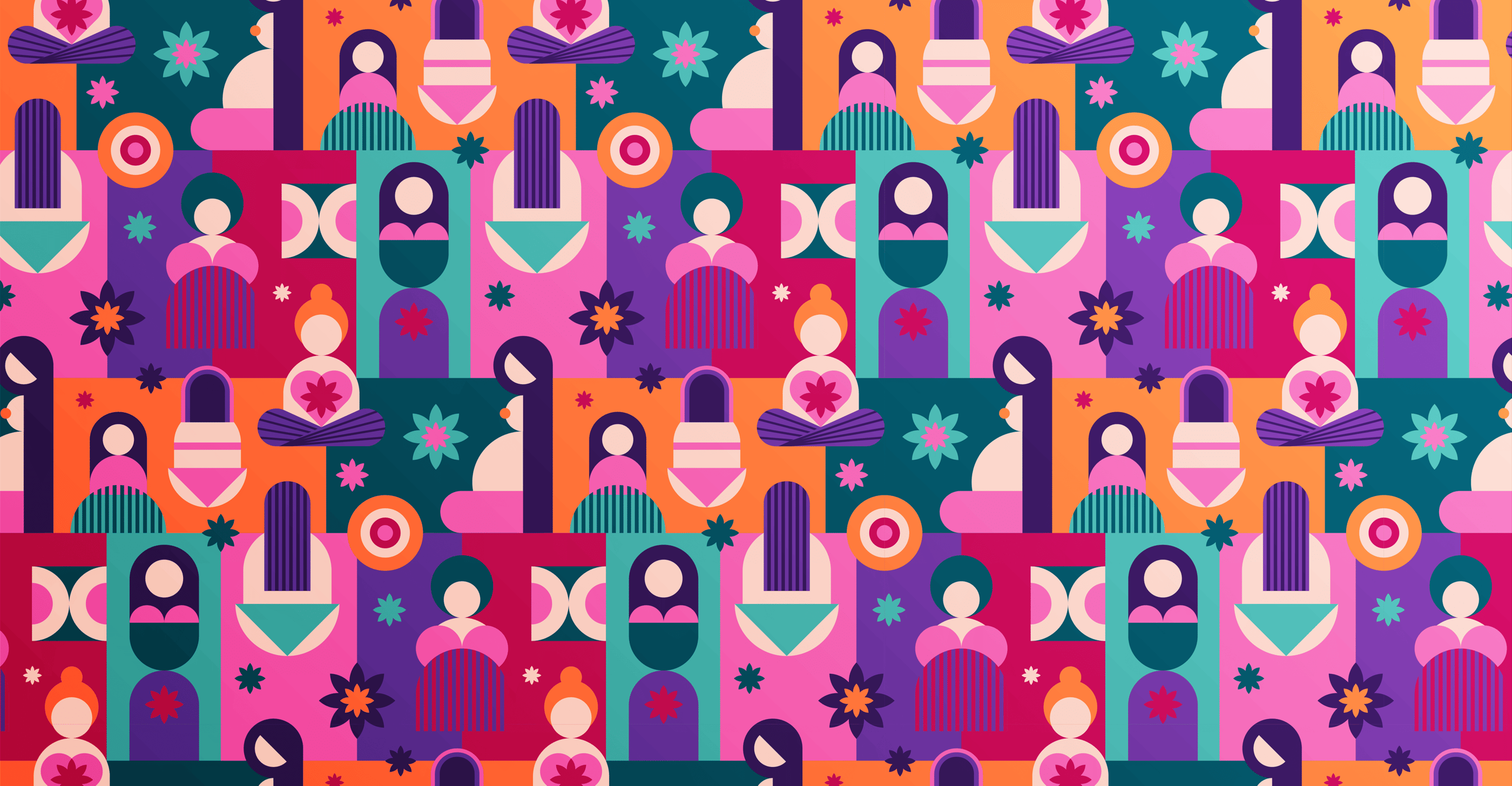
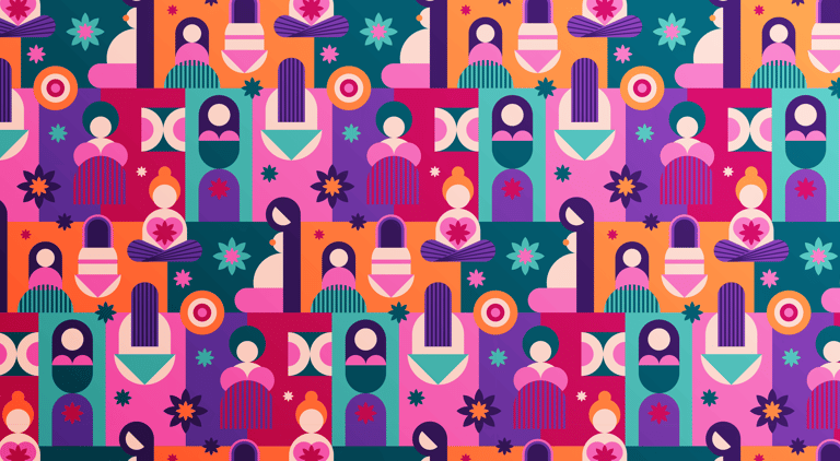
THE SOLUTION — VISUAL CONCEPT
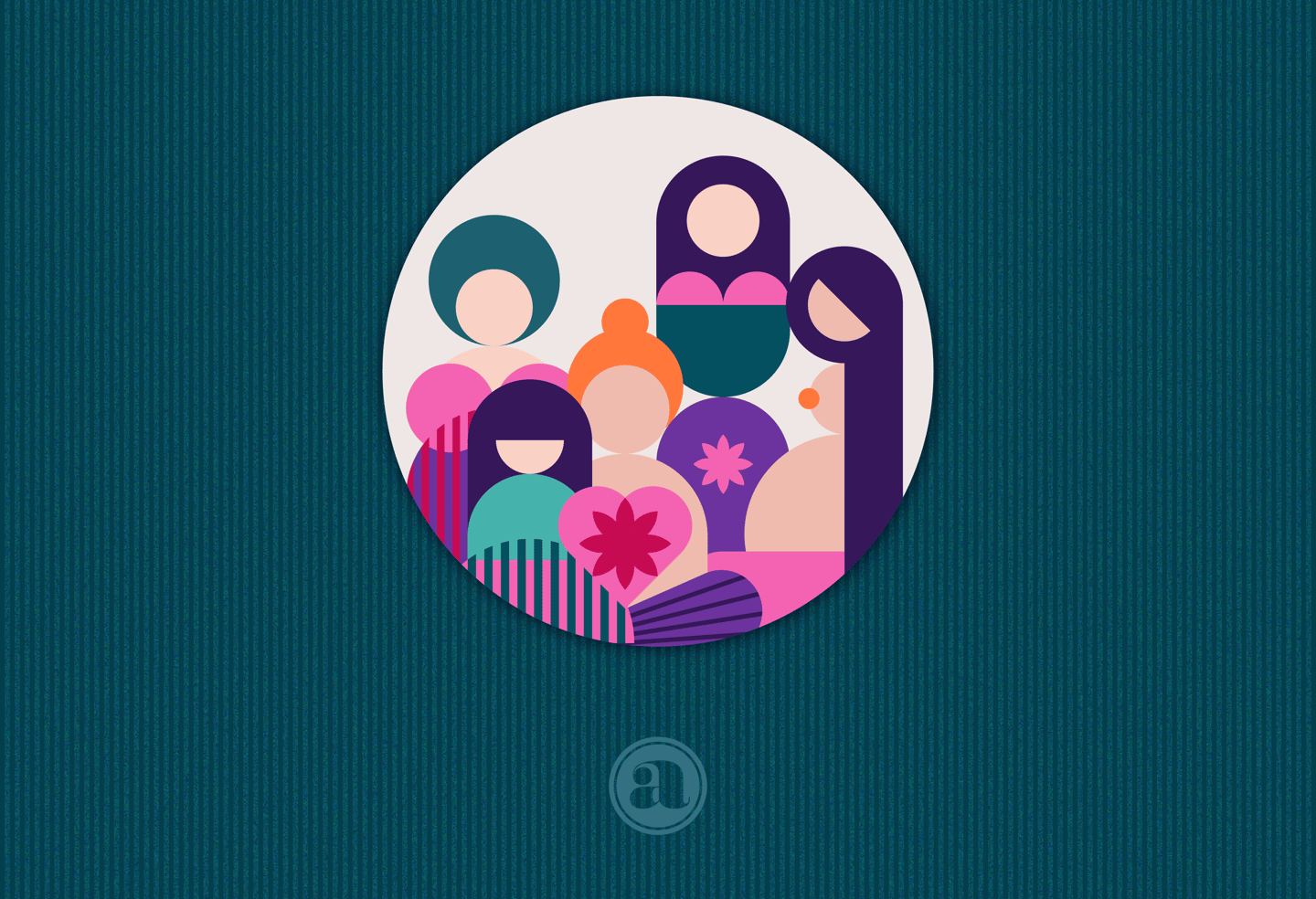
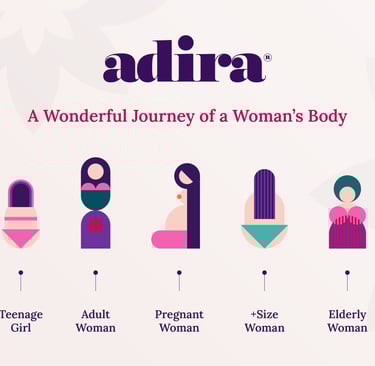
To bring Adira’s mission to life, I returned to its core idea: the journey of a woman’s body.
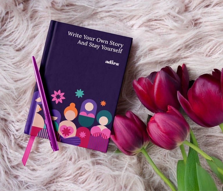
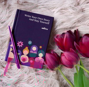
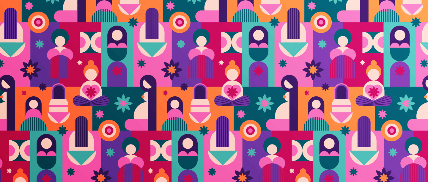
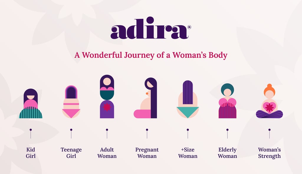
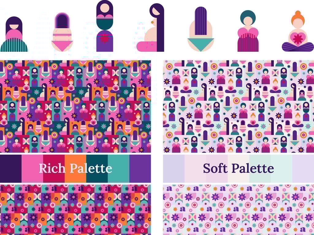
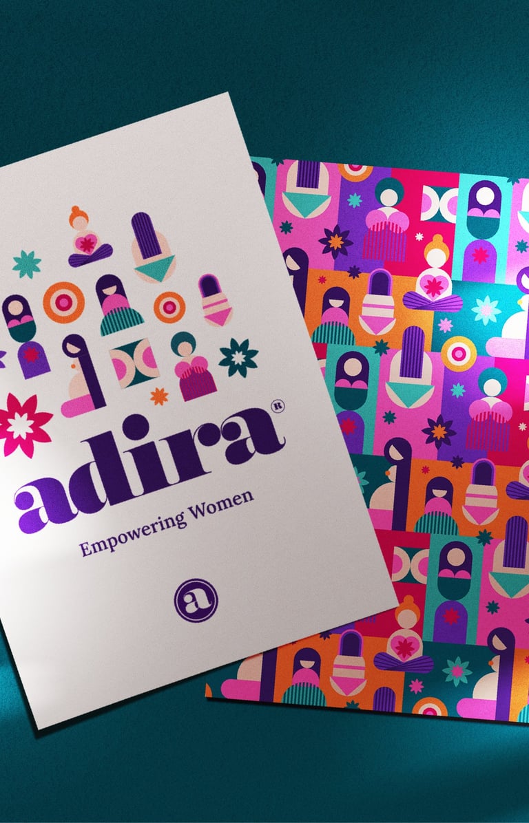
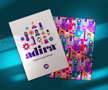
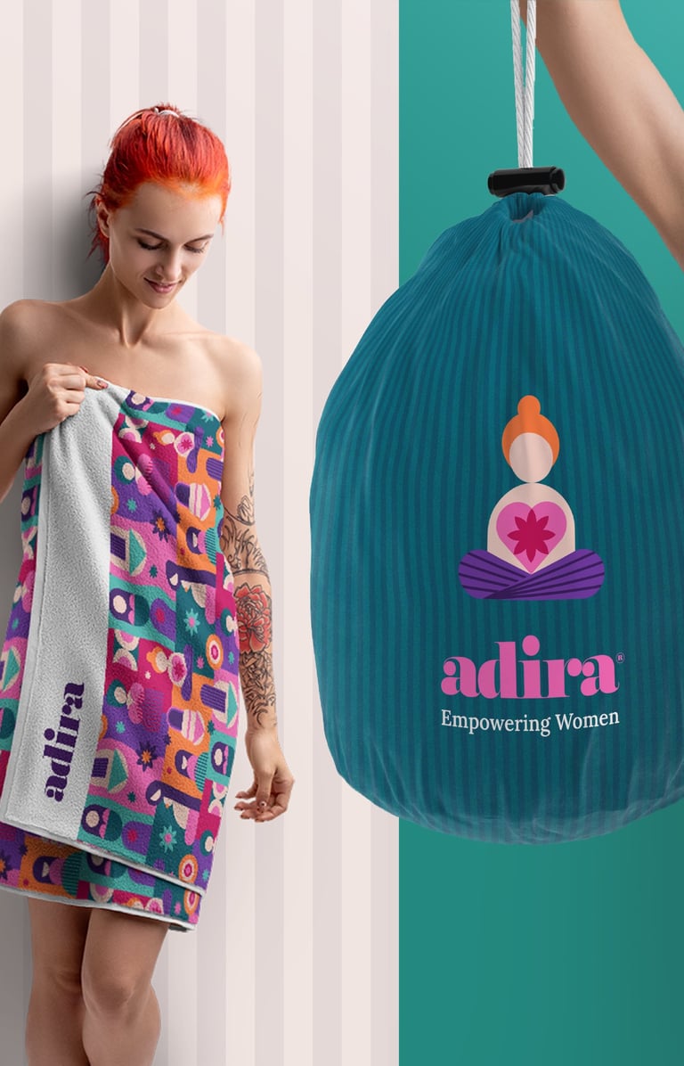
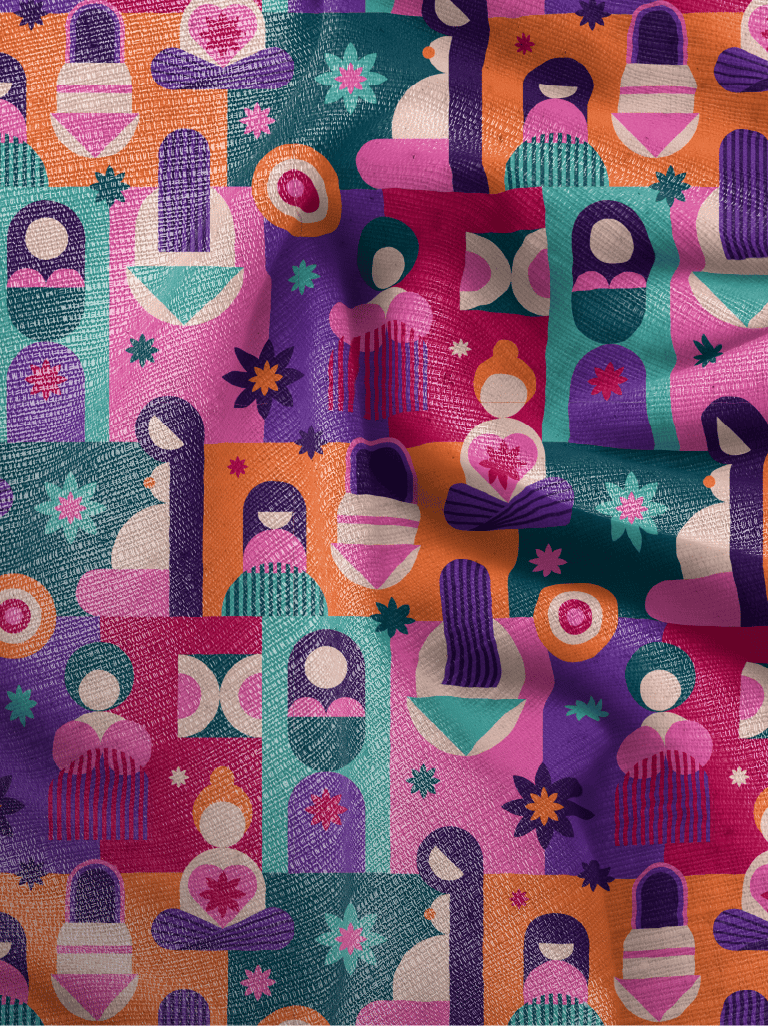
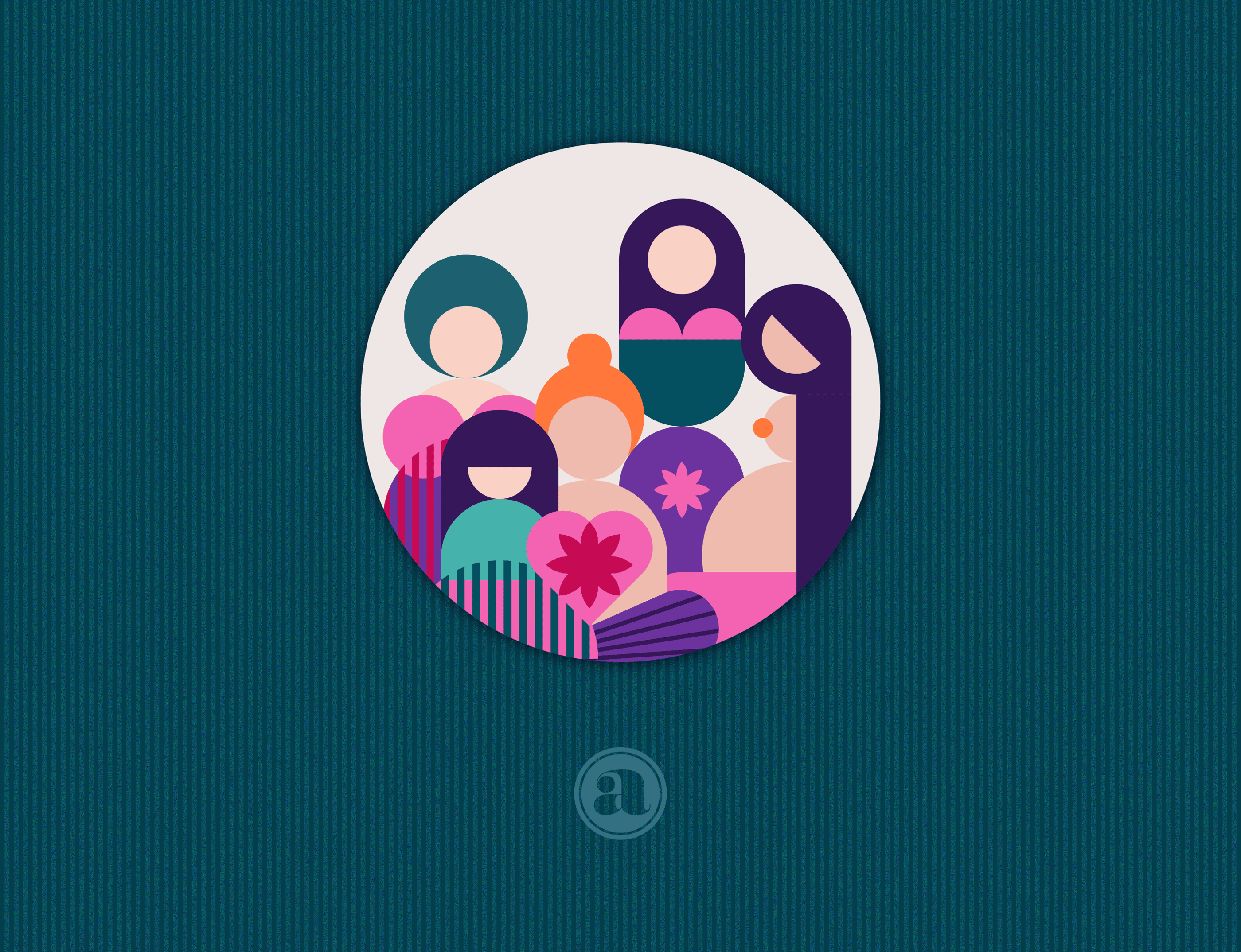
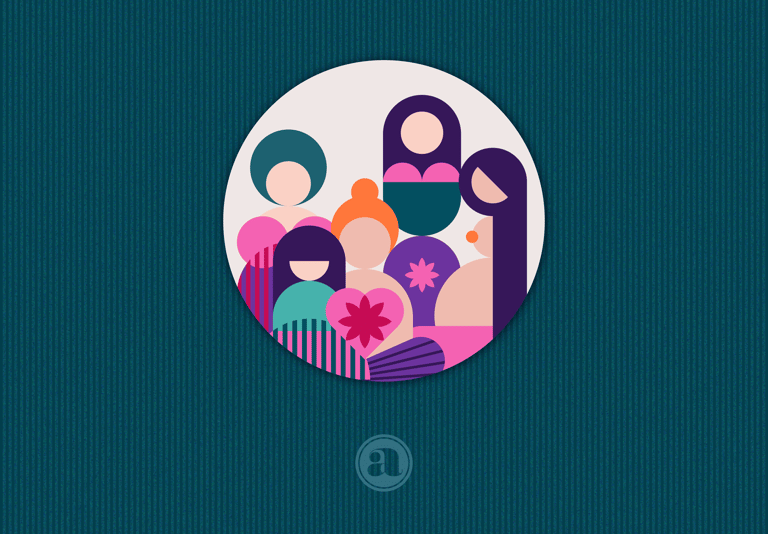
I created a series of illustrations — symbolic, minimal, and instantly recognizable — representing each stage of a woman’s life. From a baby girl to a senior woman, these figures weren’t literal portraits, but geometrically-built icons. Their purpose wasn’t to define beauty — but to honor being. To make every woman feel seen and valued.
Each illustration was intentionally a little abstract, a little universal, emotionally intuitive — inviting viewers to see themselves in the shapes, rather than comparing themselves to them. The aesthetic echoed Indian visual sensibilities — graceful lines, thoughtful use of shapes and space, bold and rich color harmonies that evoke emotion, not spectacle.
Together, they form a visual timeline of womanhood, a core storytelling device used across packaging, print, digital, and more. Simple, versatile, and unmistakably Adira, they say: You are seen. Not just one version of you — but all of you.
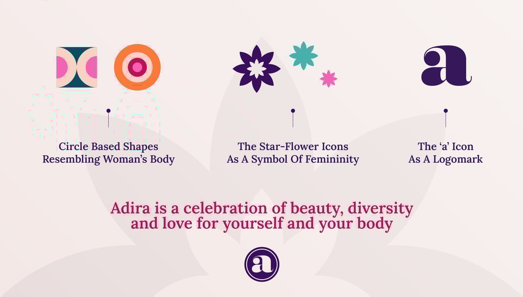
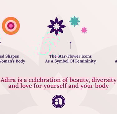
I also complimented the icons illustrations with some abstract shapes to cover different decorative and functional purposes. With the visual core defined, I built out a full identity system to carry this story across every brand touchpoint.


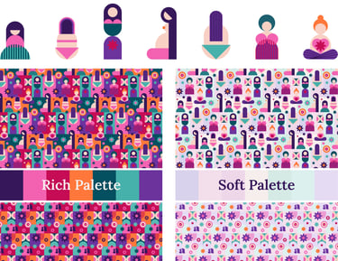
Color Palette
A well-curated color palette and typography are crucial for an effective brand identity. My selection prioritized both visual appeal and functional efficiency.
At the center is Adira’s signature purple — a symbol of strength and dignity. Around it, a palette of bold, emotionally warm tones reflects Indian preferences for brightness and vibrance. Each color has a role, ensuring harmony and flexibility across media.
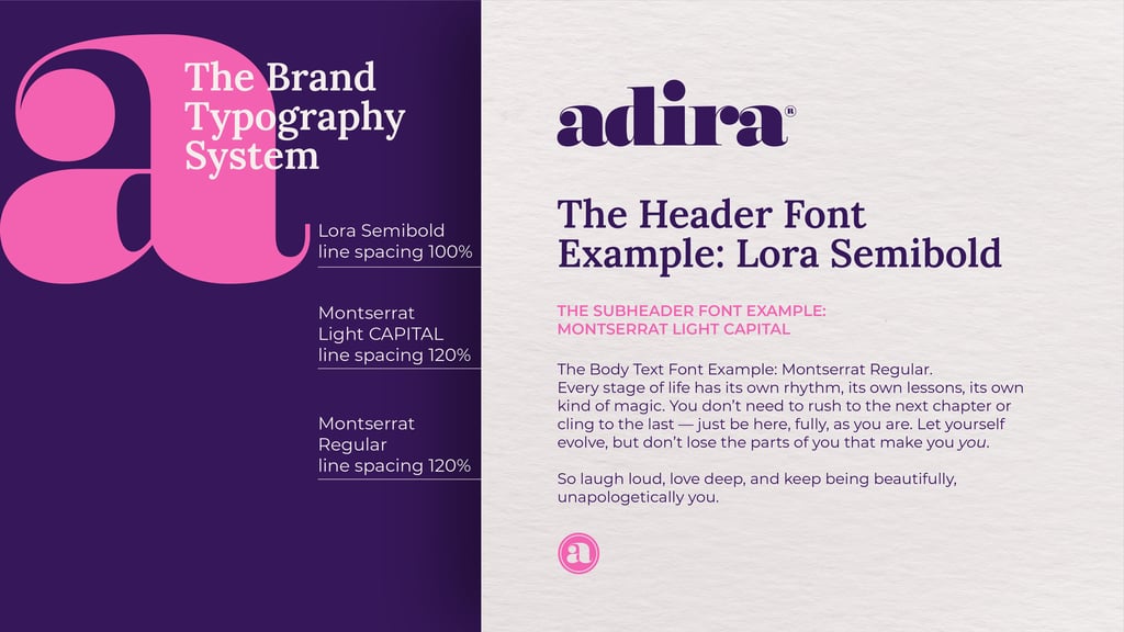
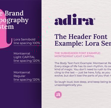
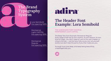
Typography
The type system needed to be highly legible, approachable, and emotionally resonant — accessible to a wide audience, including older women, without sacrificing style.
Lora (Serif): Elegant and warm, with subtle calligraphic roots. It brings personality and readability to headlines and storytelling.
Montserrat (Sans-serif): Clean, timeless, and structured — perfect for body text and information. It offers clarity and balance.
Together, they express Adira’s voice: confident, inclusive, and human.
Brand Graphics & Design Elements
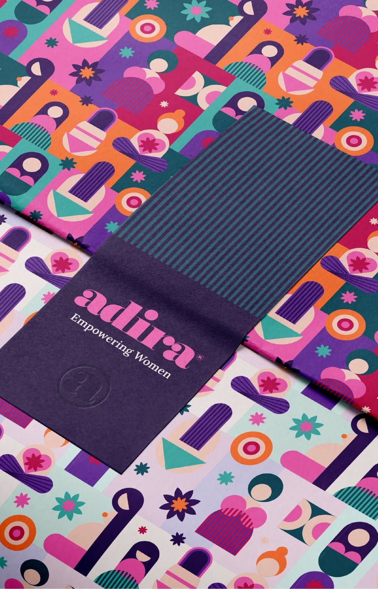
Expanding on the core illustrations and color palette, I developed a functional and versatile visual system that works consistently, enhancing the brand’s presence and synergetically enforcing it’s impact.
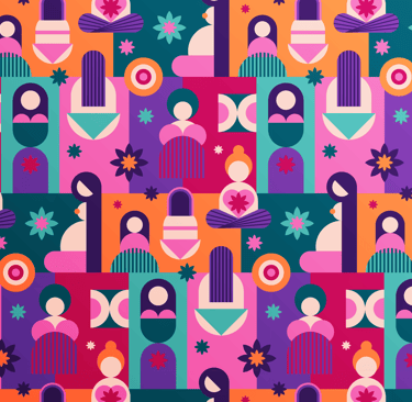
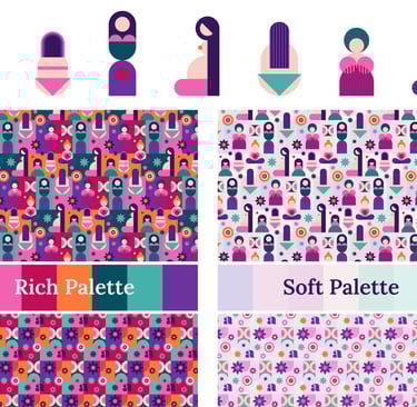
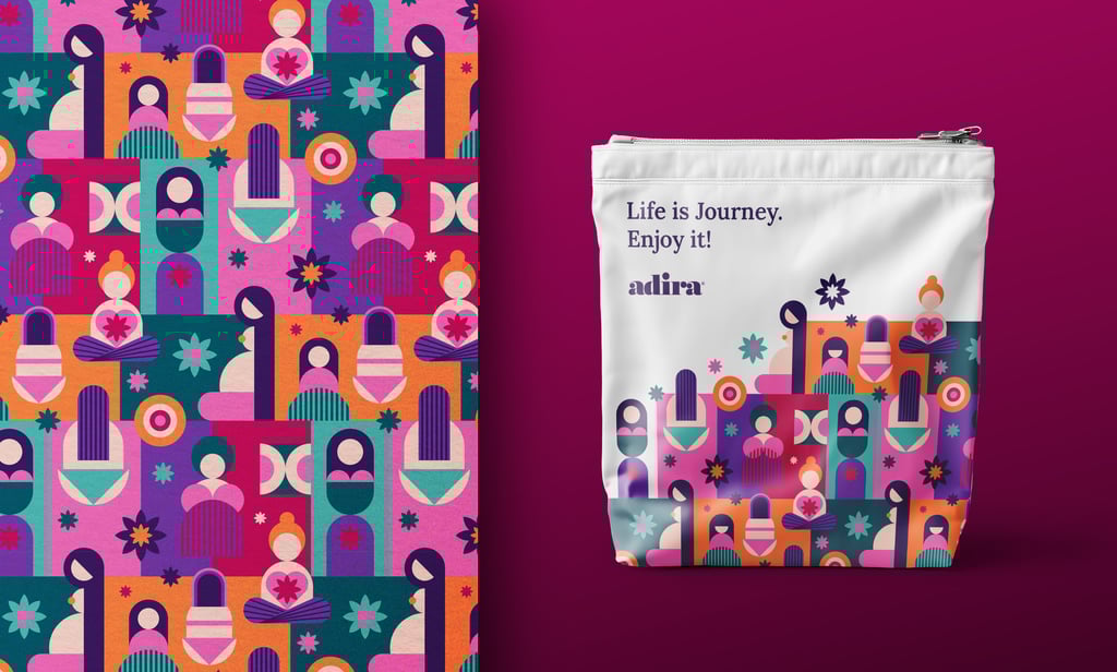
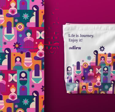
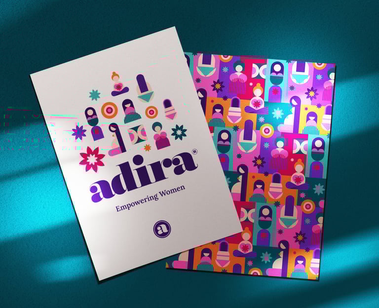
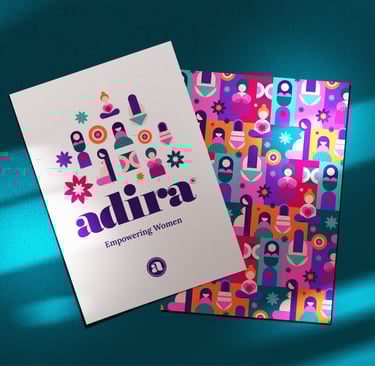
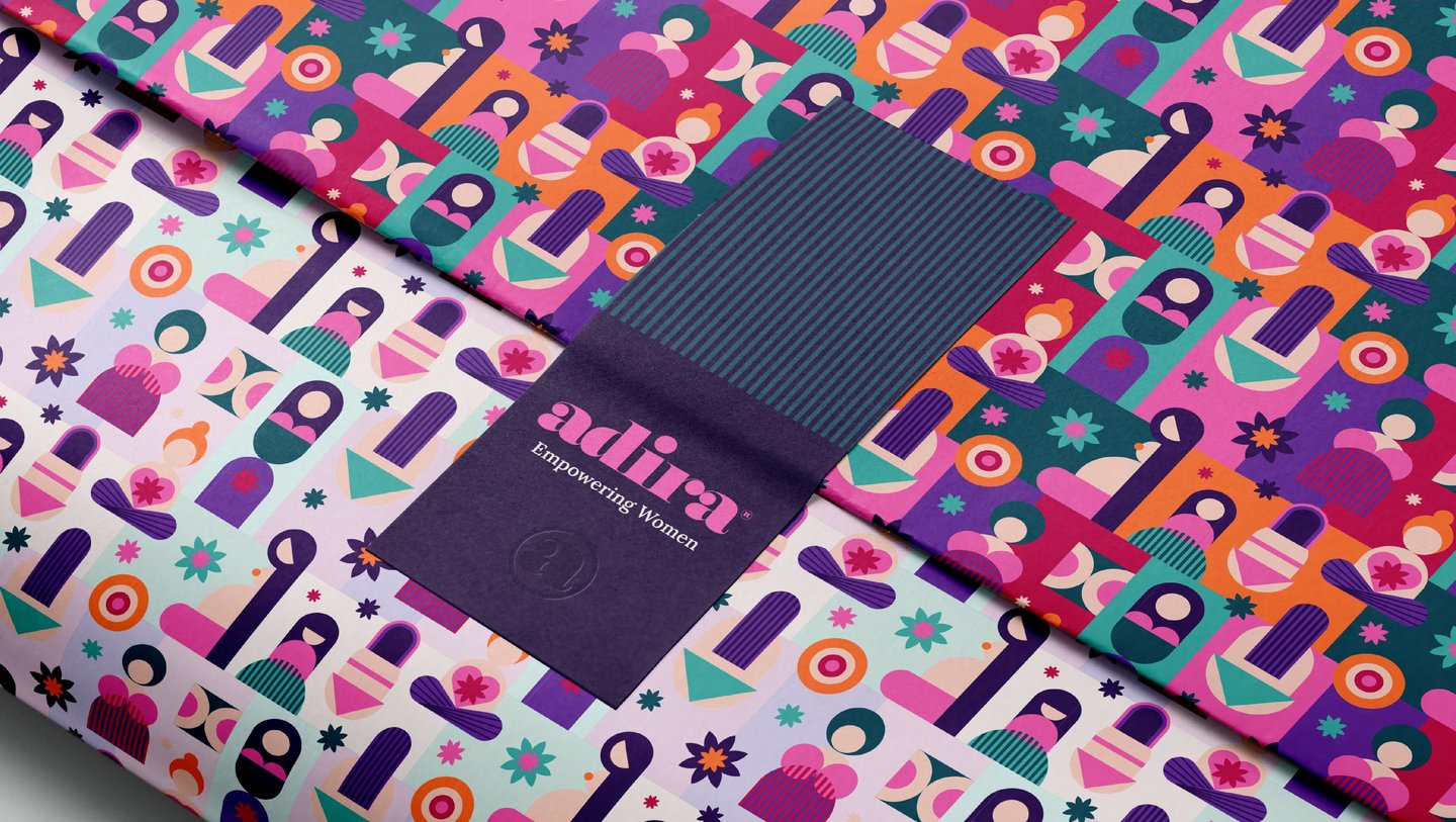
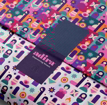
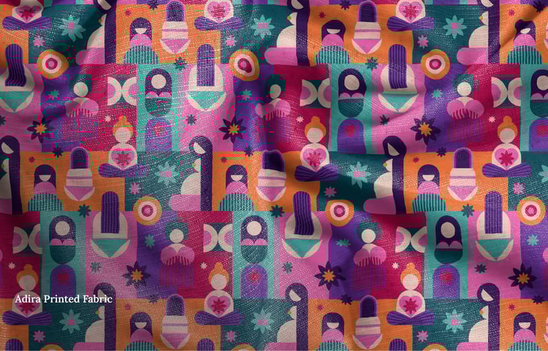
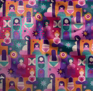
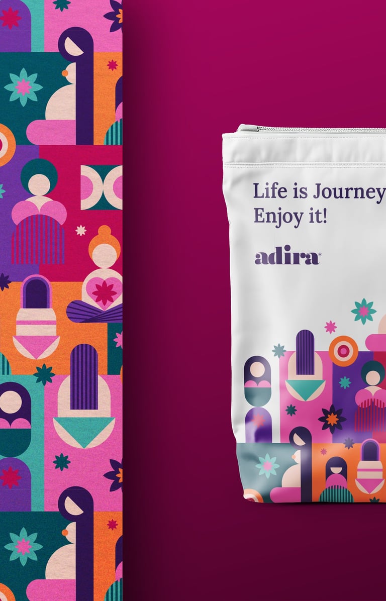
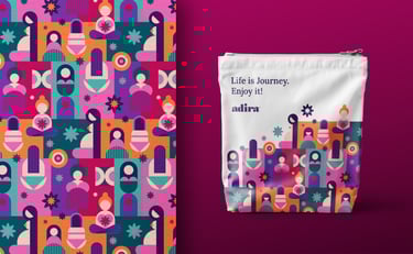
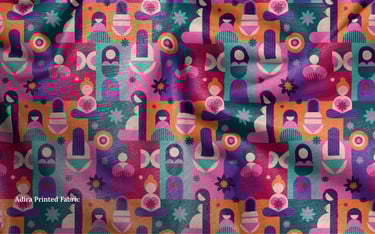
Thus I developed a Signature Brand Pattern — a dynamic, flexible pattern made from core illustrations, adaptable for various product lines and branding needs, and supporting graphic elements: stripped backgrounds, shapes and refined textures to enhance visual engagement.
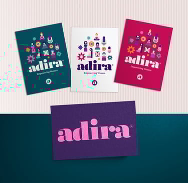
BASIC BRAND IDENTITY ELEMENTS — BRAND ASSETS
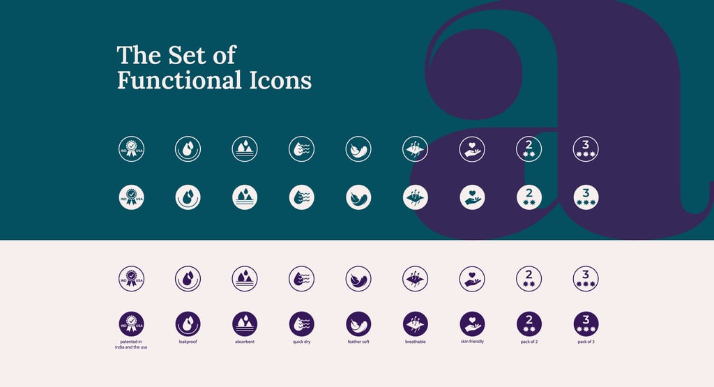
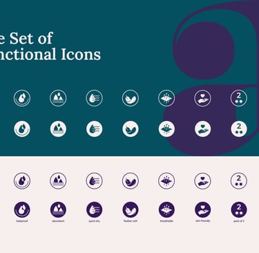
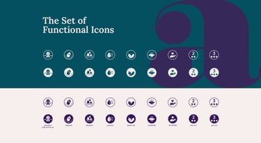
Set of Functional Icons
Based on the client's requirements I thoroughly crafted a set of Functional Icons: a custom-designed set of icons representing product features and service advantages, available in different versions for seamless application.
BRAND IDENTITY APPLICATION
Here you can see how the whole Identity System of Adira brand is applied on different touchpoints and work together in synergy, ensuring consistensy and cohesity in perception across different platforms of brand's communication.
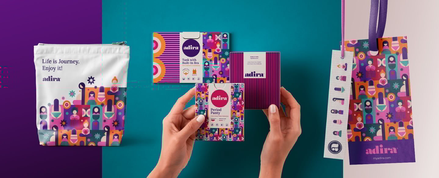
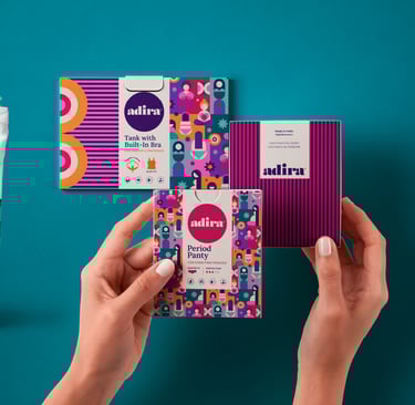
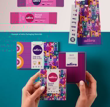
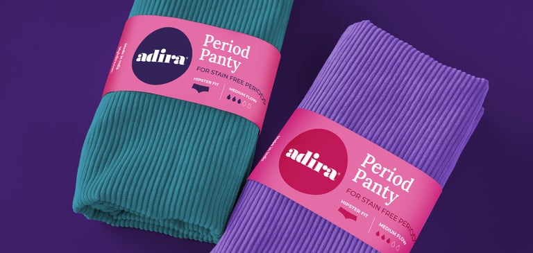
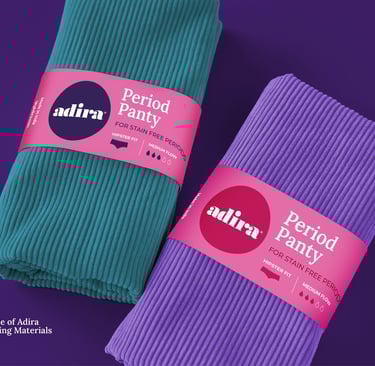
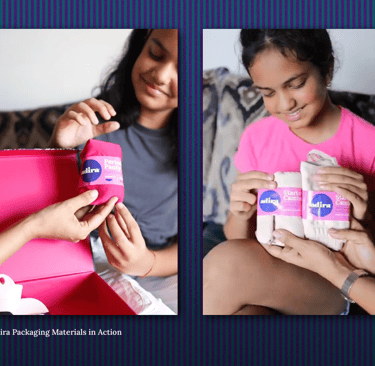
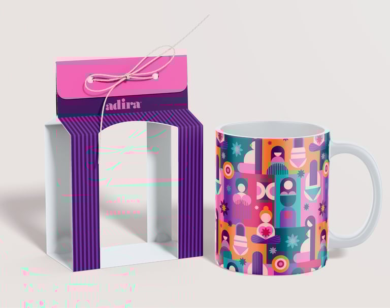
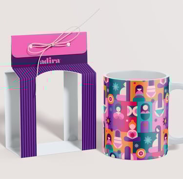
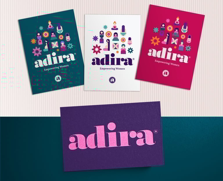
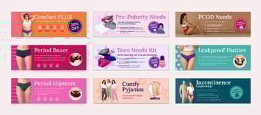
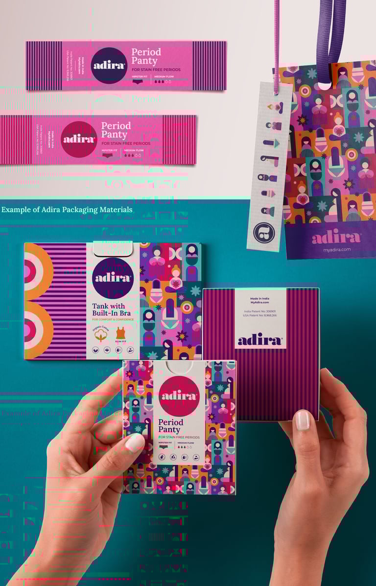
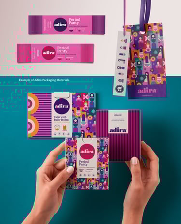
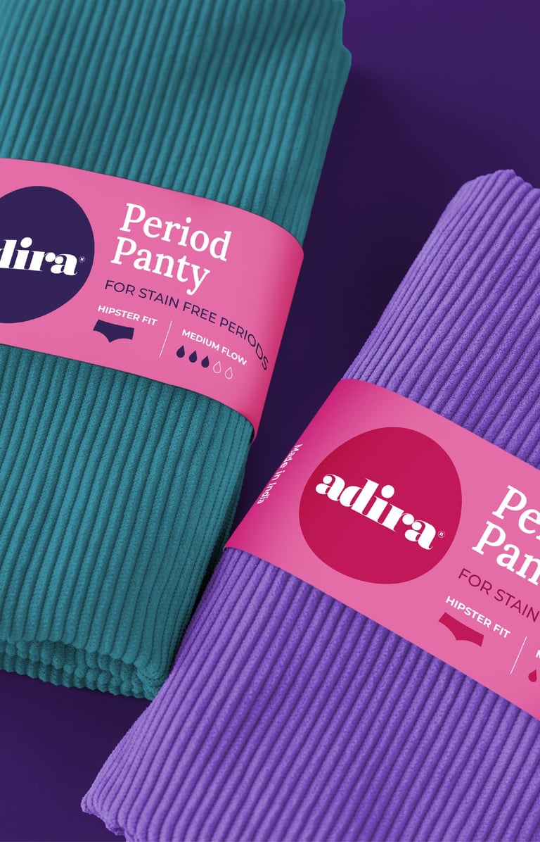
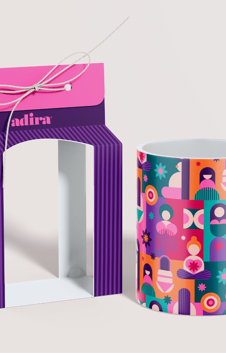
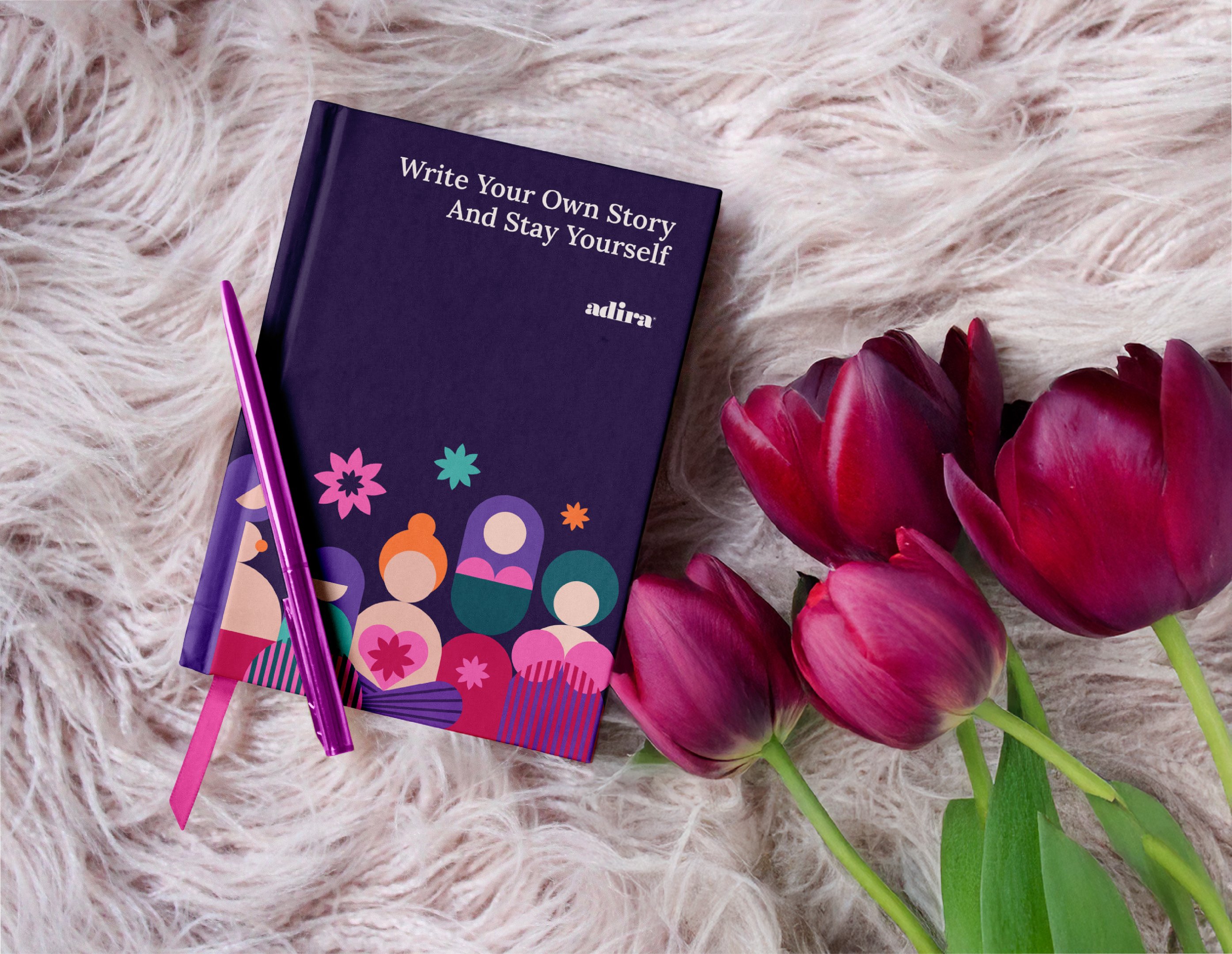
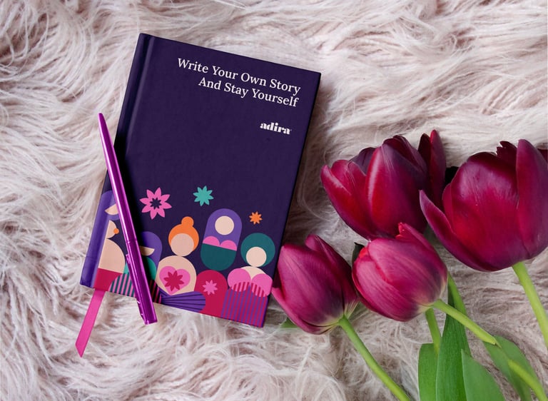
Packaging Materials
I designed packaging of different types that feels personal and respectful. The Adira brigt palette and life-stage illustrations make it recognizable and warm, while the icons and clear typography guide women with practical information.
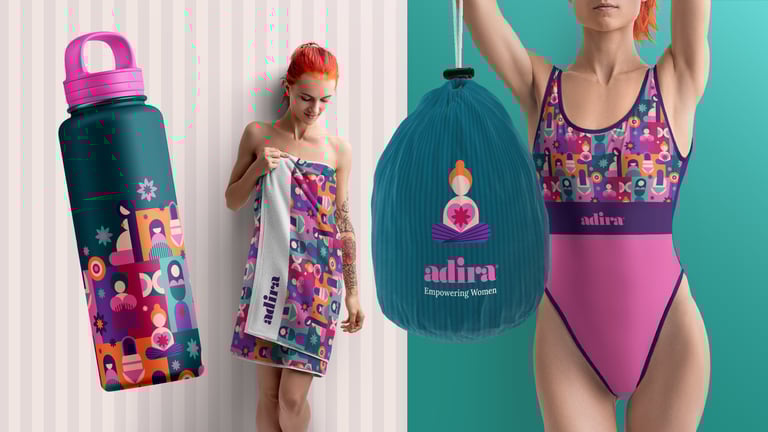
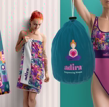
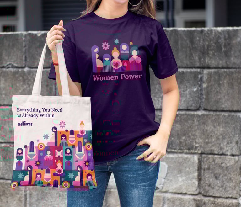
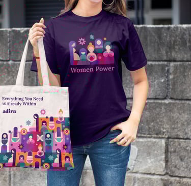
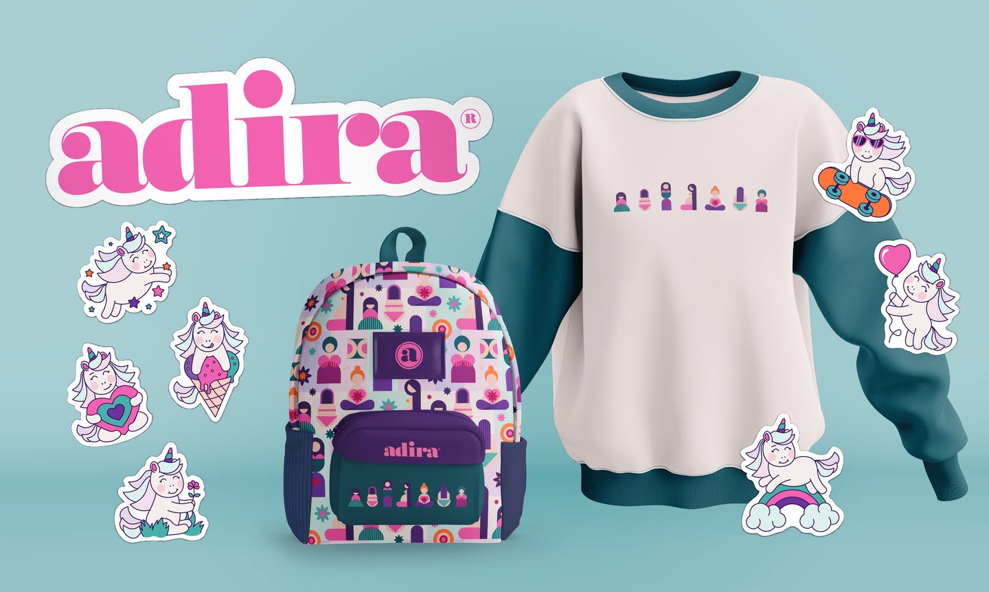
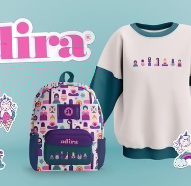
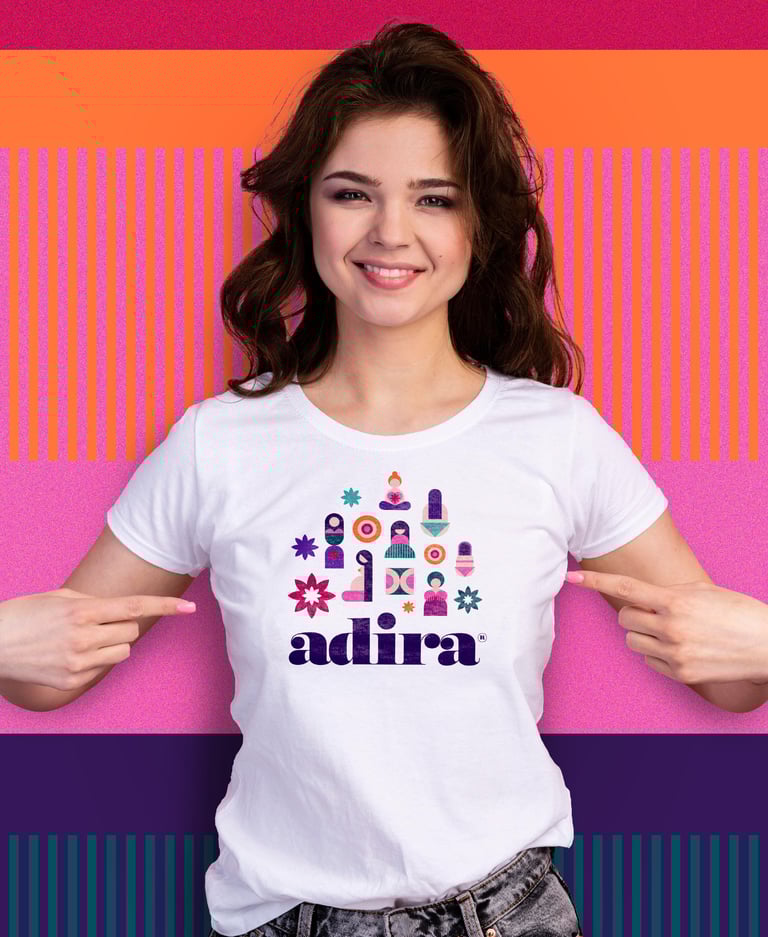
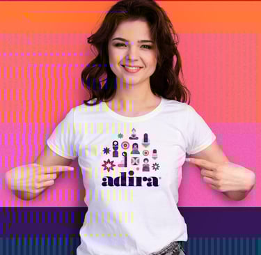
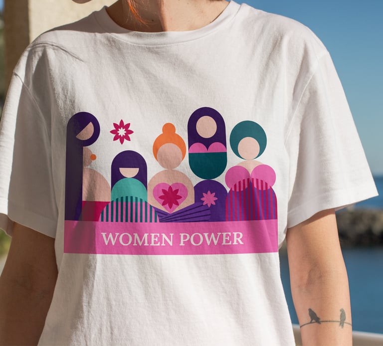
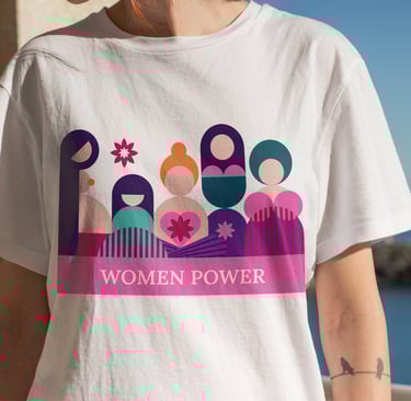
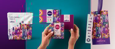
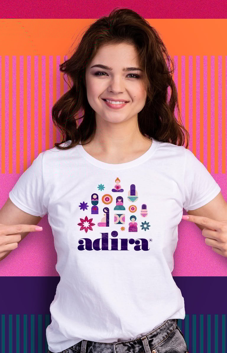
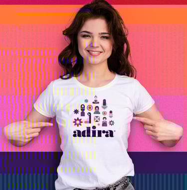
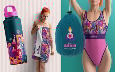
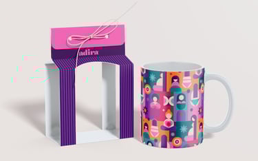
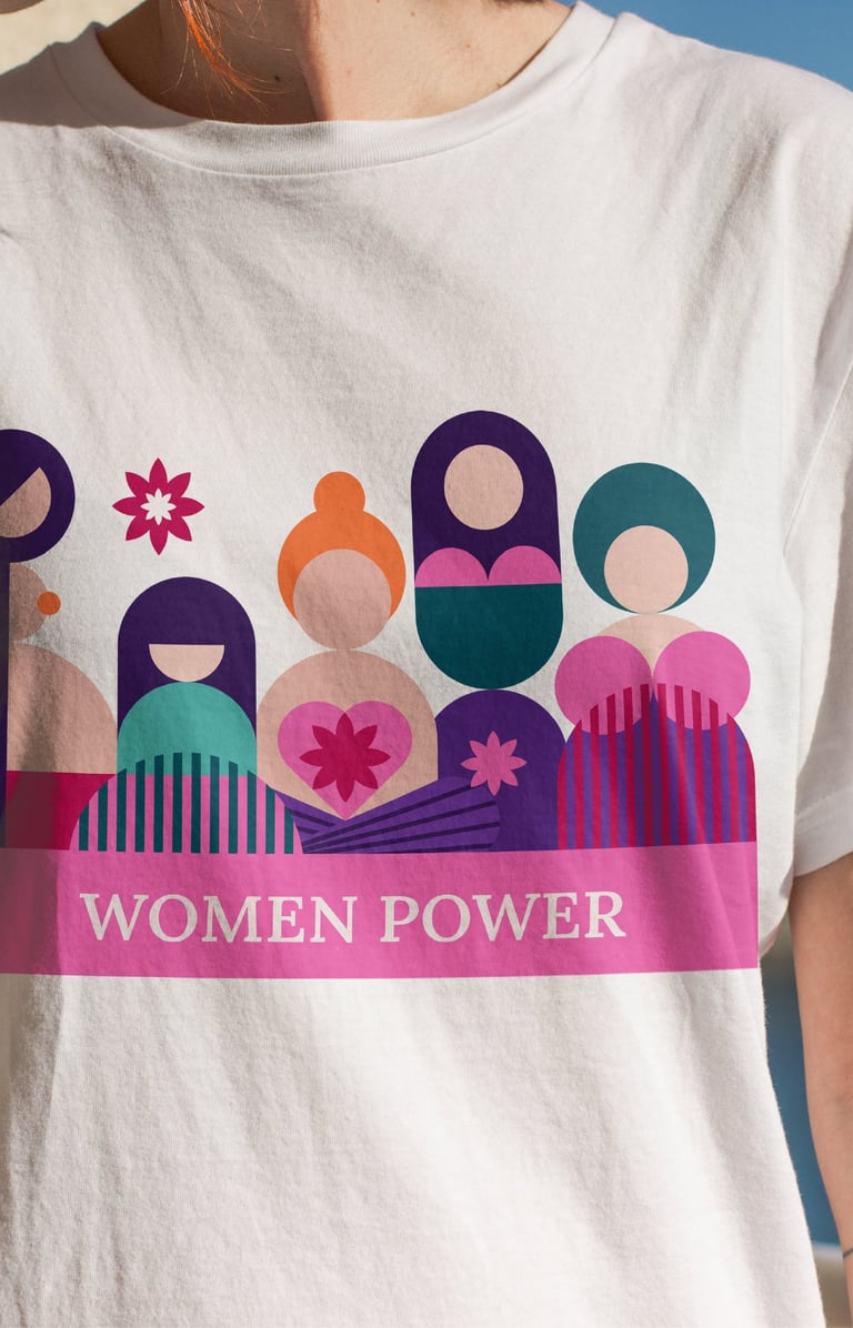
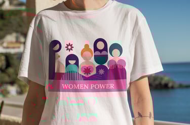
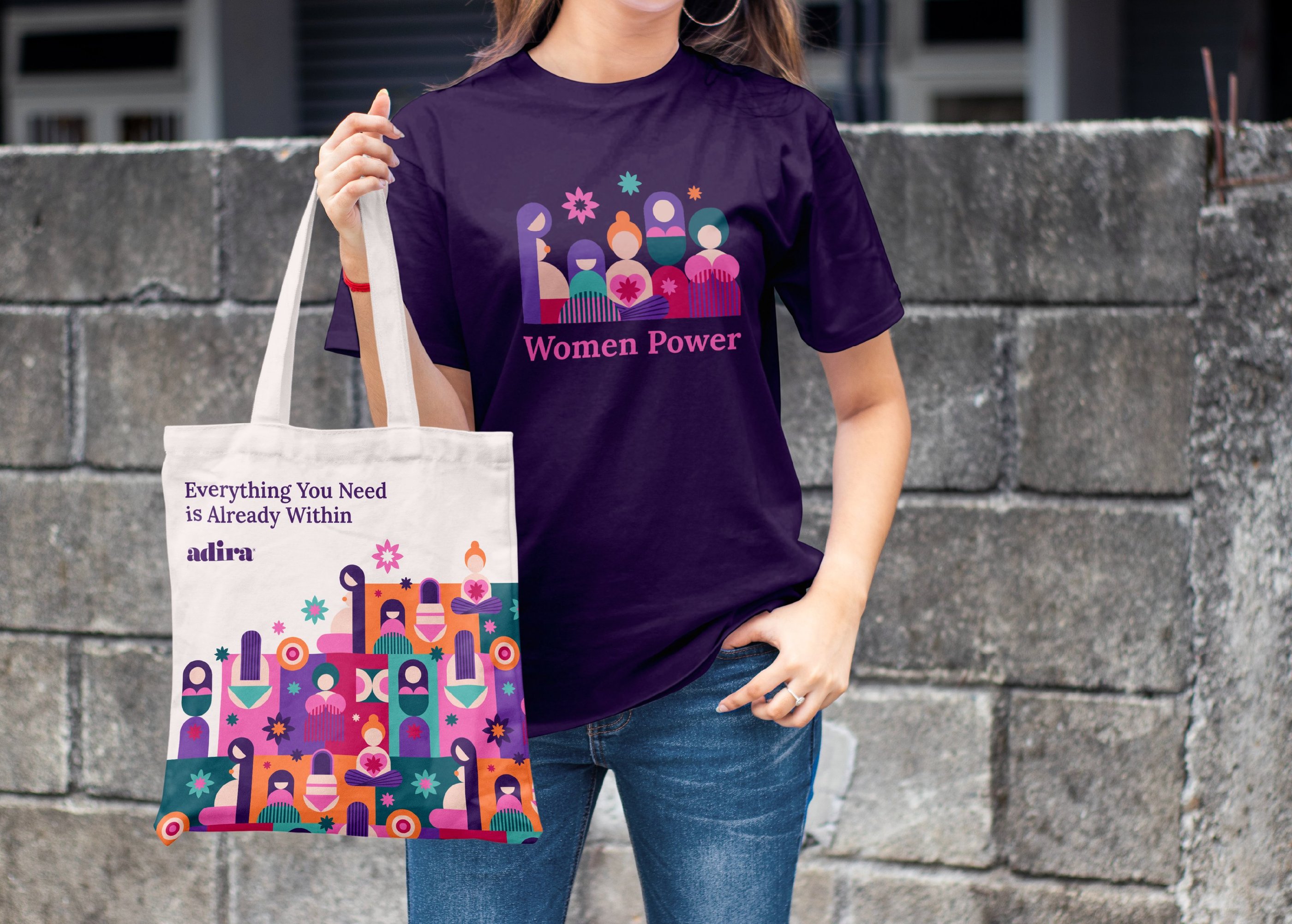
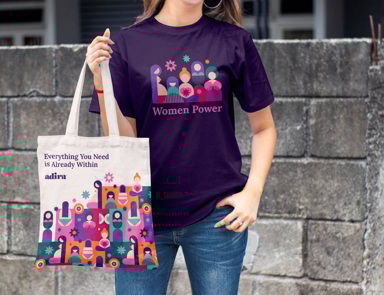
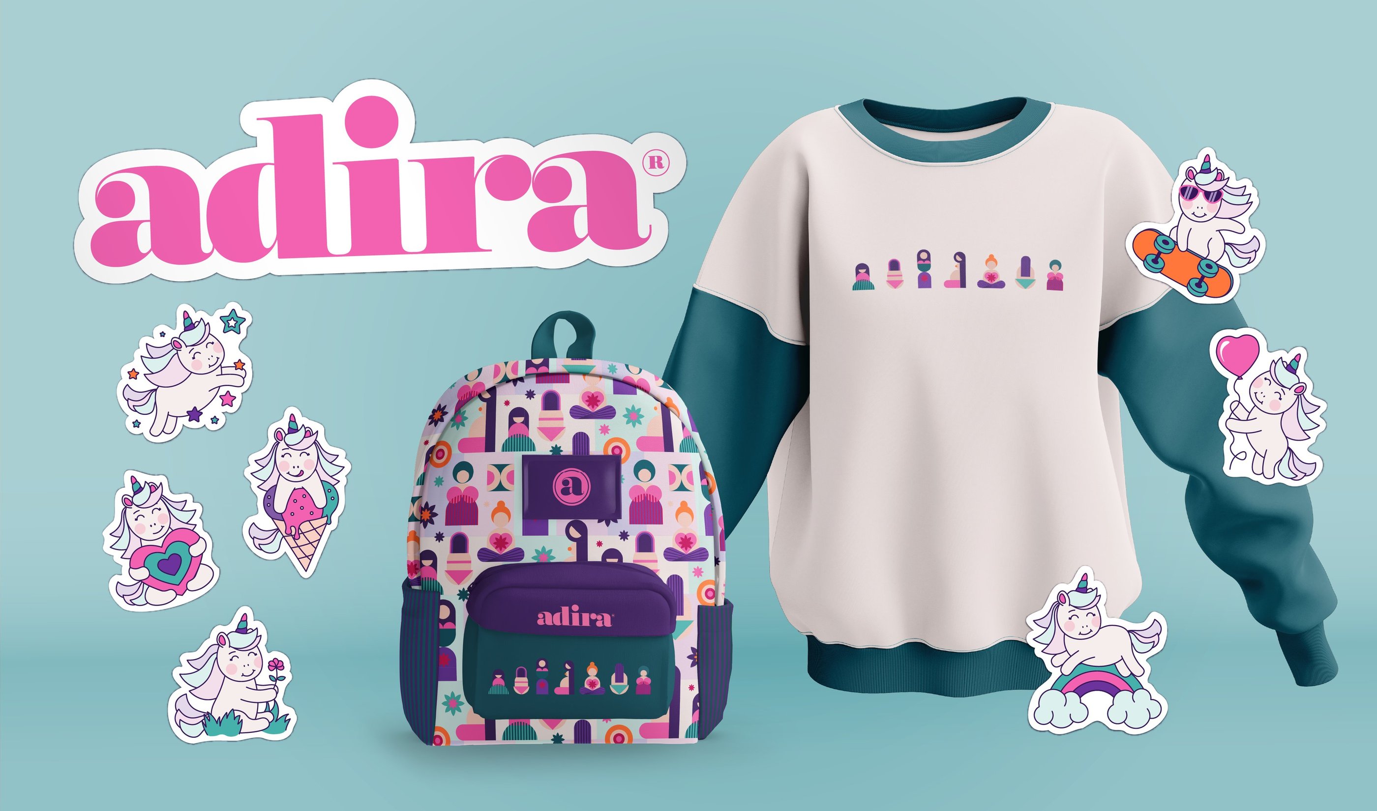
Merchandise, Apparel and Souvenir Products
I brought Adira’s identity into everyday life through apparel and accessories of different types. The patterns and life-stage symbols build recognition, while the colors keep the look fresh and connected to the brand.
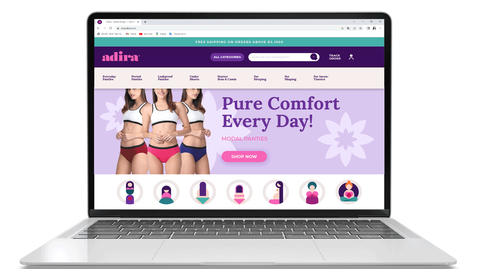
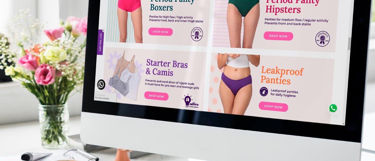
Web Site Design & Digital Materials
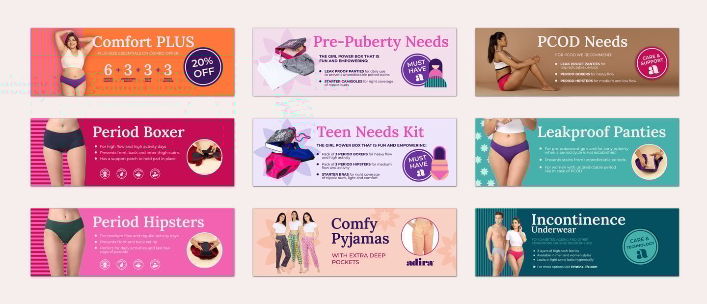
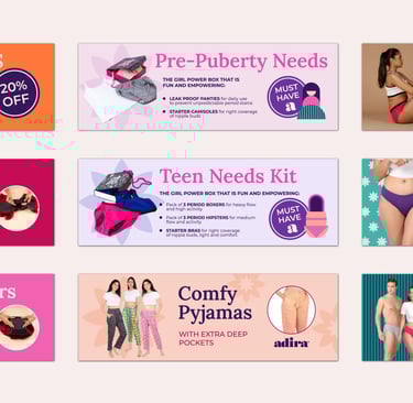
I developed the key website pages and set the overall approach to ensure a consistent look across the platform. The design keeps the site engaging and aligned with Adira’s brand identity. I also created a set of digital banners for different products, giving the brand flexible tools for campaigns and promotions.
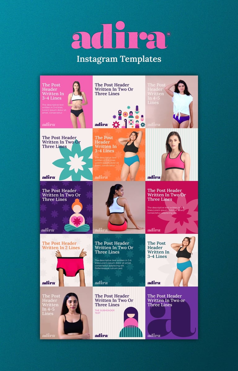
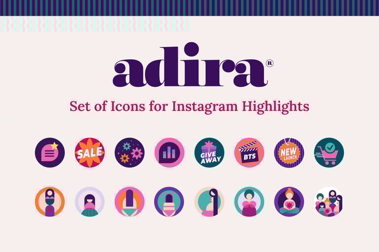
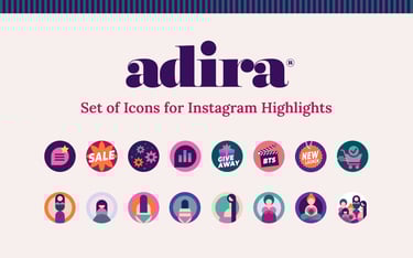
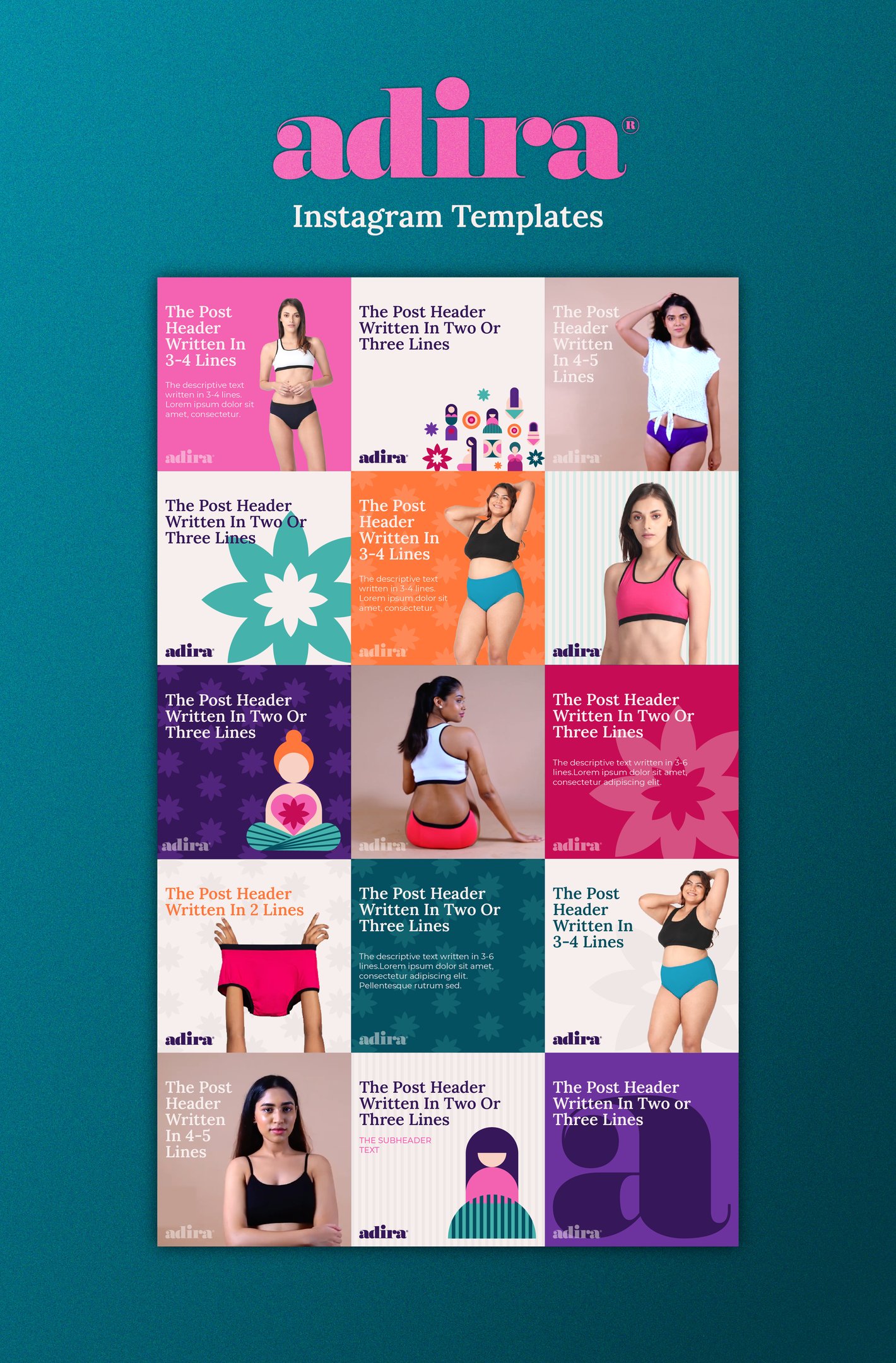
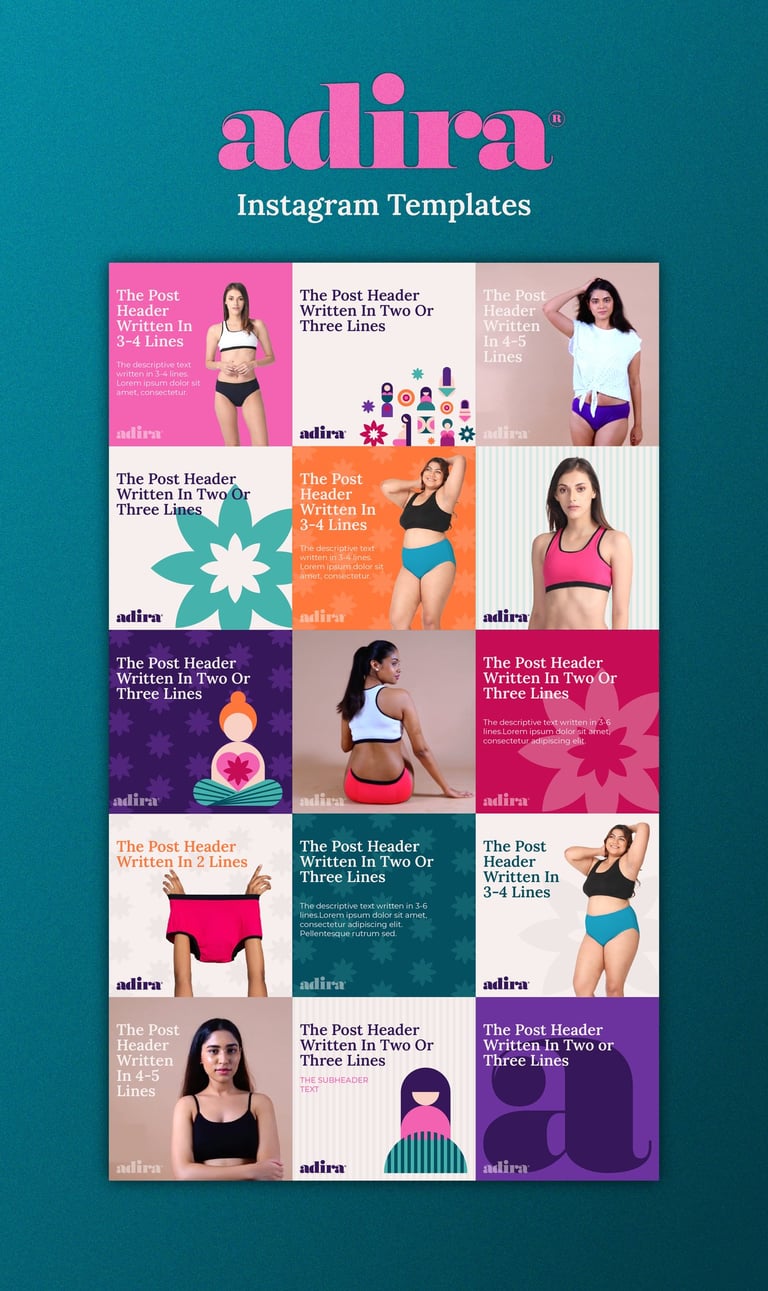
Instagram Templates & Highlight Icons
I built templates that keep Adira’s feed consistent and flexible. The layouts, colors, and highlight icons make posts easy to follow, while the overall look keeps the brand close and relatable.
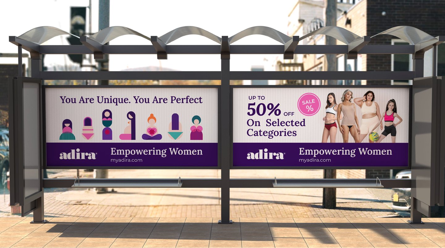
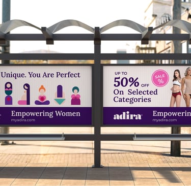
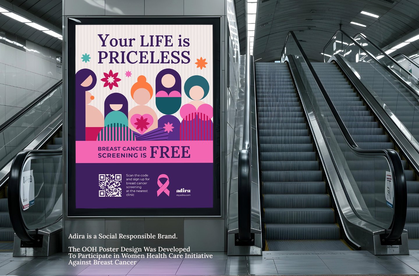
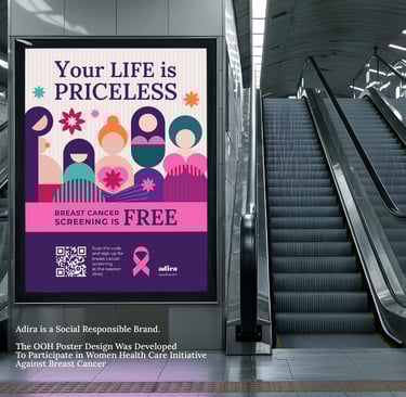
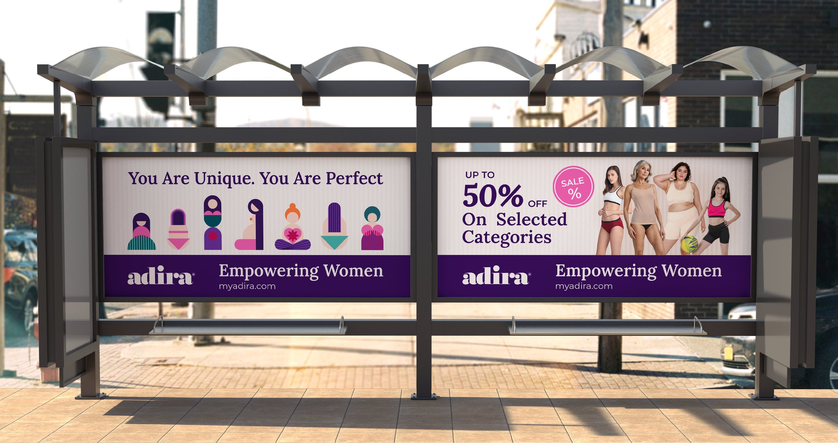
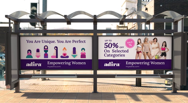
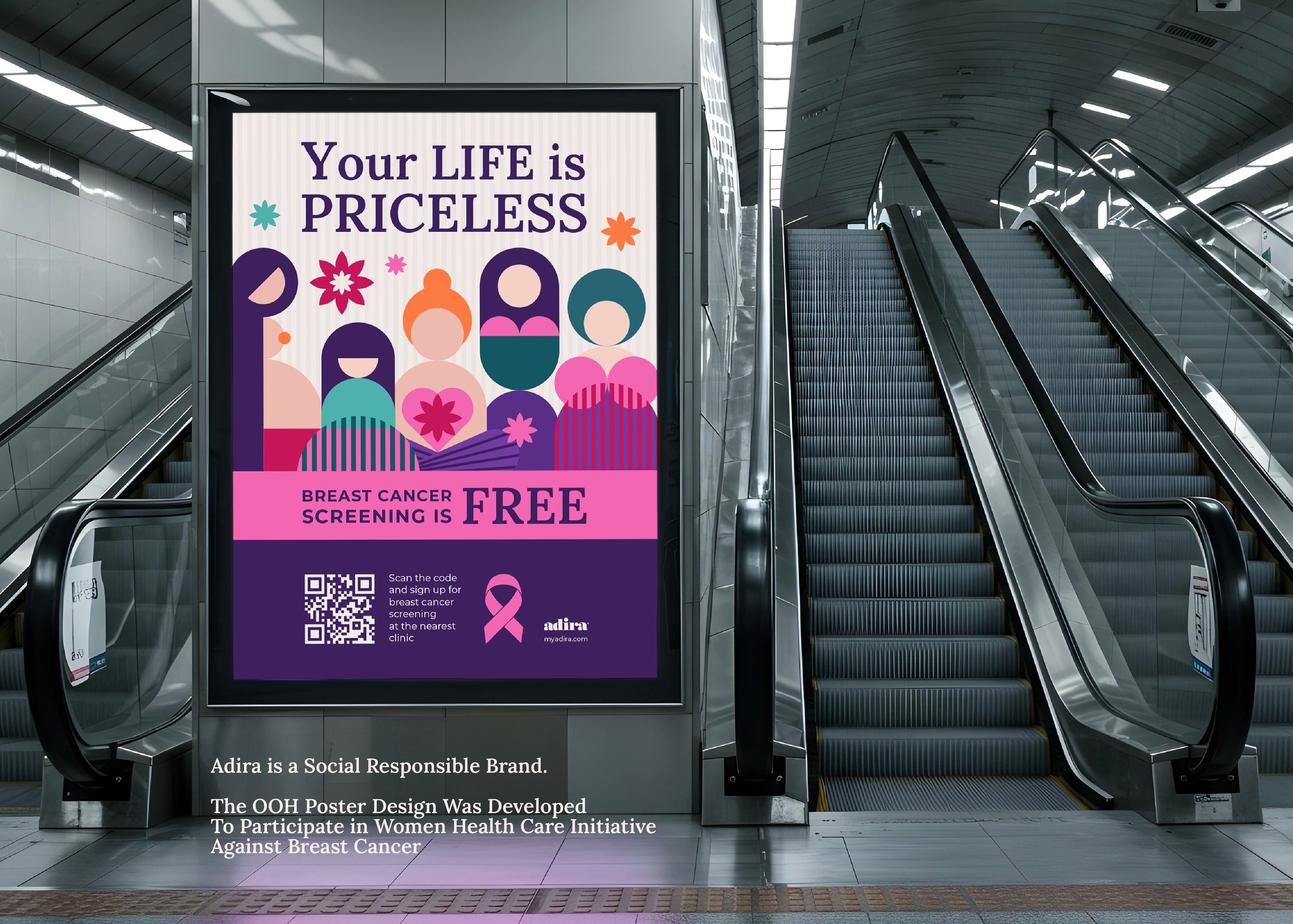
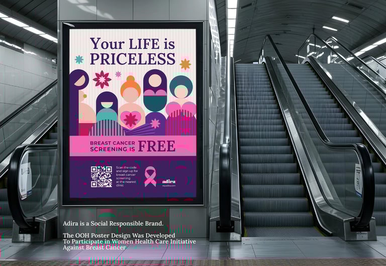
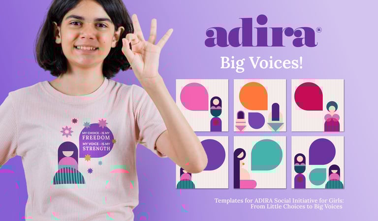
OOH & Social Initiative
I designed out-of-home and social visuals that stand out in public spaces. Strong illustrations and short messages deliver the cause clearly, while the visual style keeps it aligned with Adira’s identity.

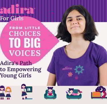
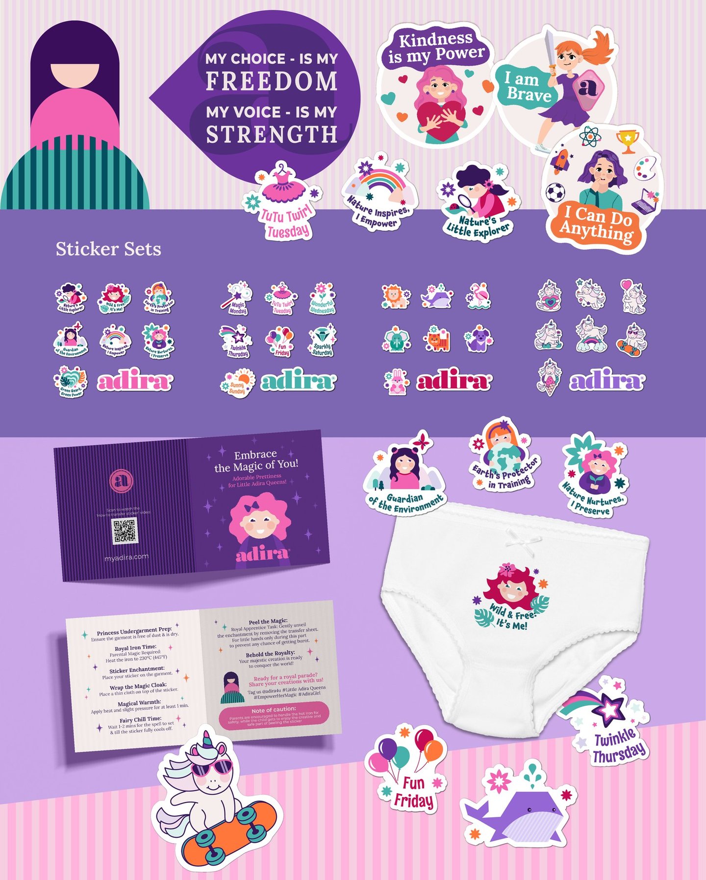
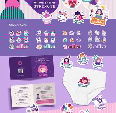

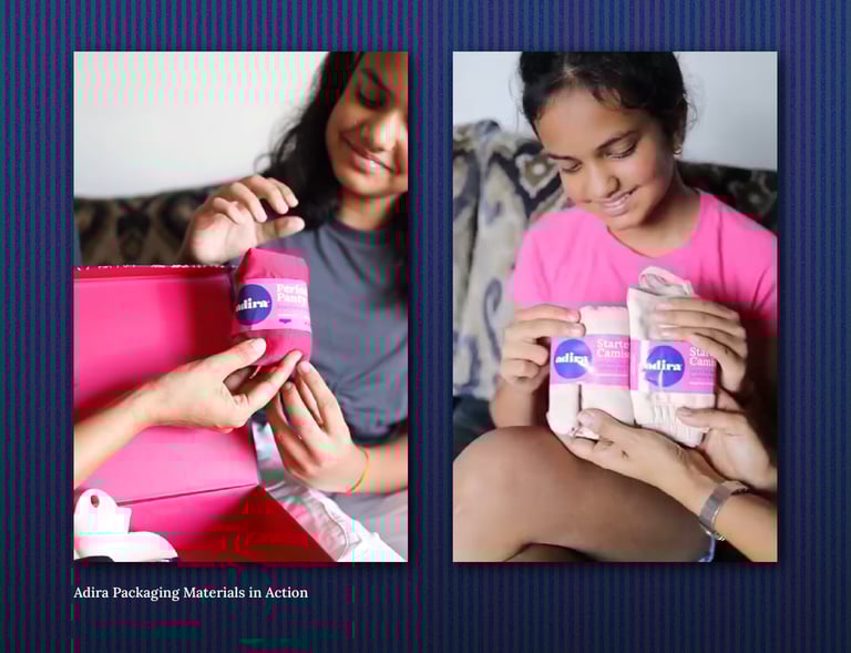
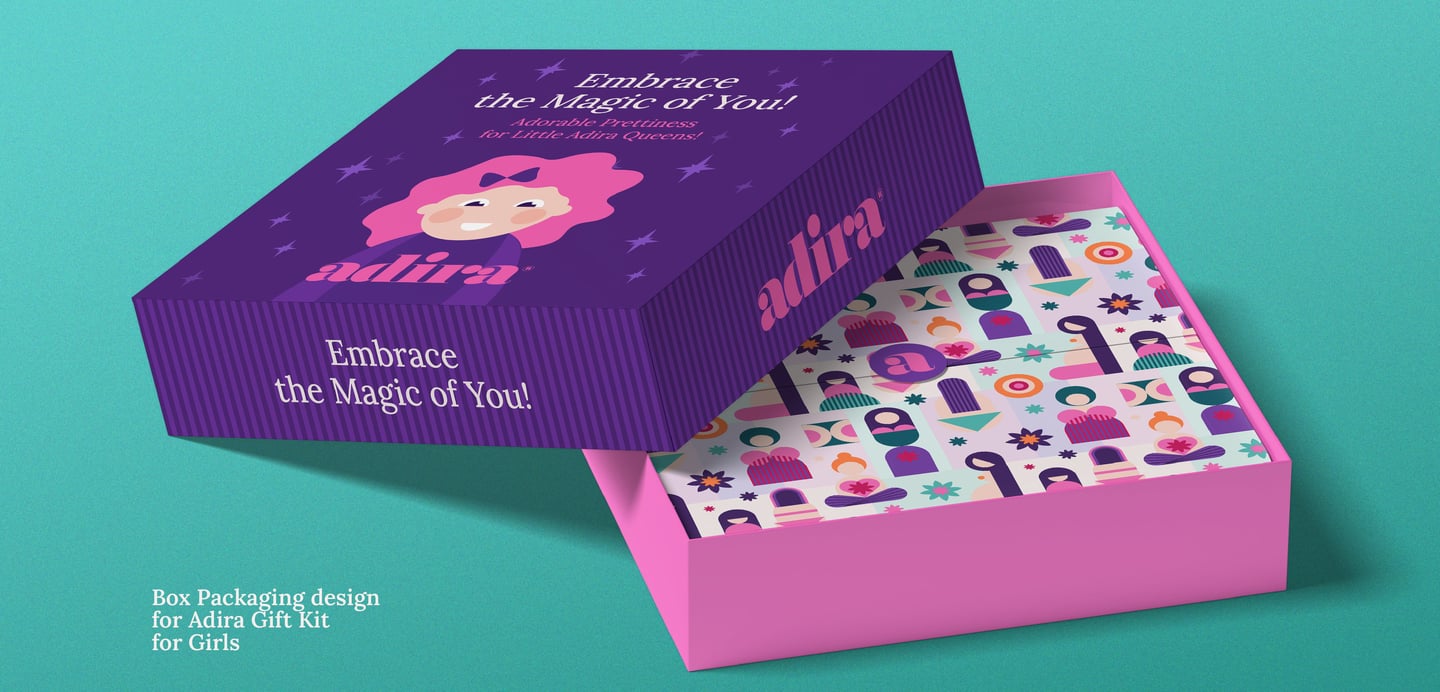
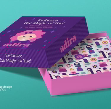
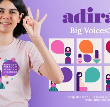
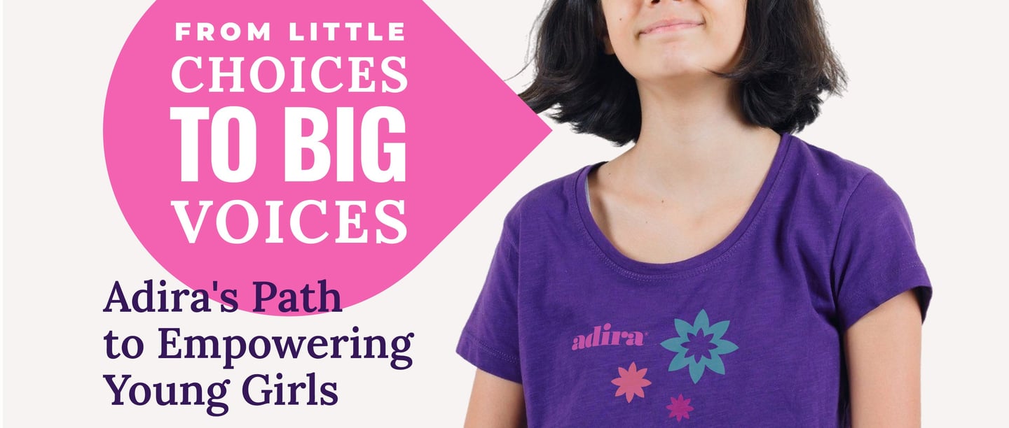
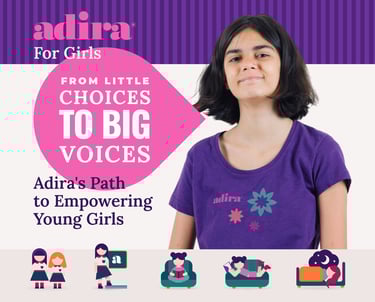
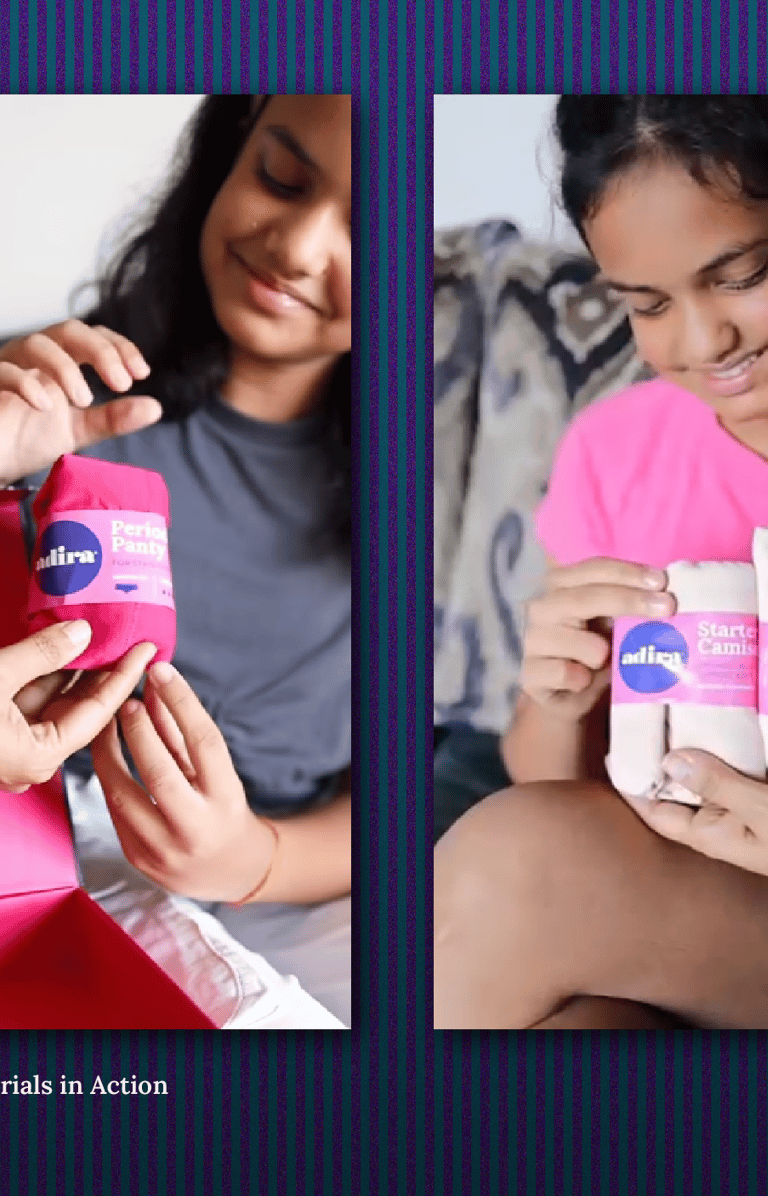
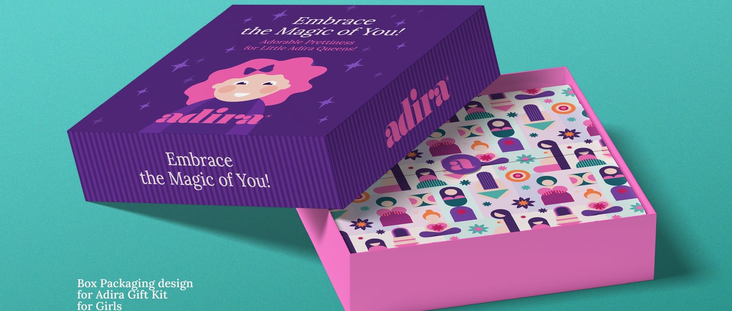
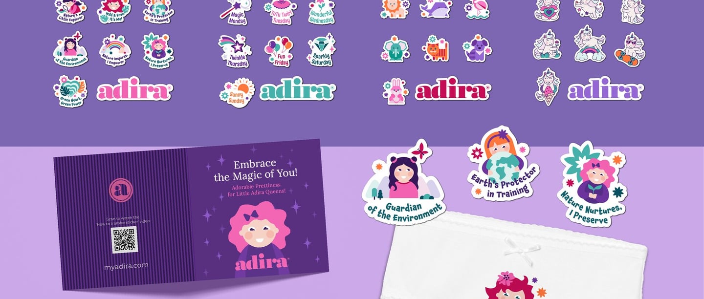
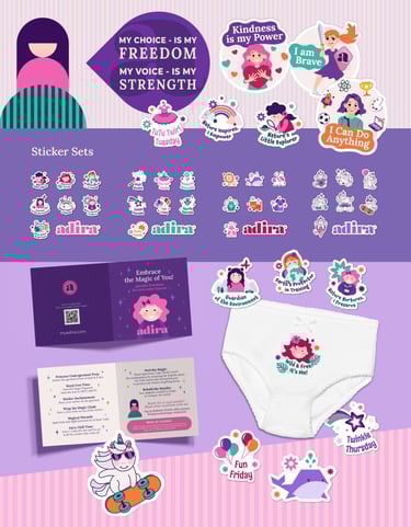
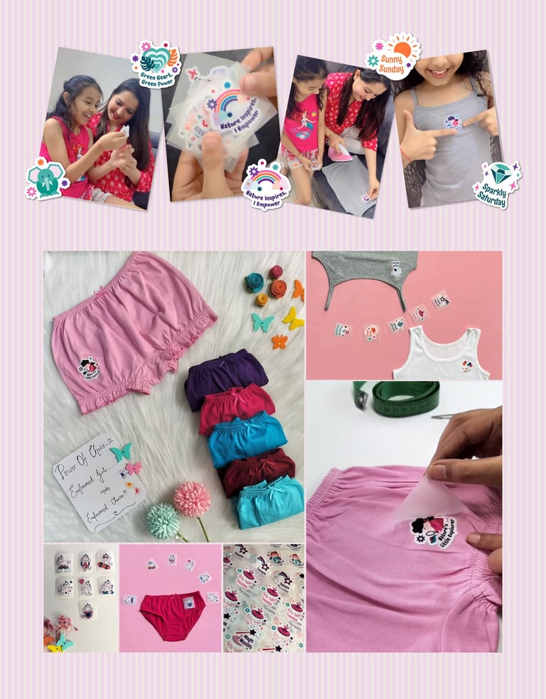
ADIRA SPECAL INITIATIVE FOR YOUNG GIRLS “FROM LITTLE CHOICES TO BIG VOICES”
One of the project’s most meaningful chapters was designing for Adira’s social initiative, “From Little Choices to Big Voices.” Through this campaign, Adira extends its mission to the youngest generation — offering gentle, thoughtful guidance while empowering young girls to build confidence and independence through small, everyday choices from an early age.
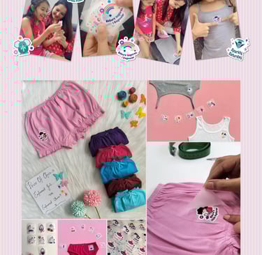
A key feature: personalized thermo-stickers for underwear. Girls can select the designs they love and apply them themselves — a small but joyful act of personalization that celebrates individuality, autonomy, and creativity, and further - helps spark a lifelong journey of self-expression and strength.
To support the initiative, I created:
A playful, child-friendly sticker collection
Instructional brochures with friendly visuals
Thoughtful packaging that felt like a gift
Campaign templates to extend the story across social media
This initiative deepened the brand’s emotional reach — connecting with the next generation, one choice at a time.
RESULTS
While exact numbers are still unfolding, the real impact of this project is already unmistakable. From the very first presentation, the new identity resonated deeply with the Adira team — so much so that what began as a branding task has evolved into an ongoing creative partnership.
The visual system not only met the brief — it expanded it. By capturing the emotional complexity of womanhood across all life stages, the design offered Adira a new lens through which to speak to its audience: one rooted in authenticity, empowerment, and care. The bold use of color, the emotionally symbolic illustrations, the thoughtful application of typography and brand language — together, these elements formed a holistic system that is as strategic as it is soulful.
More than just a makeover, the identity now functions as a valuable brand asset — a consistent, emotionally resonant visual language that actively builds brand equity. It establishes trust, strengthens recognition, and fosters long-term loyalty by meeting women not only where they are in life, but in how they want to feel.
The Adira community, too, responded with enthusiasm. The updated presence sparked new engagement across social channels, while the “From Little Choices to Big Voices” initiative opened doors for meaningful conversations with a younger audience — and their families.
But perhaps the clearest result lies in the relationship that followed. The client’s words of appreciation, their excitement in rolling out each new touchpoint, and their decision to continue working together are a testament to the success of the project. It wasn’t just a brand refresh. It was a brand reawakening — and I’m proud to still be part of its unfolding story.
CONCLUSION
Working on Adira has been one of the most meaningful experiences in my design career. The project gave me a rare opportunity to build a visual world that speaks to real people, real emotions, and real transitions in life. Designing for a brand with such a strong mission encouraged me to stay thoughtful, intuitive, and intentional at every step.
This project helped me evolve as a brand designer. It deepened my understanding of how design can shape perception, create trust, and support people in vulnerable moments. I learned to navigate complexity with clarity and to make bold choices grounded in empathy and purpose.
I’m truly grateful to the Adira team for their trust and creative freedom. Their openness made this collaboration both inspiring and enriching. Being part of this transformation was a gift — and it continues to shape the way I think about branding and the kind of impact I want my work to have.
Adira Brand Identity
CASE STUDY

Client: ADIRA
Industry: Underwear Fashion
Project Scope:
Rebranding, Full Brand Identity System development: logo variations, functional color palette, typography system, set of illustrations, signature patterns, set of functional icons, sub-brand extension assets.
Branded materials: Web-site layouts, set of digital banners, packaging materials, social media templates, postcards, branded merchandise, stickers collection for a special Adira's initiative for girls.
ABOUT THE BRAND:
Adira is an Indian brand redefining comfort and confidence through functional underwear for every stage of womanhood — from puberty to maternity, periods to menopause.
The name, meaning “strong and noble,” reflects Adira’s mission to enhance women’s lives with comfort, care, and innovation.
With its strong community, Adira needed a visual identity that connects emotionally and stands out with clarity.
DESIGN CHALLENGE:
The task was to create an identity that reflects the evolving journey of a woman’s body with honesty and care.
It had to express empowerment, comfort, and self-love, while embracing Indian color and warmth.
Above all, the brand needed to celebrate women without objectification — a visual voice that is respectful, real, and emotionally intelligent.
THE SOLUTION — VISUAL CONCEPT
I translated Adira’s mission into a series of symbolic illustrations representing every stage of womanhood.
Built from simple geometric forms, they are abstract, universal, and emotionally intuitive — designed to honor women rather than define beauty.
Echoing Indian aesthetics through graceful lines and bold colors, the icons create a visual timeline of womanhood, used across packaging, digital, and print.
Paired with abstract shapes, they form a flexible system that makes the brand consistent, versatile, and unmistakably Adira.
Color Palette
I developed a color palette that balances strength, warmth, and flexibility. Adira’s signature purple symbolizes dignity, while bold, vibrant tones reflect Indian sensibilities. Each color works together to create harmony and consistency across all brand touchpoints.
Typography
I created a type system that is clear, approachable, and accessible to all ages. Lora brings warmth and elegance to headlines, while Montserrat provides clean, readable body text. Together, they convey Adira’s confident, inclusive, and human voice.
Brand Graphics & Design Elements
I expanded Adira’s core illustrations and colors into a versatile visual system. This includes a Signature Brand Pattern built from the icons, plus supporting elements like backgrounds, shapes, and textures — all designed to enhance consistency and engagement across products and brand touchpoints.
BASIC BRAND IDENTITY ELEMENTS — BRAND ASSETS
Set of Functional Icons
I designed a custom set of icons representing product features and service benefits. Multiple versions ensure they can be applied seamlessly across all brand touchpoints.
Here you can see how the whole Identity System of Adira brand is applied on different touchpoints and work together in synergy, ensuring consistensy and cohesity in perception across different platforms of brand's communication.
RESULTS
The new identity deeply resonated with the Adira team and expanded the brand’s creative vision.
The system, from color and illustrations to typography, delivers consistency, emotional connection, and strategic impact. It strengthened recognition, built trust, and fostered engagement across social channels.
The client’s enthusiasm and ongoing collaboration show the project’s lasting success.
CONCLUSION
Working on Adira was a deeply meaningful experience. It allowed me to create a visual world that reflects real people, emotions, and life transitions.
The project strengthened my skills in designing with empathy, clarity, and purpose, and collaborating with the Adira team made the process inspiring and enriching.


BRAND IDENTITY APPLICATION
Packaging Materials
I designed different types of packaging that feel personal and respectful. The bright palette and life-stage illustrations make it warm and recognizable, while icons and clear typography provide practical guidance.


Merchandise, Apparel and Souvenir Products
I translated Adira’s identity into apparel and accessories. Life-stage symbols and patterns build recognition, while the colors keep the products fresh and connected to the brand.
Web Site Design & Digital Materials
I designed the key pages and set the overall approach to keep the site consistent and engaging. I also created digital banners for different products to support campaigns and promotions.

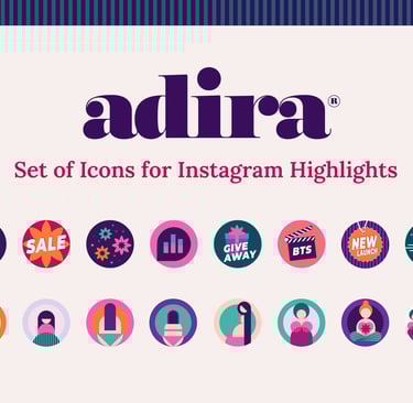
Instagram Templates & Highlight Icons
I created templates to keep Adira’s feed consistent and flexible. Layouts, colors, and highlight icons make posts easy to follow while keeping the brand approachable and relatable.
OOH & Social Initiative
I designed out-of-home and social visuals that stand out in public spaces. Strong illustrations and short messages deliver the cause clearly, while the visual style keeps it aligned with Adira’s identity.
ADIRA SPECAL INITIATIVE FOR YOUNG GIRLS “FROM LITTLE CHOICES TO BIG VOICES”
I designed Adira’s social initiative to empower young girls with confidence and independence.
Key features included a playful sticker collection, instructional brochures, thoughtful packaging, and social media templates.
Personalized elements, like thermo-stickers, made the experience joyful and engaging, helping girls express individuality while connecting with the brand.


Get News & Inspiration
© 2024-2025 tanyabe.com.
All rights reserved
Useful Links